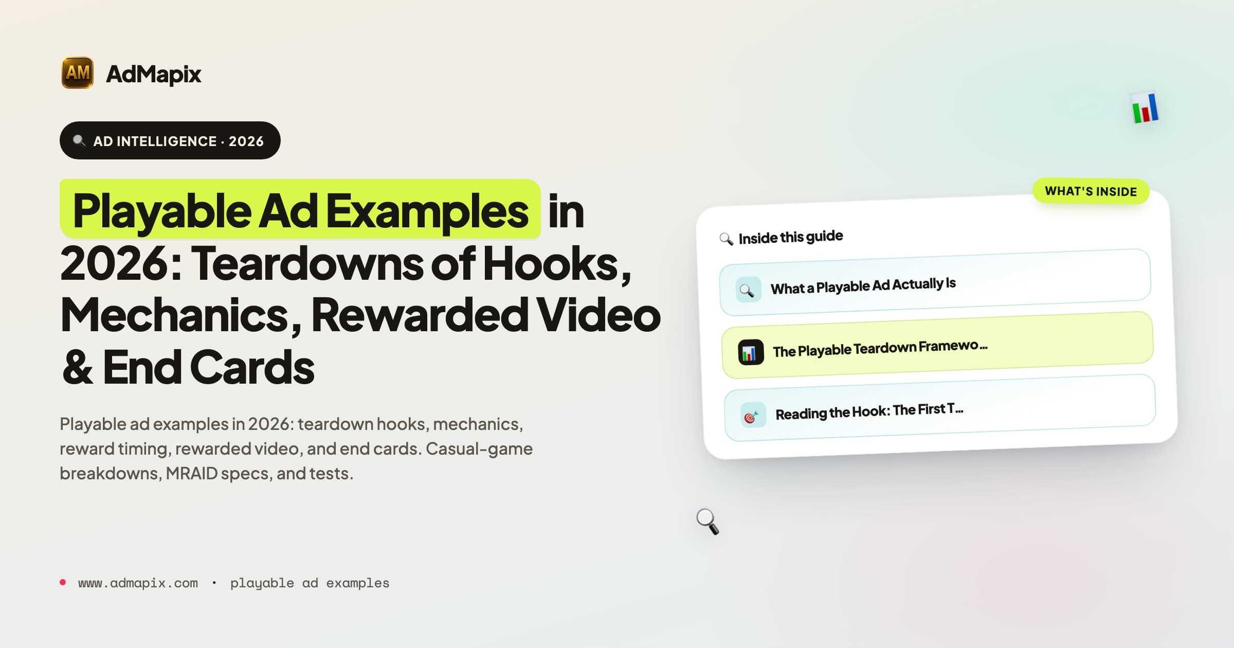
Playable Ad Examples in 2026: Teardowns of Hooks, Mechanics, Rewarded Video & End Cards
A 2026 teardown library of playable and interactive ad examples — how to read each one by hook, core mechanic, reward timing, guidance, and end card, plus deep breakdowns of casual-game playables, rewarded-video and interactive end cards, the full app-install creative format spectrum, MRAID and Unity specs, the metrics that actually grade a playable, and a workflow that turns competitor examples into a test backlog.
Playable Ad Examples in 2026: Teardowns of Hooks, Mechanics, Rewarded Video & End Cards
By the AdMapix Research Team — Updated June 21, 2026
A playable ad is a short, interactive HTML demo that lets a user try a slice of a game before installing it, which means the most useful way to study playable ad examples is to read each one as a mini product demo: what hook starts the session, what mechanic the user actually performs, how fast the first reward lands, and what the end card asks for. In 2026, playables and their cousins — rewarded video, interactive end cards, and the wider family of app-install creative — are the dominant performance formats in mobile game and app user acquisition, and the gap between a competently torn-down example and a screenshot in a folder is the gap between a brief you can ship and inspiration you'll forget. This guide is for mobile game UA managers, playable producers, creative strategists, and agencies who need to turn examples into testable briefs. After reading it, you should be able to take any playable, rewarded-video, or interactive install ad apart and decide what variation to test next.
We've torn down thousands of playable and interactive creatives across casual, mid-core, and app verticals, and the lesson repeats: teams that "save good playables" without a scoring system end up with an asset graveyard, while teams that read every example on the same dimensions ship sharper concepts faster. The asset itself is never the edge — anyone can see a competitor's playable. The edge is a teardown vocabulary that turns what you see into what you test. This article gives you that vocabulary, then applies it across every major interactive install format.
TL;DR — Playable & Interactive Ad Examples in One Screen
- Read every playable as a mini product demo, not as footage. The defining feature is that the user does something — a tap, drag, merge, aim, or build — so you study the mechanic they touch, not the shots they watch.
- Score every example on five observable dimensions: hook, core interaction, reward timing, guidance, and end card. Five well-tagged teardowns beat fifty saved screenshots.
- Interaction-to-reward time is the loudest signal you can observe. Strong playables let the user do something meaningful and get paid off within the first few seconds.
- The format family is wider than "playable." Rewarded video, interactive end cards, and the full app-install creative spectrum all follow related logic, and a canonical teardown covers them together.
- Format constraints explain the creative. Playables live inside MRAID, single-HTML, file-size, and orientation rules; rewarded placements add an opt-in completion dynamic. The rules shape what's possible.
- Public evidence shows structure, never performance. You can read the hook, mechanic, reward, and end card; you cannot read CPI, ROAS, install rate, retention, or spend. Every observation is a hypothesis until your own data confirms it.
- The output is a tagged, searchable library and a test backlog — sorted by mechanic, not by app — that a creative lead can brief from on demand.
What a Playable Ad Actually Is
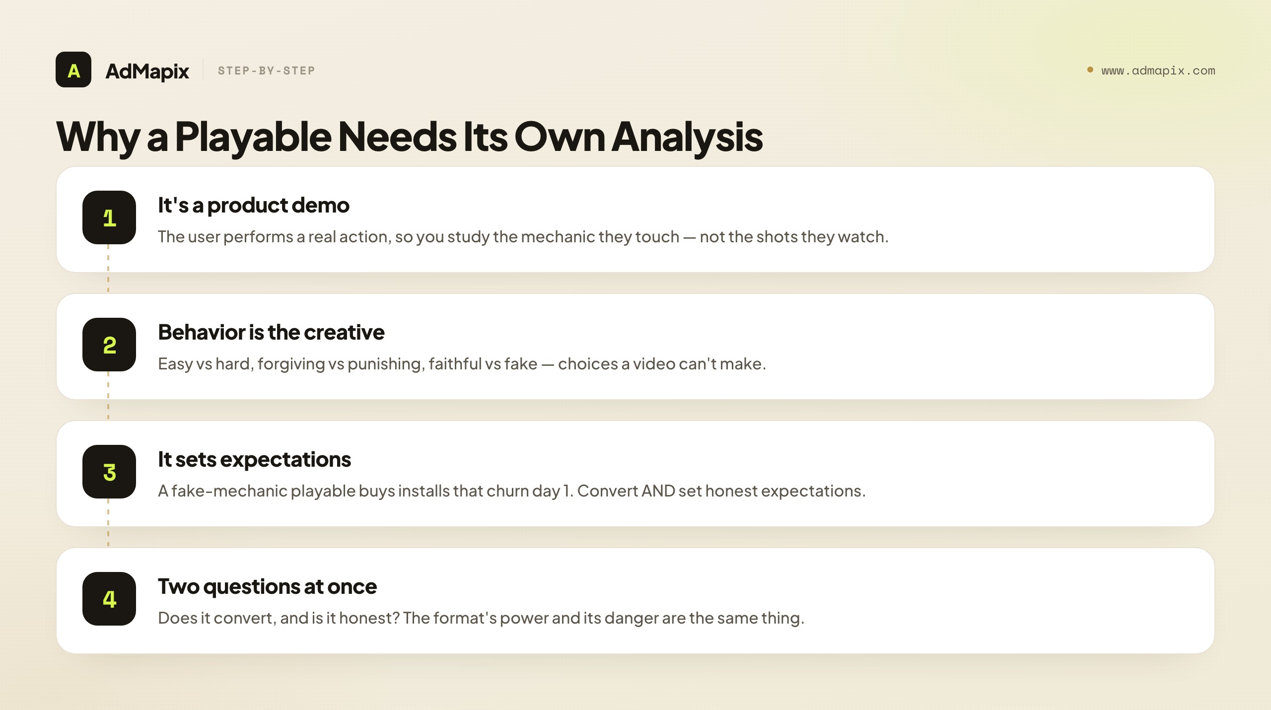
A playable ad is a self-contained interactive demo, usually a single HTML file, that runs inside an ad slot and ends in a store call-to-action. It is not a video and not a static banner: the defining feature is that the user performs a real action — a tap, a drag, a merge, an aim-and-fire — rather than watching passively.
That distinction matters because it changes what you should extract. With a video ad you study pacing and shot order; with a playable you study the mechanic the user is allowed to touch, whether that mechanic represents real gameplay, and how the demo guides a first-time player without a tutorial. Two playables can share the same art and feel completely different because one lets you fail and retry while the other is on rails. The interactivity is the product, and the product is what you're really evaluating.
There's a deeper reason playables earn their own analysis discipline: they are the only ad format where the user's behavior inside the ad is part of the creative. A video either holds attention or doesn't; a playable can be easy or hard, forgiving or punishing, faithful to the real game or a complete fabrication. Those choices don't just affect whether the user installs — they affect whether the user who installs stays, because a playable that misrepresents the game buys you installs that churn on day one. This is why the best playable teardowns always ask two questions at once: does this convert, and does this set an honest expectation? The format's power and its danger are the same thing.
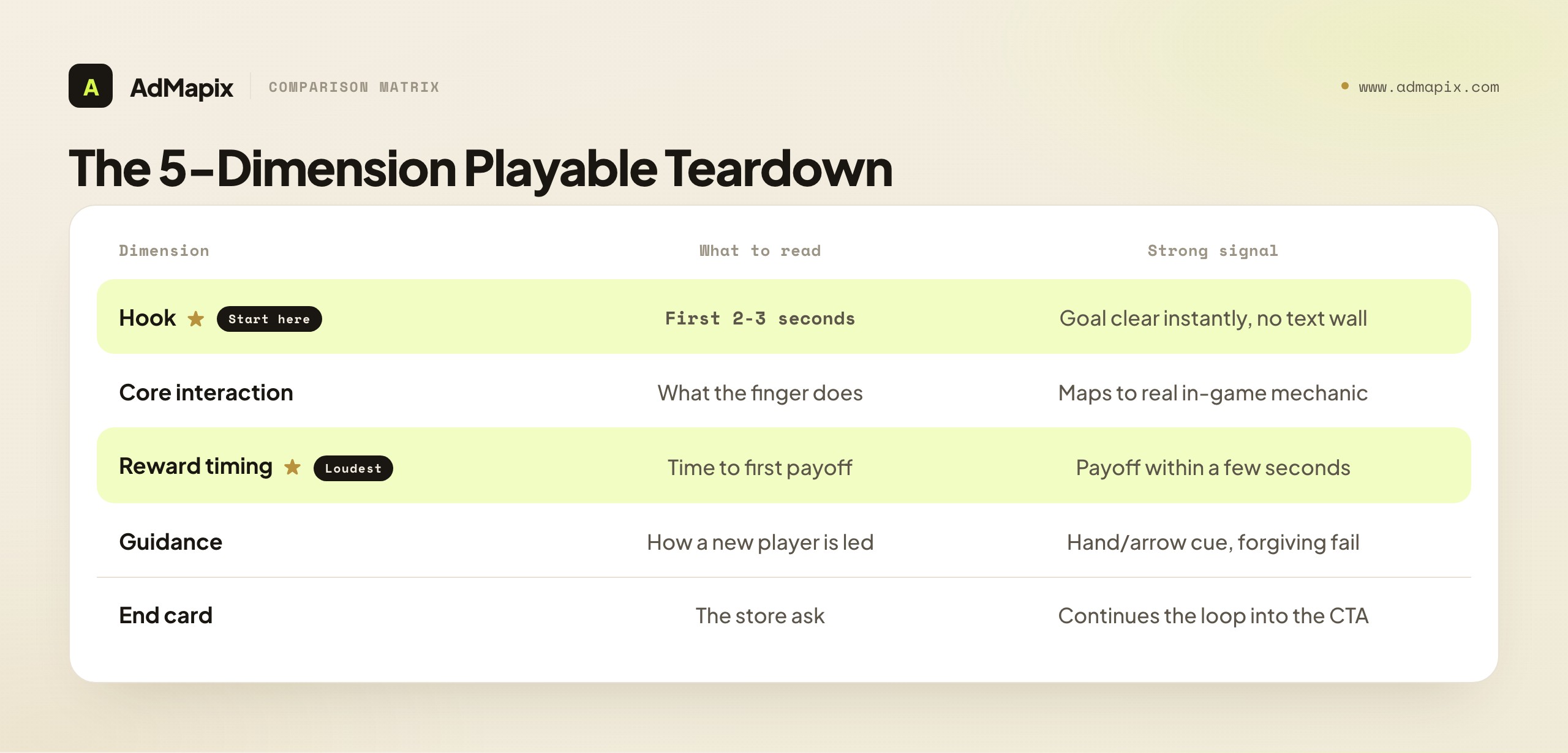
The Playable Teardown Framework
The fastest way to make examples useful is to score every playable on the same five dimensions, then compare. Each row is something you can observe directly in the creative without any private performance data.
| Dimension | What to look for | Strong signal | Weak signal | Next action |
|---|---|---|---|---|
| Hook | The first 2-3 seconds: fail-bait, near-win, satisfying motion, or a clear promise | User understands the goal instantly with no text wall | Long instruction screen before any interaction | Note the hook type; queue a variation test |
| Core interaction | What the finger actually does (tap, drag, aim, merge, build, sort) | Maps to real in-game mechanics | A fake mechanic that doesn't exist in the game | Flag mismatch risk for retention |
| Reward timing | How fast the first payoff (win, currency, level clear) appears | Payoff within the first few seconds | Reward gated behind a long sequence | Test moving the reward earlier |
| Guidance | How a new player is led without a tutorial | Hand/arrow cue, forgiving fail state | Dead ends, unclear next step | Add or simplify the cue |
| End card | The store ask and whether play continues | Continues the gameplay loop into the CTA | Hard cut to a generic store button | Test an interactive end card |
Use it as a checklist per example, not a one-time read. The discipline that makes the framework pay off is consistency: score every example on all five rows, even the ones that seem obvious, because the comparison across a tagged set is where the patterns surface. A single playable tells you what one studio did; thirty scored playables tell you which hooks the category clusters on, which mechanics get faked most often, and where the under-exploited reward-timing gap is. The framework's value is cumulative, not per-asset.
Reading the Hook: The First Three Seconds of a Playable
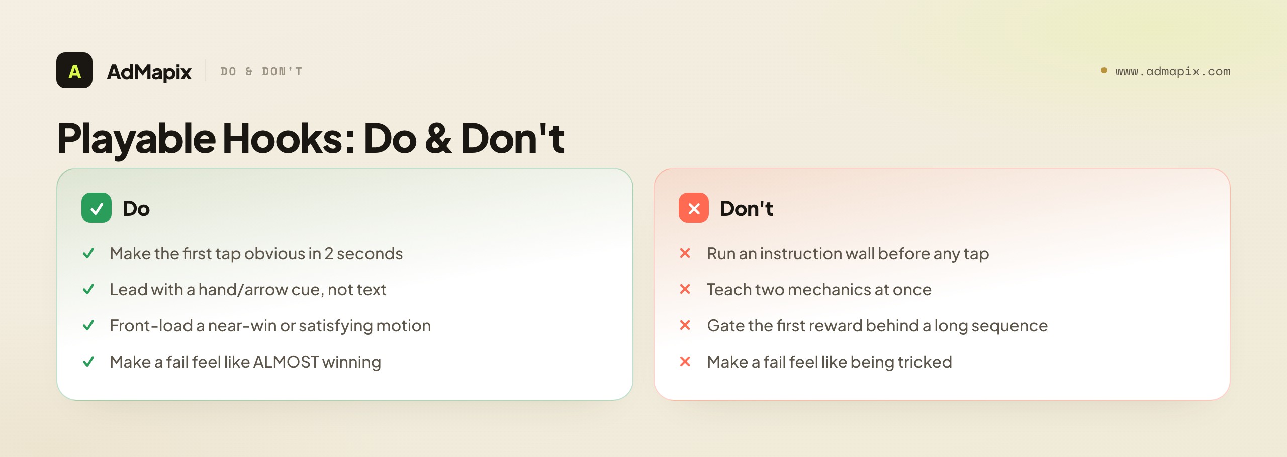
The playable hook is its own craft, distinct from a video hook, because the playable hook has to do something a video hook never does: communicate an interaction the user is about to perform, not just an idea to absorb. The best playable hooks make the user's first tap obvious within two seconds, with no instruction wall, because every second of "what am I supposed to do here?" is a drop-off.
The recurring playable hook types worth tagging:
- Fail-bait. The demo sets up a near-certain, low-stakes failure the user can immediately recover from — a pin that lets the lava through, a block that doesn't quite fit. The failure creates tension and a reason to retry, which carries the user toward the end card. The craft is in making the fail feel like almost winning, not like being tricked.
- Near-win. The user is dropped one move away from a satisfying win, completes it, and gets an instant payoff. This front-loads the dopamine and is one of the most common high-performing patterns in casual playables.
- Satisfying motion. Some playables lead with an inherently pleasing interaction — a smooth merge, a satisfying sort, a chain reaction — where the feel of the mechanic is the hook. These work when the mechanic is genuinely tactile.
- Clear-promise. A simple, legible goal stated through the visual itself ("get the ball in the cup," "match three") that needs no text. The hook is the clarity.
The failure mode shared across all of them is the instruction wall — a screen of text or a tutorial that runs before the user can touch anything. On a format whose entire premise is interaction, making the user read before they play is the cardinal sin. When you tear down a weak playable, the instruction wall is the most common culprit, and "remove the text, lead with the tap" is the most common fix worth queuing.
Types of Playable Examples to Collect
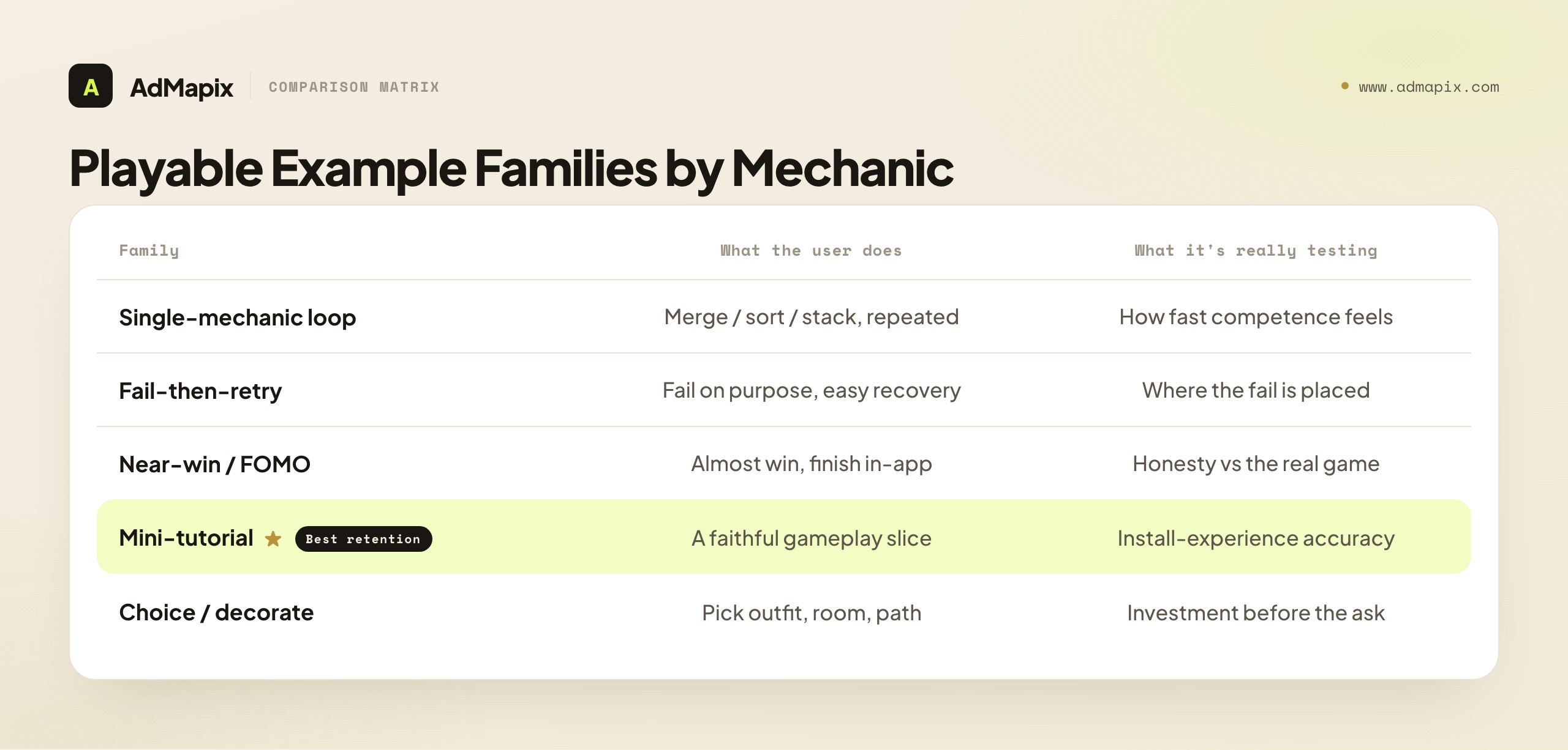
Different genres lean on different playable patterns, so collect by mechanic type rather than by app. Below are the recurring families you'll see, and what each one is really testing.
- Single-mechanic loops (merge, sort, tap-to-stack): the playable is the mechanic, repeated until the reward. Study how few taps it takes to feel competent — the best ones make the user feel skilled within three interactions.
- Fail-then-retry (puzzle, draw-the-line, pin-pull): the demo lets you fail on purpose to create tension, then offers an easy retry. Study where the fail is placed and how forgiving the recovery is.
- Near-win / FOMO: the user almost wins, then the end card promises completion in-app. Study honesty — does the real game deliver that moment, or is the playable writing a check the game can't cash?
- Mini-tutorial of the real game: a faithful slice of actual gameplay. Study whether it represents the install experience accurately, which affects retention more than install rate.
- Choice / decorate: the user picks an outfit, room, or path. Study how the choice creates investment before the ask — a user who customized something is more committed to installing.
Collecting by mechanic rather than by app is the single most important organizing decision, because mechanics transfer across genres and apps don't. A merge mechanic that wins for a gardening game may be exactly what your puzzle game should test; you'll only see that if your library is sorted by what the finger does, not by which studio shipped it.
Casual-Game Playables: The Highest-Volume Category
Casual games are where playables were perfected and where the most examples live, so they deserve a dedicated read. Casual playables — merge, match-3, puzzle, idle, hyper-casual runners, and "save the X" pull-pin games — share a design philosophy built around the shortest possible path to competence and reward, because their audience is broad, impatient, and acquired at enormous scale where small creative wins compound into large CPI differences.
The defining traits of strong casual playables:
- Sub-three-second comprehension. The casual audience will not read. The goal must be legible from the visual alone, and the first interaction must be obvious. Casual playables that lead with a hand cue pointing at the first tap consistently out-test those that explain.
- Instant, frequent reward. Casual play loops are short, so casual playables stack rewards fast — a win, then currency, then a level clear, often within the first five seconds. The dopamine cadence of the ad mirrors the dopamine cadence of the game.
- Forgiving difficulty. A casual playable that lets the user lose hard reads as frustrating, not challenging. The fail-then-retry pattern works here only when the recovery is trivially easy.
- One mechanic, repeated. Casual playables almost never teach two mechanics. They pick the single most satisfying interaction and loop it, because cognitive load is the enemy of a broad audience.
A specific casual sub-pattern worth its own tag is the "satisfying but fake" mechanic — the pull-pin or pour-water playable attached to a game whose actual core loop is something else entirely (often a merge or builder). These convert extremely well because the mechanic is inherently pleasing, but they carry the highest retention risk in the entire format, because the user who installs expecting pin-pulling and finds a merge game churns immediately. When you tear down casual examples, flag the fake-mechanic ones explicitly: they're a lesson in install-rate craft and a warning about the retention bill that follows.
Rewarded Video and Interactive End Cards
Rewarded placements are a related format that belongs in the same canonical teardown, because the rewarded video plus interactive end card combination is one of the highest-converting structures in mobile UA, and it follows playable logic with a different attention contract.
A rewarded ad runs when the user has opted in to watch in exchange for an in-app reward — extra lives, currency, a continue. Google's AdMob documents rewarded ads as letting users earn in-app items by interacting with video, playable, and survey formats. That opt-in changes the creative math completely: the hook competes less for attention (the user already chose to watch) and more for completion and conversion. The user is a captive but not necessarily an interested audience, so the rewarded creative's job is to convert captivity into genuine interest before the reward lands and the user bounces back to their game.
The rewarded structure splits into two halves you should tear down separately:
- The video half. A short, fast demonstration that builds desire before the interactive moment. Study how quickly it shows the core appeal, whether it teases an interaction, and how it leads into the end card without a jarring cut.
- The interactive end card. A miniature playable that appears after the video, giving the captive user one quick interaction and an install ask. This is where the conversion happens. Study whether the end card continues the video's promise into a real tap, or hard-cuts to a generic store button (the most common conversion leak in the format).
The interactive end card is the highest-leverage, most-neglected element in rewarded creative. A strong video with a dead end card — a static screen and a store button — leaks the conversion the video earned. The pattern worth testing is almost always "make the end card playable": give the captive user one satisfying interaction that flows straight into the CTA, so the install ask arrives at the peak of engagement rather than after it. Unity positions tools like Playworks for building exactly these interactive end cards alongside full playables, which is a signal of how central the end card has become to the format.
The Full App-Install Creative Spectrum
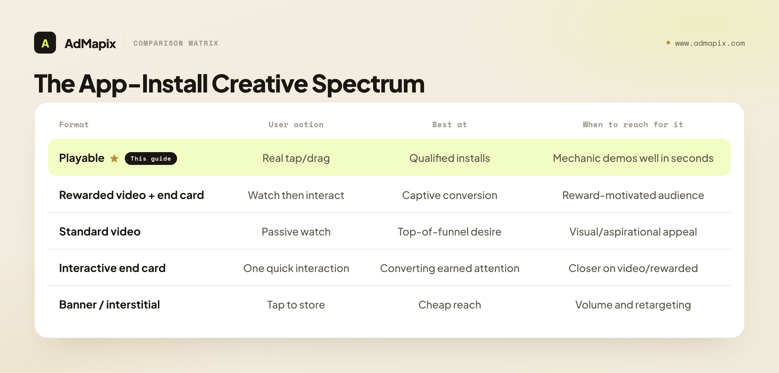
Playables don't exist in isolation — they're one point on a spectrum of app-install creative formats, and a canonical teardown places them in that context, because a UA team rarely runs playables alone. Understanding the whole spectrum tells you which format to reach for at which moment, and lets you tear down a competitor's format mix rather than just individual assets.
| Format | User action | Best at | Main constraint | When to reach for it |
|---|---|---|---|---|
| Playable | Interactive (real tap/drag) | High-intent installs, qualified users | MRAID, single HTML, file-size cap | When the mechanic demos well in seconds |
| Rewarded video + end card | Watch then one interaction | High completion, captive conversion | Opt-in context, reward dynamic | When you have a captive, reward-motivated audience |
| Standard video | Passive watch | Reach, top-of-funnel desire | Attention competition, fast skip | When the appeal is visual/aspirational, not tactile |
| Interactive end card (standalone) | One quick interaction | Converting earned attention | Depends on a lead-in format | As the closer on video or rewarded |
| Banner / interstitial | Tap to store | Cheap reach, retargeting | Low engagement, banner blindness | Volume and retargeting, not discovery |
The strategic read from the spectrum: format is a funnel decision, not a preference. Standard video creates desire at the top; playables and rewarded end cards convert intent near the bottom; banners and interstitials handle cheap reach and retargeting. A competitor running heavy playables is investing in install quality and qualified users; one running mostly banners is buying volume. When you tear down a rival's creative, log the format mix, because the mix encodes their UA strategy — whether they're optimizing for cheap installs or for users who stick.
The End Card: Where the Install Actually Happens
The end card deserves its own section because it's where the conversion happens and where the most value leaks, across every format above. You can ship a brilliant playable or a perfect rewarded video, and a weak end card will quietly waste the engagement you earned. Studying the playable while ignoring the end card is the most common analysis blind spot in the entire format.
A strong end card does three things. First, it continues the loop — the gameplay or the satisfying interaction flows into the CTA rather than hard-cutting to a generic store button, so the install ask arrives while engagement is still high. Second, it states a clear, single ask — one button, one obvious next step, no competing elements. Third, it delivers the promised payoff — if the playable teased a near-win or a reward, the end card pays it off or credibly promises it in-app, closing the loop the hook opened.
The failure modes are equally consistent and worth tagging: the hard cut (engagement-killing jump from play to a static store screen), the cluttered card (multiple buttons and messages diluting the single ask), and the broken promise (an end card that doesn't deliver on what the playable set up, which feels like a bait-and-switch and depresses both install rate and retention). When your teardown finds a strong demo with a weak end card, you've found a clean, testable opportunity: keep the demo, rebuild the card to continue the loop, and you often recover conversion without touching the hook at all.
Format Constraints That Shape Playables
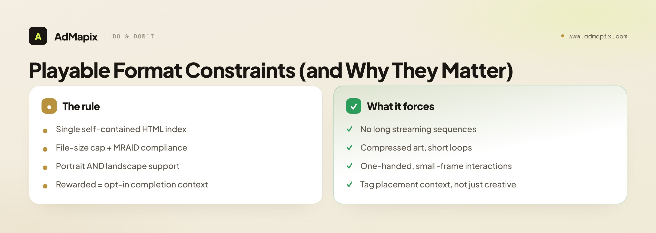
Every playable example you study was built inside platform rules, and those rules explain why creatives look the way they do. Knowing the constraints keeps your teardown grounded and your test backlog buildable.
- Single HTML index file. Unity's playable asset specifications require a self-contained playable, which is why these ads bundle assets and stay small rather than streaming. This is why playables can't show long, asset-heavy sequences — everything must fit in one lightweight file.
- File-size limits and MRAID compliance. Size caps push teams toward compressed sprites and short loops; MRAID is the standard that lets the ad talk to the host app and fire the store CTA. When you see a playable using simple, repeated art, the file-size cap is usually why.
- Orientation support. A playable usually has to handle both portrait and landscape, which is why interactions are designed to work one-handed in a small frame. Mechanics that need two hands or precise gestures rarely survive the orientation requirement.
- Rewarded context. When a playable runs as a rewarded ad, the user opted in to earn an in-app item, so the hook competes less for attention and more for completion. The same creative behaves differently in a rewarded slot versus an interstitial, which is why you should always tag the placement context alongside the creative.
These constraints aren't trivia — they're the reason your test backlog has to be buildable within the rules. A brilliant playable concept that needs ten megabytes or a two-handed gesture is a concept you can't ship, so grounding your teardowns in the specs keeps your briefs realistic.
How to Grade a Playable: The Signals You Can and Can't Read
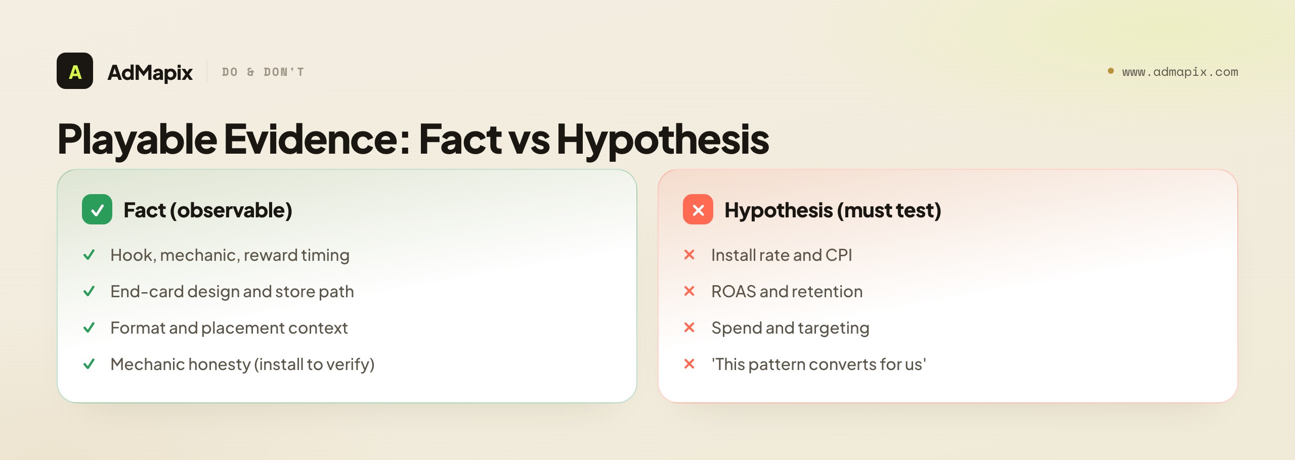
A playable is graded on engagement and qualified conversion, but the trap is assuming you can read those numbers from a competitor's asset. You can't — and being precise about what you can observe versus what you must test is what separates disciplined UA teams from screenshot hoarders.
What you can observe directly from the creative:
- Interaction-to-reward time — the loudest observable signal, measurable by simply playing the ad and timing the first payoff.
- Hook type, core mechanic, guidance quality, and end-card design — all readable from the asset.
- Format and placement context — playable vs. rewarded vs. interstitial.
- Mechanic honesty — whether the demo matches the real game, verifiable by installing it.
What you cannot read and must test on your own traffic:
- Install rate, CPI, ROAS, retention, spend, and targeting — all private, all living in the advertiser's dashboards.
The one weak public inference you can draw is persistence: a playable a studio has shipped variations of repeatedly is a stronger hypothesis than a one-off, because studios rarely keep iterating on losers. But persistence is a hint, not a verdict. The honest grading method is to read the observable structure to generate hypotheses, then run them on your own traffic to confirm them — because the only install rate and retention numbers you can trust are the ones your own campaigns produce.
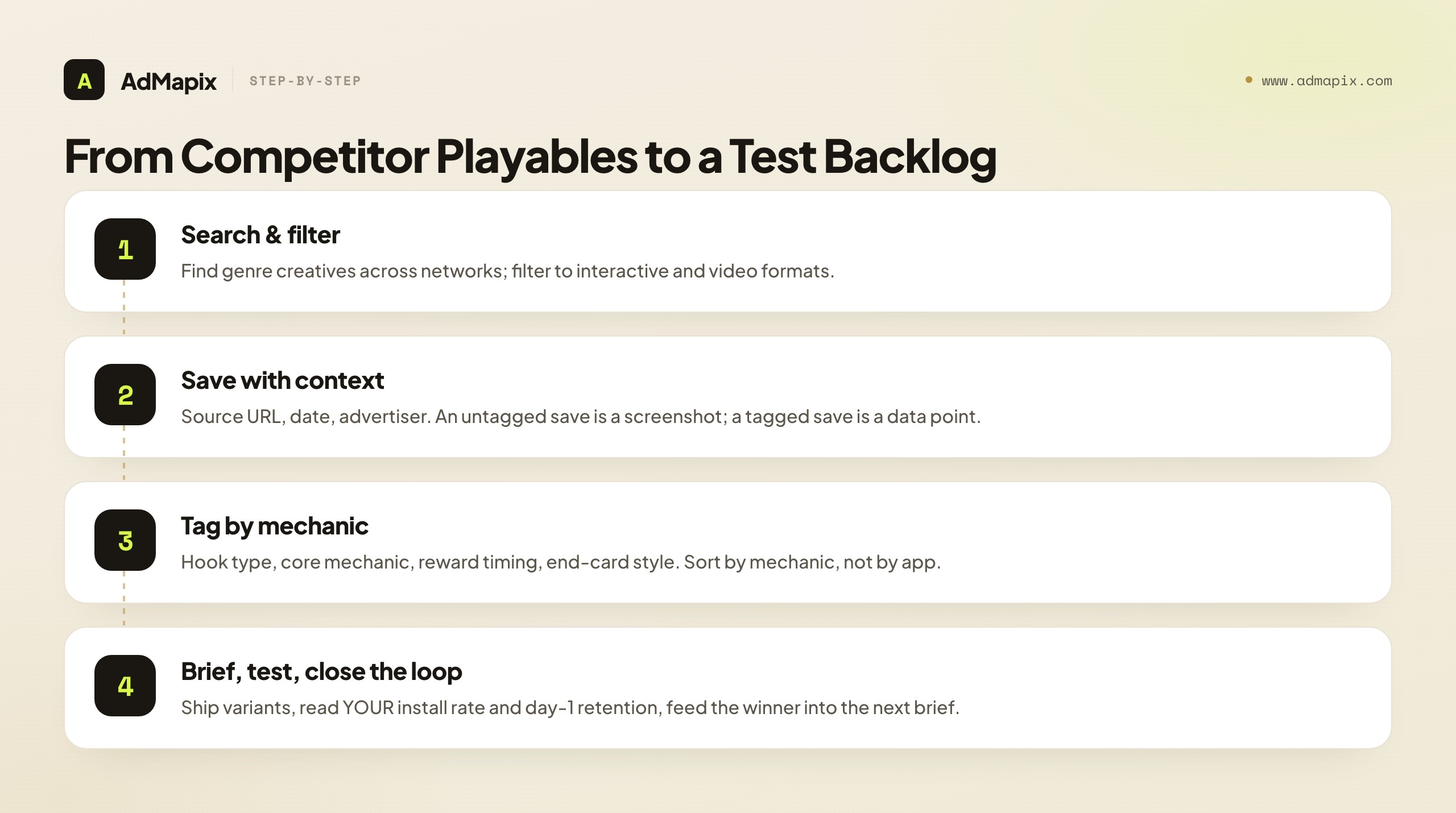
Example Workflow: From Competitor Playables to a Test Backlog
Scenario: a small UA team launching a merge game wants to know which playable patterns competitors ship before briefing their first three concepts.
Question: which hooks and mechanics repeat across merge and puzzle advertisers, and which look localized or studio-specific?
Approach: search for game ad creatives in the relevant genre, filter to interactive and video formats, save the strongest examples with the source URL and date, then tag each by hook type, mechanic, reward timing, and end-card style. The tagging is the work — an untagged save is a screenshot; a tagged save is a data point.
What the team gets: a tagged set they can sort by mechanic, a shortlist of repeated hooks worth testing, and a one-page report the creative lead can brief from — without claiming any competitor's private numbers.
Decision: brief two fail-then-retry concepts and one single-mechanic loop, and test moving the first reward earlier in each. Then — critically — close the loop: run the variants, read the team's own install rate and day-1 retention, and feed the winning pattern back into the next brief. The competitor research generated the hypotheses; the team's own data graded them.
A Worked Teardown: One Casual Merge Playable, End to End
Principles stick when you watch them applied, so here's how a single competitor playable reads when you run the full five-dimension framework. Say you're a merge-game studio and you find a rival's playable running widely across the casual networks. You're not going to copy it — you're going to score it and decide what to test.
Hook (first 2-3 seconds). The playable opens on a board with two identical fruit already touching and a glowing hand cue pointing at them — no text, no instruction screen. Within one second the user understands: drag these together. You tag the hook as near-win / clear-promise: the studio dropped the user one obvious move from a satisfying merge. Strong signal. Note for your own test backlog: the hand cue plus the pre-placed near-merge is doing all the onboarding work that an instruction wall would otherwise do badly.
Core interaction. The finger drags one tile onto another and they merge into a higher tier with a satisfying pop. You verify against the real game (you install it) and confirm this is the actual core loop — not a fake mechanic. You tag it faithful mechanic, which is the best retention signal in the framework, because the user who installs gets exactly what the playable promised.
Reward timing. The first merge pays off — pop, sparkle, a small currency drip — at roughly the two-second mark. You time it precisely by replaying. Sub-three-second first reward is a strong casual signal, and you note that the studio stacks a second reward (a level-clear flourish) around second five. The dopamine cadence is fast and deliberate.
Guidance. Every step has a hand cue, fail states are non-existent (you literally can't lose this demo), and the next move is always obvious. You tag guidance as high / forgiving. For a broad casual audience this is correct; for a mid-core game it might be too hand-holdy, which is a useful contrast to log.
End card. Here's the leak. After two merges the demo hard-cuts to a static store screen with the app icon and an install button — no continuation of the merge loop, no payoff of the momentum the demo built. You tag the end card weak / hard-cut. This is the single clearest opportunity in the whole teardown: the demo is excellent, the card wastes it.
The synthesis and the tests. You now have a complete, scored read and three testable hypotheses that fall straight out of it: (1) replicate the near-win-plus-hand-cue hook, since it onboards with zero text; (2) keep the faithful mechanic, because it's the retention-safe choice your fake-mechanic competitors aren't making; and (3) fix the end-card leak the rival left open — build an interactive end card that continues the merge into the CTA, capturing the conversion they're dropping. None of this required a single private number. You read structure, scored it, and produced three briefs — and the end-card insight alone, if it holds on your traffic, is a competitor's leak turned into your win.
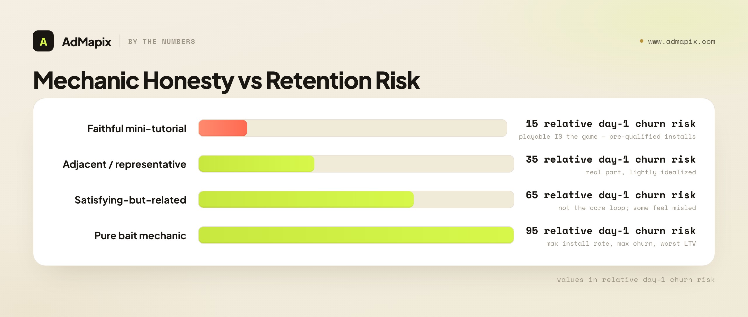
Mechanic Honesty vs. Retention: The Hidden Cost of a Fake Hook
The most important trade-off in playable design is invisible in the install-rate number and brutal in the retention number, so it deserves its own treatment. A playable can use a mechanic that exists in the real game (a faithful playable) or a mechanic that's more satisfying than the real game's actual loop (a fake or bait playable). The fake mechanic almost always wins more installs — and frequently loses most of them within a day.
The dynamic is simple and unforgiving. A pull-pin or pour-water playable attached to a merge game converts well at the install ask because the mechanic is inherently pleasing and universally legible. But the user installed expecting pin-pulling. When they open the game and find a merge loop, the expectation gap triggers immediate churn — they came for one thing and got another. The studio bought an install and lost a player, paying a CPI for a user who contributes nothing to LTV.
The honest ranking of mechanic types by retention risk:
- Faithful mini-tutorial — lowest retention risk. The playable is the game. Installs are pre-qualified; the user who installs already knows and likes the loop.
- Adjacent / representative — moderate risk. The playable shows a real part of the game, lightly idealized. Mostly honest, small expectation gap.
- Satisfying-but-related — elevated risk. The demo mechanic isn't the core loop but lives in the same game. Some users feel misled.
- Pure bait — highest risk. The demo mechanic doesn't meaningfully exist in the game. Maximum install rate, maximum day-1 churn, worst LTV.
The strategic point for your teardowns: when you tag a competitor's playable, always record mechanic honesty, and when you see a category flooded with bait playables, read it as a signal that the category is optimizing for install rate over retention — which is an opening, not a model to copy. A faithful playable that converts slightly worse but retains far better often wins the only metric that matters, blended LTV. The studios that quietly win casual UA are frequently the ones running honest playables while their competitors chase the vanity install rate of bait mechanics.
Interactive vs. Static End Cards: The Conversion You're Leaving on the Table
The end card decision — interactive or static — is one of the highest-leverage choices in the entire format, and the worked teardown above showed exactly why: a great demo with a static hard-cut card leaks the conversion it earned. Placing the two end-card approaches against the engagement they capture and the effort they cost makes the trade-off concrete.

A static end card is a screen — app icon, a line of copy, an install button — that appears when the playable or video ends. It's cheap to build, fast to ship, and almost always under-converts relative to the engagement the demo created, because it hard-cuts the user out of the experience at the exact moment their engagement peaked. The user goes from doing something satisfying to looking at a store button, and the momentum dies in that transition.
An interactive end card continues the loop: it gives the captive, engaged user one more quick, satisfying interaction that flows directly into the CTA, so the install ask arrives at the peak of engagement rather than after it. It costs more to build and is the thing most worth that cost, because it's where the conversion the demo earned actually gets captured. Unity positions Playworks specifically for building these interactive end cards alongside playables, a signal of how central they've become.
The decision framework, mapped to effort and payoff: low-effort static cards are acceptable only on cheap, high-volume, low-intent placements where the install is incidental; the moment you're investing in a real playable or rewarded video, a static card is false economy — you spent the budget to build engagement and then declined to capture it. The highest-payoff, most-neglected test in most UA accounts is "make the end card interactive," because it recovers conversion without touching the hook or the mechanic. When your teardown of a competitor finds a strong demo behind a static card, you've found their leak; when it finds an interactive card flowing into the CTA, you've found a studio that understands the format and is worth watching closely.
Playable A/B Testing and Iteration Cost
Reading competitor examples generates hypotheses; A/B testing on your own traffic is the only thing that grades them — and understanding the cost structure of playable iteration keeps your test backlog realistic. Playables are more expensive to produce and iterate than video or static, because each variant is a small software build, not a re-edit, so you can't test fifty variants the way you might with static creative.
That cost reality shapes how you should test. Because each playable variant carries real production cost, you isolate the highest-leverage variable and test it cleanly rather than spraying variants. The framework's five dimensions double as a priority order for what to test first:
- End card first. It's the cheapest meaningful change (you often keep the whole demo) and the most common leak. Static-to-interactive end-card tests have the best effort-to-impact ratio in the format.
- Reward timing second. Moving the first payoff earlier is usually a small build change with an outsized effect on completion and install rate.
- Hook third. A new hook (different near-win setup, different cue) is a moderate build and a high-impact test, but more expensive than the two above.
- Core mechanic last. Changing the demonstrated mechanic is effectively a new playable and the most expensive test — reserve it for when honesty or comprehension data says the mechanic itself is the problem.
The discipline mirrors the hook-testing rule from creative research generally: change one thing, hold the rest constant, and read the metric that localizes the result. Test an end card and you learn about end cards; rebuild the hook and the mechanic and the reward at once and you've spent a large production budget to learn nothing transferable. Given that playables cost more to iterate than any other format, that discipline isn't just good practice — it's budget protection. The teams that win playable UA are the ones that let competitor teardowns tell them what to test and their own A/B data tell them what works, in that order, one expensive variable at a time.
What Public Playable Evidence Can and Cannot Prove
A visible playable proves the creative existed and shows you its structure; it does not prove the creative performed. You can confidently observe the hook, the mechanic, the reward timing, the end-card design, and the store path. You cannot read spend, install rate, CPI, ROAS, retention, or targeting from the asset alone — those live in the advertiser's private dashboards.
So treat every observation as a hypothesis until your own test data confirms it. "This studio ships fail-then-retry playables" is a fact you can verify by collecting examples. "Fail-then-retry converts better for us" is a hypothesis you prove only by running it on your own traffic. The discipline of separating the fact (the creative) from the hypothesis (its performance) is what keeps competitive research honest and keeps you from copying a competitor's expensive mistake on the assumption that visible equals profitable.
Common Playable Ad Mistakes
- Confusing visibility with performance proof. A playable you can see is a clue about creative direction, not evidence of spend, ROAS, or retention.
- Saving assets without context. A file with no source URL, date, format, and reason-for-saving is almost impossible to reuse three weeks later.
- Mixing formats under one tag. Video, interstitial, rewarded, and playable examples teach different lessons and need separate tags.
- Copying the art before reading the mechanic. First identify the hook, interaction, reward timing, and end card; only then decide what's worth testing.
- Studying the playable but ignoring the end card. The end card is where the install ask happens — a strong demo with a weak CTA leaks the conversion.
- Chasing install rate while ignoring the retention bill. A fake-mechanic playable can win installs and lose them all to day-1 churn; grade for qualified installs, not raw volume.
- Organizing by app instead of by mechanic. Mechanics transfer across genres; apps don't. A library sorted by app hides the patterns worth testing.
Building a Searchable Playable Library
A folder of saved playable videos is where good examples go to die. The asset that compounds is a searchable, mechanic-tagged library where every entry is already scored on the five dimensions, so it can become a brief in minutes rather than being re-discovered weeks later. For playables specifically, the tagging schema matters more than for any other format, because playables vary on more axes — and the right tags are what let you sort by the thing that transfers.
Every entry should capture, at minimum:
- Source, date, advertiser, and store link. Without these, a saved playable is unverifiable and useless for a client report — and the store link lets you install to check mechanic honesty.
- Mechanic tag. The core interaction (merge, sort, pull-pin, aim, build, decorate). This is the primary sort key, because mechanics transfer across genres and apps don't.
- Hook type. Fail-bait, near-win, satisfying motion, or clear-promise — the tag that lets you find every example of a hook you want to test.
- Reward-timing note. Time to first payoff, measured by replaying. The loudest observable signal, worth recording as a number.
- End-card tag. Interactive vs. static, and continues-loop vs. hard-cut. The field that surfaces conversion-leak opportunities.
- Mechanic-honesty rating. Faithful → adjacent → satisfying-but-related → pure bait. The field that protects you from copying a competitor's retention problem.
- Status. Untested → briefed → tested → result, so the library is a pipeline, not a museum.
The payoff of this structure is the same as for any creative library: once thirty or forty playables are tagged this way, you can answer questions no screenshot folder can — which mechanics the category over-uses, which hook types your own wins cluster around, which competitors run honest playables versus bait, and where the under-tested reward-timing gap sits. That meta-view is the strategic return on disciplined tagging, and it's invisible to anyone still scrubbing through a folder of saved video clips looking for inspiration the night before a brief is due.
Mid-Core and Non-Game App Playables
Most playable examples and most of this guide live in casual gaming, but playables have spread well beyond it, and a canonical teardown has to read the mid-core and non-game app cases too — because they invert several of the casual rules and reward a different kind of analysis. If you only study casual playables, you'll misjudge every example that isn't trying to win the broadest, most impatient audience.
Mid-core game playables serve a narrower, more committed audience — strategy, RPG, shooter, and 4X players who want depth and will tolerate, even reward, a more demanding demo. The casual rule of sub-three-second comprehension and a single repeated mechanic doesn't fully apply here. A mid-core playable can show a slightly more complex interaction, a hint of progression, or a taste of the strategic layer, because the audience it's qualifying is looking for exactly that. The risk inverts too: where a casual playable's danger is over-complexity, a mid-core playable's danger is over-simplification — a demo so dumbed-down that it under-sells the depth and attracts casual users who churn when they hit the real game's learning curve. When you tear down a mid-core playable, judge it against a different bar: does it qualify a committed player, or does it casual-wash a deep game and import the wrong audience?
Non-game app playables are the fastest-growing and least-understood category. Fintech, e-commerce, productivity, dating, and health apps increasingly use interactive demos to show a core flow before install — a budgeting app letting you categorize a transaction, a shopping app letting you swipe a product, a language app letting you complete one exchange. These follow playable logic (the user does something, then gets an install ask) but the "reward" isn't a game win — it's a moment of understood value, the instant the user grasps what the app does for them. The teardown shifts accordingly: instead of reward timing, you measure time-to-comprehension — how fast the demo communicates the app's core value — and instead of mechanic honesty, you check whether the demoed flow is the real onboarding flow or an idealized fiction the app can't deliver.
The strategic point for collection: tag every playable by category context (casual / mid-core / non-game app), because a pattern that wins in one is often wrong in another. A faithful, depth-showing demo that's right for a strategy game would over-qualify and starve a hyper-casual title; a sub-three-second value flash that's perfect for a fintech app would under-sell a mid-core RPG. Reading a playable without its category context is how teams import the wrong lessons from the wrong examples — and the fix is simply to never compare a casual merge demo against a mid-core strategy demo as if they were trying to do the same job.
When to Use AdMapix
AdMapix is a cross-network ad creative search tool, and it fits the part of this workflow that screenshots and bookmarks stop supporting: finding playable and video examples at scale and keeping them organized as evidence. Use Search AdMapix to discover examples across networks, Media to keep saved assets searchable, Video Analysis to break down motion, pacing, and interaction cues, and Reports to turn repeated patterns into a brief the creative team can act on. Pricing helps you compare the workflow for a solo marketer, an agency, or a UA team, and you can start from Login.
It's a good fit if you study creatives weekly, work across multiple games or clients, and need to hand patterns to a team. It is not the right tool if you only need a one-off look at a single advertiser, or if you expect it to reveal private spend, targeting, or revenue — no public ad research tool can do that. AdMapix sits in the cross-network creative-intelligence slot: it removes the manual collection so your time goes to the teardown and testing that actually move CPI and retention.
FAQ
What is a playable ad?
A playable ad is a short, interactive HTML demo that lets a user try a slice of a game inside an ad slot, then ends in a store install prompt. Unlike video, the user performs a real action — tapping, dragging, merging, or aiming — which is why playables are analyzed as mini product demos rather than as passive footage.
How do I analyze a playable ad example?
Score it on five observable dimensions: the hook in the first few seconds, the core interaction the user performs, how fast the first reward appears, how a new player is guided without a tutorial, and what the end card asks for. Tag each one consistently so you can compare examples and decide which variation to test next.
What makes a casual-game playable convert?
Casual playables win on sub-three-second comprehension (the audience won't read), instant and frequent rewards that mirror the game's dopamine cadence, forgiving difficulty, and a single repeated mechanic with no cognitive load. Watch out for the "satisfying but fake" mechanic — a pull-pin or pour-water demo attached to a merge game converts installs but risks heavy day-1 churn when the real game disappoints.
How do rewarded video and interactive end cards differ from playables?
A rewarded ad runs when the user opts in to watch in exchange for an in-app reward, so the creative competes for completion and conversion rather than initial attention. The strongest rewarded structure is a short video that builds desire followed by an interactive end card — a miniature playable — that converts the captive user. The end card is where most of the conversion happens, and a hard cut to a generic store button is the format's most common leak.
Can an ad research tool show a playable's install rate or spend?
No. Public ad research shows the visible creative, its format, and its store path. It cannot reveal install rate, CPI, ROAS, retention, spend, or targeting — those live in the advertiser's private dashboards. Treat every creative observation as a hypothesis until your own test data confirms it.
Why do so many playables use a fail-then-retry hook?
A deliberate, easy-to-recover failure creates tension and gives the user a reason to keep playing, which raises the chance they reach the end-card install ask. It's a pattern, not a guarantee — whether it works for your game depends on your traffic and your actual gameplay, so it belongs in your test backlog, not your assumptions.
What's the difference between an app-install video and a playable?
A video is passive — the user watches and the format is best at creating top-of-funnel desire for visual or aspirational appeal. A playable is interactive — the user performs a real action, and the format is best at converting intent into qualified installs when the mechanic demos well in seconds. Most UA teams run both: video to create desire, playables and interactive end cards to convert it.
What should I save from each playable example?
Save the source URL, the date, the app or advertiser, the format, the hook type, the core mechanic, the reward timing, the end-card style, and a one-line note on why you saved it. Organize by mechanic rather than by app, because mechanics transfer across genres and that context is what makes an example reusable in a brief or report weeks later.
Do playable ads have to follow specific technical specs?
Yes. Playables are typically built as a single self-contained HTML file under a file-size cap, must be MRAID-compliant so the ad can talk to the host app and fire the store CTA, and usually support both portrait and landscape. These constraints explain why playables use compressed art and short, one-handed interaction loops — and why a concept that needs heavy assets or two-handed gestures isn't shippable.
How do I grade a playable if I can't see the competitor's numbers?
Read the observable structure — interaction-to-reward time, hook type, mechanic honesty, guidance, and end-card design — to generate hypotheses, and use persistence (a studio shipping repeated variations) as a weak profitability hint. Then confirm on your own traffic: install rate, CPI, and day-1 retention from your own campaigns are the only performance numbers you can trust.
Related Reading
- Playable Ads Guide: Formats, Specs, and Best Practices — the production-side companion to this teardown library.
- Ad Hook Examples in 2026: 7 First-3-Second Patterns — the broader hook framework that playable hooks are a specialized case of.
- In-Game Advertising: Formats and Strategy — where playables and rewarded video sit in the wider in-game ad landscape.
- Mobile Game Ads Guide — the full creative and channel picture for mobile game UA.
- Paid User Acquisition: A 2026 Playbook — the UA strategy these install creatives serve.
- App Store Creative Optimization — converting the install the playable earned, on the store page.
Sources
- Unity playable asset specifications — Unity describes playable ads as a quick interactive demo and documents requirements such as a single HTML index file, file-size limits, MRAID compliance, and orientation support.
- Unity Playworks — Unity Playworks is positioned for creating, customizing, testing, publishing, and analyzing playable ads and interactive end cards.
- Google Developers: rewarded ads — Google describes rewarded ads as letting users earn in-app items by interacting with video ads, playable ads, and surveys.
- Google AdMob ad units, formats, and types — AdMob documents ad units, formats, and ad types, including banner, interstitial, rewarded, native advanced, app open, video, rich media, and interactive ads.
Sources checked as of June 21, 2026. Platform docs and ad product pages change, so re-check the source URL before using these details in a client report or quarterly plan. AdMapix surfaces public ad creatives across networks; it does not expose advertiser spend, install rate, targeting, or revenue, which remain private.
See what competitors are really running
Search 6M+ ad creatives, landing pages, and weekly spend across 200+ countries. No credit card, no commitment.
Related Articles
Ad Hook Examples in 2026: 7 First-3-Second Patterns (with UGC Breakdowns)
A complete 2026 library of ad hook examples organized into seven repeatable patterns — problem, proof, objection, comparison, curiosity, offer, and transformation — with UGC hook breakdowns, platform-by-platform differences for TikTok, Meta, and YouTube, an industry-by-industry hook map, a hook-testing workflow that ships variants, the metrics that actually grade a hook, and a worked teardown that turns a competitor opener into a running test.
Outbrain Ad Spy Tool in 2026: Native Ad Research for the Open Web
How to research Outbrain native ads from public evidence in 2026 — what a spy tool can and cannot prove, how to decode headline-and-thumbnail hooks, advertorial landing paths, retargeting trails, and how to turn patterns into testable native campaigns.
B2B Ad Creative Examples in 2026: Formats, Offers & Proof for LinkedIn and Google
A 2026 teardown library of B2B ad creative examples — how to read each one by buyer role, format, offer, and proof, with role-by-role breakdowns for CFOs, IT/security, RevOps and demand gen, an offer ladder mapped to funnel stage, a proof-type taxonomy, LinkedIn vs Google format comparisons, a worked competitor teardown, and a workflow that turns a folder of screenshots into a brief or test backlog.