App Store Creative Optimization in 2026: Icon, Screenshots, Video & A/B Testing Playbook
A complete 2026 app store creative optimization playbook — optimize your icon, screenshots, preview video, and custom product pages; A/B test the right way with Apple PPO and Google Play experiments; research competitor ASO creatives; and measure conversion lift across markets.
By the AdMapix Research Team — Updated June 21, 2026
App Store Creative Optimization in 2026: Icon, Screenshots, Video & A/B Testing Playbook
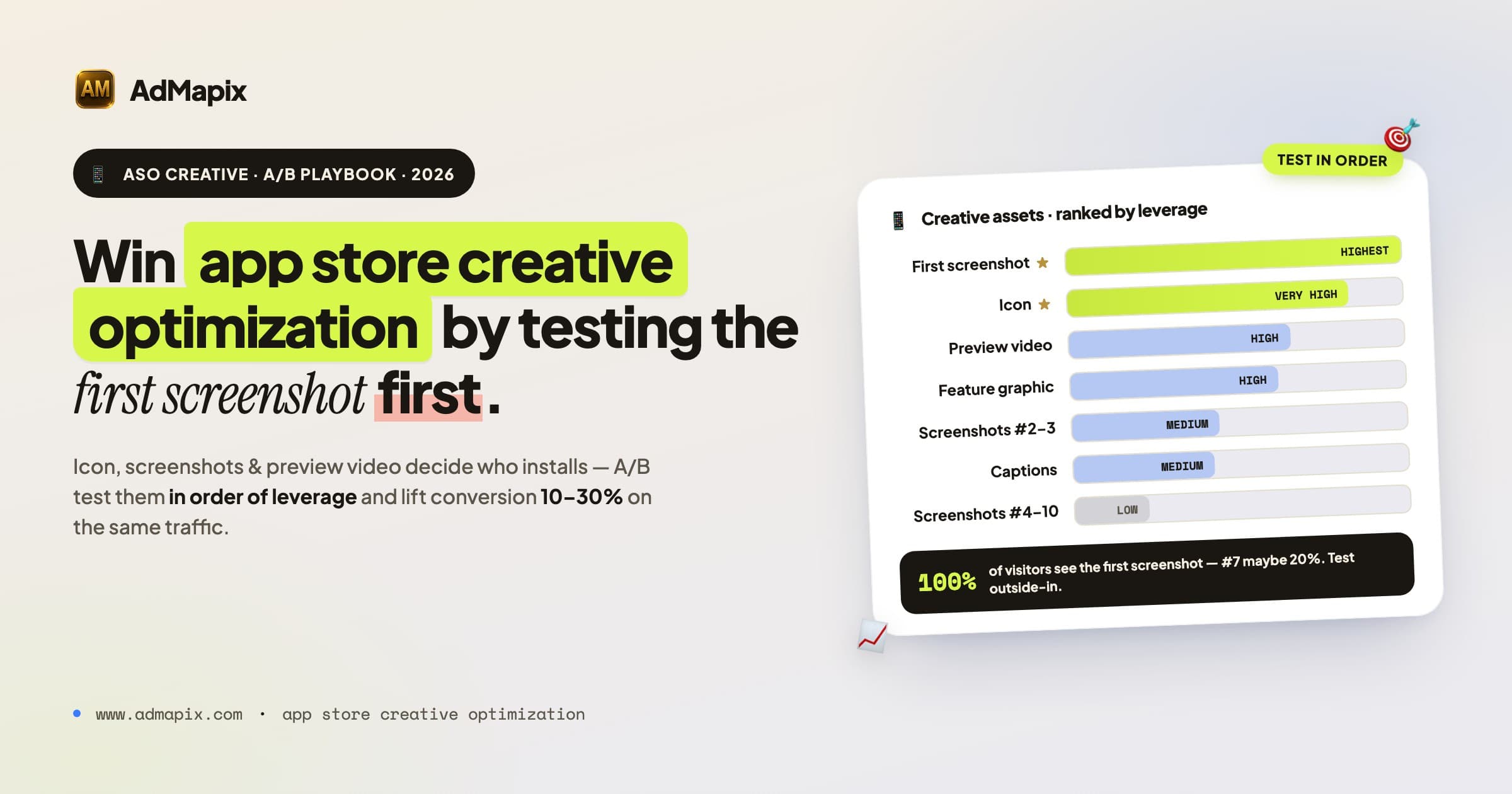
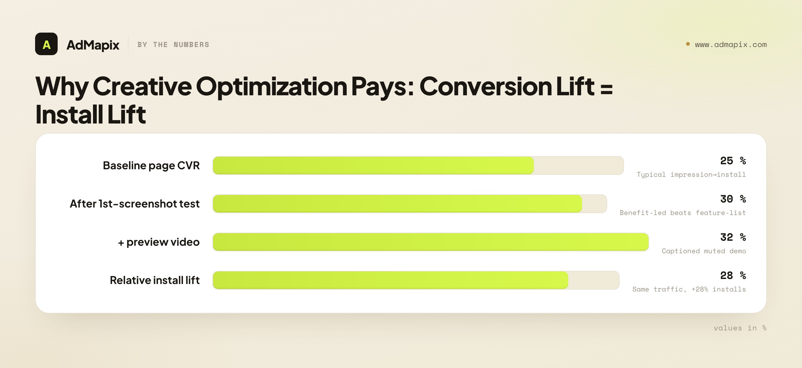
App store creative optimization is the systematic A/B testing and refinement of the visual assets on your App Store and Google Play product pages — icon, screenshots, preview video, and feature graphic — to lift the rate at which a page visitor becomes an install. Most ASO effort goes to keywords and titles, but those only get users to the page; what happens after they arrive is decided almost entirely by your creatives. A typical product page converts at 25–35% (impression → install), and disciplined creative optimization can shift that 10–30% relative — moving from 25% to 32% is a 28% increase in installs from the exact same traffic. This is the highest-ROI work most ASO teams aren't doing systematically. This playbook covers every creative element, the right way to A/B test each, how to research competitor ASO creatives (including via ad-creative intelligence), and how to measure conversion lift across markets.
TL;DR — App Store Creative Optimization in One Screen
- Creatives, not keywords, decide conversion. Keywords drive impressions; the icon, first screenshot, and preview video decide whether those impressions become installs.
- The first screenshot is the single most important asset — 100% of visitors see it; screenshot #7 maybe 20%. Test it first and hardest.
- A/B test natively: Apple Product Page Optimization (PPO) and Google Play Store Listing Experiments. Run 1–2 weeks minimum for significance; change one thing at a time.
- Research competitors first. Document the top 10 apps' first-screenshot patterns, captions, video hooks, and localization before designing your own. Pair store-creative analysis with paid ad-creative intelligence to see the full angle a competitor is pushing.
- Optimize for muted autoplay. Preview videos play silently in search — caption everything, show value in the first 3 seconds, prefer portrait.
- Localize by market, not just language. A screenshot that converts in the US may flop in Japan or Germany even in the same language; if conversion varies 30%+ across same-language markets, your creatives aren't localized enough.
- Platforms differ. Google Play's feature graphic is a unique, high-visibility asset; Apple's screenshots must reflect real UI while Google Play allows marketing screenshots. Custom Product Pages (Apple) and custom store listings (Google) let you match creative to traffic source.
Why App Store Creatives Are Under-Optimized
Most ASO effort goes to keyword research and title optimization. That's important — but it only gets users to your product page. What happens after they arrive depends almost entirely on your screenshots, preview video, and icon.
The typical app store product page converts at 25–35% (impression → install). Creative optimization can shift that rate by 10–30% relative — moving from 25% to 32% conversion is a 28% increase in installs from the same traffic. That's the highest-ROI work most ASO teams aren't doing systematically.
Why is it neglected? Three reasons. First, creatives feel like a design problem, not a growth problem, so they get handed to whoever made the original assets and rarely revisited. Second, A/B testing creatives requires discipline — a real experiment, a stop condition, statistical patience — and many teams ship a redesign on gut feel instead. Third, the feedback loop is invisible without instrumentation: a better keyword shows up in rank trackers, but a better screenshot only shows up in a conversion rate most teams don't watch closely. Fix those three and creative optimization becomes the cheapest install growth you have.
This article covers: how to optimize each creative element, how to analyze competitor store creatives, what to A/B test in screenshots and videos, platform-specific differences (Apple App Store vs Google Play), and how to measure creative impact on conversion.
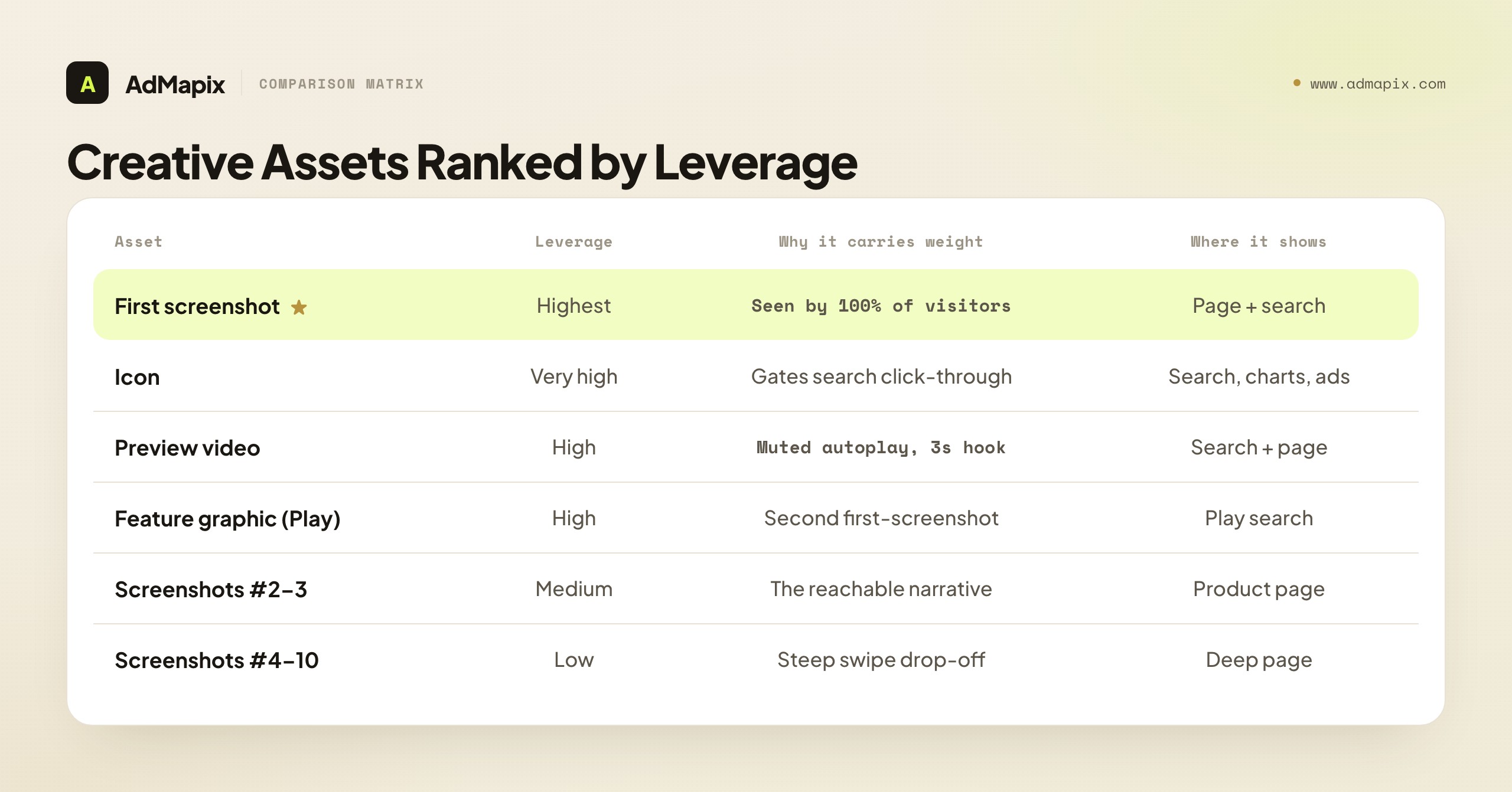
The Creative Assets That Drive Conversion (Ranked by Leverage)
Not every creative element carries equal weight. Spend your testing budget in order of leverage:
| Asset | Leverage | Why | Where it shows |
|---|---|---|---|
| First screenshot | Highest | Seen by 100% of page visitors; defines the page in 2 seconds | Product page + search results |
| Icon | Very high | Decides click-through from search before the page even opens | Search results, charts, ads |
| Preview video | High | Muted autoplay in search; first 3s hooks or loses | Search results + product page |
| Feature graphic (Google Play) | High | Prominent in Play search; functionally a second first-screenshot | Google Play search results |
| Screenshots #2–#3 | Medium | The narrative most swipers actually reach | Product page |
| Caption strategy | Medium | Carries value when screenshots render as small thumbnails | Search thumbnails + page |
| Screenshots #4–#10 | Low | Steep drop-off; few visitors swipe this far | Product page (deep) |
| Color / contrast | Low (cumulative) | Differentiation in a crowded results row | Everywhere, additively |
The pattern is clear: the assets that appear in search results (icon, first screenshot, feature graphic, video first-frame) carry far more leverage than the deep screenshots, because they work on every impression, not just the minority who scroll. Optimize outside-in: win the search-results row first, then the product page, then the deep scroll.
Optimize the Icon First (It's in Every Surface)
The icon is the most-seen and most-neglected creative asset. It appears in search results, top charts, your Apple Search Ads and Google App Campaign creatives, and the home screen after install. A weak icon caps your click-through before the product page ever loads.
What to optimize:
- Legibility at small sizes. The icon renders as small as ~58px in search. If it's unreadable at thumbnail size, it fails. Test it shrunk before you test anything else.
- Category contrast. Pull up the top 20 results for your main keyword. If your icon blends into a sea of the same blue gradient, a contrasting color or shape is differentiation you can win on.
- Symbol vs wordmark. Most high-converting app icons use a single bold symbol, not text — text is unreadable at small sizes and wastes the limited canvas.
- Consistency with screenshots. The icon and first screenshot are seen together in search; if their color worlds clash, the row looks unprofessional.
You can A/B test icons through Apple PPO and Google Play experiments. An icon test is high-leverage precisely because the icon gates everything downstream — a 10% icon click-through lift compounds with whatever conversion lift your page already has. Test the icon early, then leave it stable (frequent icon changes confuse returning users and erode brand recognition).
Analyze Competitor Store Creatives First
Before designing or testing your own creatives, analyze what the top 10 apps in your category are doing. This is the ASO equivalent of ad-creative competitive analysis — and the two are complementary: store creatives show you what converts on the product page, while a competitor's ad creatives reveal the angles and hooks they're spending money to push.
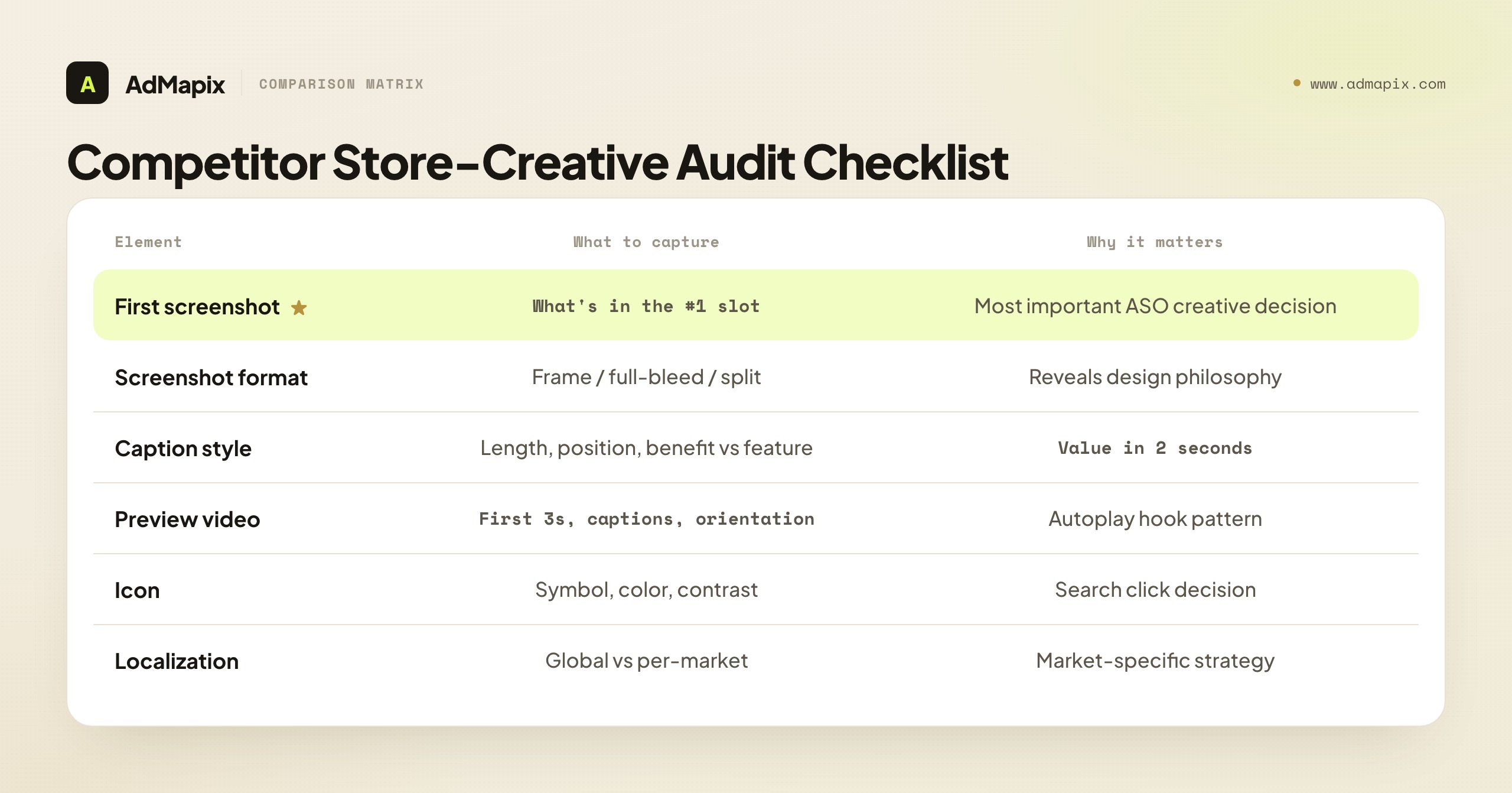
What to document for each competitor:
| Element | What to capture | Why it matters |
|---|---|---|
| Screenshot count | How many screenshots posted | Apple allows 10, Google Play 8. Using all slots signals investment |
| Screenshot format | Device frame vs full-bleed vs split-screen | Reveals design philosophy |
| First screenshot | What's in the #1 slot (most seen) | The most important creative decision in ASO |
| Text overlay | Caption style, length, positioning | How they communicate value in 2 seconds |
| Feature ordering | Which features appear in which screenshot position | Reveals what they think matters most |
| Preview video | Length, first 3 seconds, captions, portrait/landscape | Video autoplay behavior varies by platform |
| Icon | Symbol, color, contrast vs category | The search-results click decision |
| Color palette | Dominant colors, contrast, brand consistency | Visual differentiation in search results |
| Localization | Same creatives across locales or localized per market | Reveals market-specific strategy |
Patterns to look for:
- What's the dominant first-screenshot pattern in your category? (Feature showcase, social proof, lifestyle imagery, or value proposition?)
- Are competitors using the same screenshots globally or localizing per market?
- Is anyone using video? If yes, what's the first-3-second hook pattern?
- Is the category visually homogenized? If all top apps use the same screenshot template, differentiation is an opportunity, not a risk.
Connect Store Creatives to Ad Creatives
The store page is only half a competitor's creative strategy. The other half is what they run as paid ads to drive traffic to that page — and the angle in the ad usually previews the angle in the screenshots (or reveals a mismatch you can exploit). Pulling a competitor's app-install ads from ad libraries and creative-intelligence tools tells you which hooks they're paying to test, which often predicts what their next screenshot refresh will emphasize. This is where ad-creative intelligence feeds ASO: our competitor ad analysis framework lays out the 5-dimension system for reading those ad creatives, and spy on ads across all platforms maps where to find app-install ads across networks. A competitor running a heavy "save time" hook in ads but a feature-list first screenshot has an ad-to-store mismatch — and a tighter, coherent page is exactly how you out-convert them.
A Repeatable Competitor ASO Research SOP
Make competitor creative research a routine, not a one-off audit. A repeatable monthly pass takes about an hour and consistently surfaces test hypotheses:
- Fix your competitor set. Pick the same 8–10 apps — the top charts for your main keyword plus 2–3 fast risers. Risers matter because they're often the ones actively testing new creative.
- Capture the store creatives. For each app, screenshot the icon, first three screenshots, and note whether a preview video exists and its first-3-second hook. Log it in a shared sheet with the date so you can spot changes month over month.
- Capture the ad creatives. Pull each competitor's app-install ads from ad libraries and creative-intelligence tools. Note the dominant hook, offer, and format — and whether it matches their store page.
- Tag the patterns. Across the set, identify the dominant first-screenshot archetype, the common caption style, who's using video, and who's localizing. Convergence is signal: where everyone clusters is the template you can break.
- Write hypotheses, not notes. Every pattern should become a test idea: "All five leaders use feature-showcase first screenshots; test a benefit-led first screenshot." A research pass that doesn't produce a test queue was just sightseeing.
- Re-run monthly and diff. The highest-value output is the change — a competitor's new first screenshot, a new video, a new market. A diff against last month's capture is where the actionable intelligence lives.
The discipline mirrors paid ad-creative research: a fixed set, a consistent capture, a diff over time, and a rule that every observation produces a testable hypothesis. The store-page side and the ad side reinforce each other — together they show you the whole creative angle a competitor is betting on.
Screenshot A/B Testing: What Actually Moves Conversion
Apple's Product Page Optimization (PPO) and Google Play's Store Listing Experiments support native A/B testing. Here's what to test, in priority order.
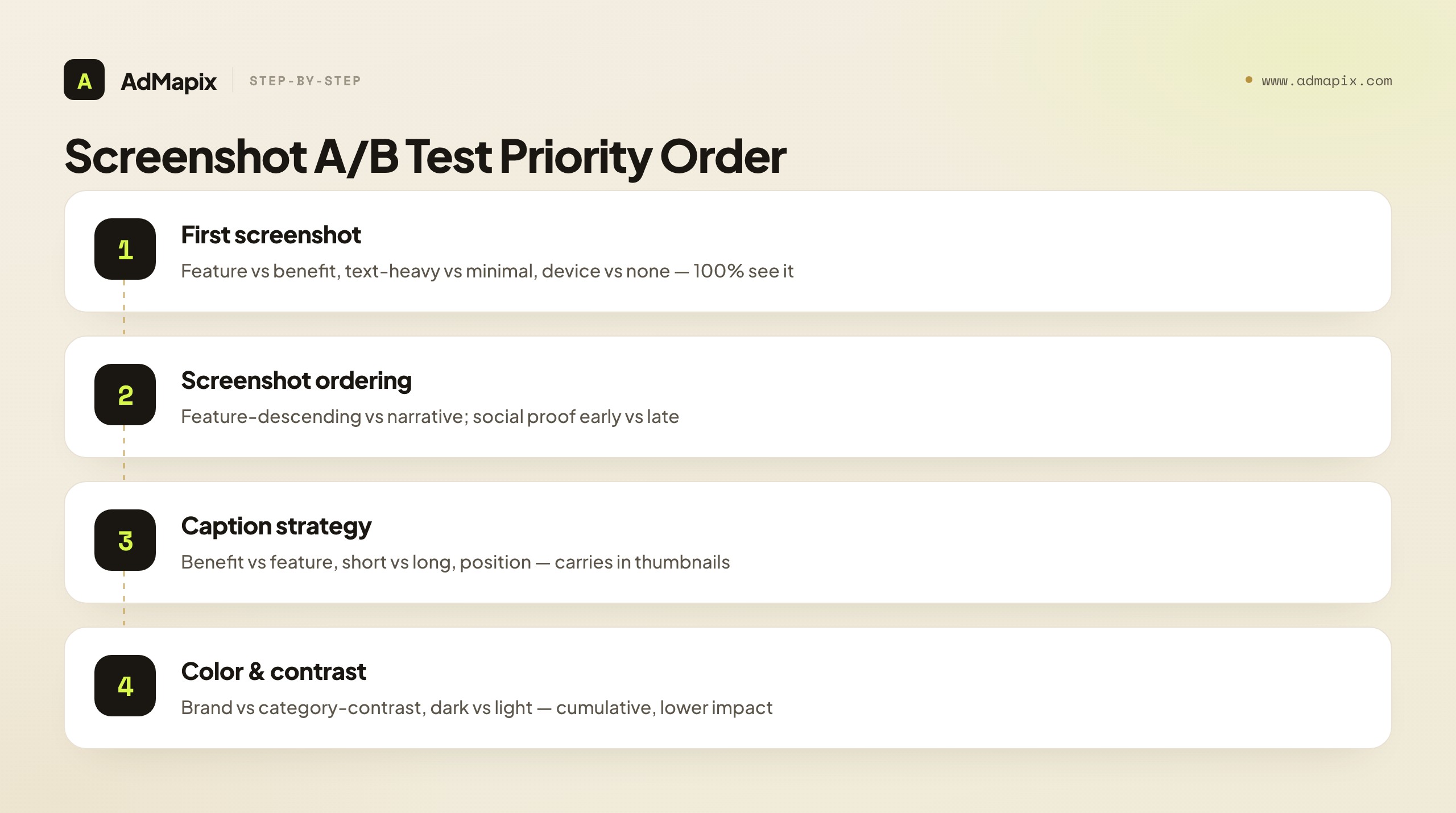
Priority 1 — First screenshot (highest impact):
- Test: Feature showcase vs lifestyle/emotional image
- Test: Text-heavy caption vs minimal text
- Test: Single device frame vs multiple devices vs no device
- Why first: Screenshot #1 is seen by 100% of page visitors. Screenshot #7 by maybe 20%.
Priority 2 — Screenshot ordering:
- Test: Feature-descending (most important first) vs narrative flow (story order)
- Test: Social proof early (screenshot #2) vs social proof late (screenshot #6)
- Why second: The drop-off curve is steep — users who swipe past screenshot #3 are rare.
Priority 3 — Caption strategy:
- Test: Benefit-led captions vs feature-led captions
- Test: Short captions (3–5 words) vs longer captions (8–12 words)
- Test: Caption position (top, middle, bottom of screenshot)
- Why third: Captions do heavy lifting when screenshots are viewed in search results as small thumbnails.
Priority 4 — Color and contrast:
- Test: Brand color dominant vs category-contrasting color
- Test: Dark mode vs light mode screenshots
- Why fourth: Lower impact individually but cumulative across all screenshots.
How to Run a Valid Screenshot A/B Test
A creative test that isn't statistically valid is worse than no test — it gives you false confidence. The rules that keep tests honest:
- Change one variable at a time. Test the first screenshot or the caption strategy, not both. If you change five things and conversion moves, you've learned nothing about which thing moved it.
- Run to significance, not to a calendar. 1–2 weeks is a minimum, not a target. Low-traffic apps may need longer; high-traffic apps reach significance faster. Let the tool's confidence level — not impatience — call the winner.
- Don't overlap with keyword changes. Never change screenshots and metadata in the same window. If both move, you can't attribute the conversion shift to either.
- Respect seasonality and traffic mix. A test run entirely during a holiday spike or a paid-traffic surge may not generalize. Compare like-for-like traffic.
- Watch the right metric. The test metric is product-page-visit → install, not raw installs (which also move with traffic volume). Most native tools report this correctly; confirm you're reading conversion rate, not count.
The discipline is unglamorous but decisive: one variable, enough traffic, clean attribution, the right metric. Teams that skip it ship redesigns that feel better and quietly convert worse.
First Screenshot Patterns That Convert
Because the first screenshot is the single highest-leverage asset, it's worth knowing the patterns that recur in high-converting product pages. Most winning first screenshots are a variation on one of these archetypes — pick the one that matches your category and your strongest differentiator, then test it against your current control.
| Pattern | What it shows | Best for | Risk |
|---|---|---|---|
| Benefit/outcome | The result the user gets ("Inbox at zero") | Productivity, health, finance | Vague if the benefit isn't concrete |
| Feature showcase | The standout feature in action | Utility, tools, gaming mechanics | Generic if every competitor does it |
| Social proof | Ratings, awards, user counts, press | Crowded categories, trust-sensitive apps | Weak proof underwhelms |
| Lifestyle/emotional | A person experiencing the value | Lifestyle, dating, wellness | Can feel like a stock-photo ad |
| Value proposition | A single bold headline claim | New categories needing explanation | Relies entirely on the copy landing |
| Gameplay/UI hero | A vivid screenshot of the actual app | Games, visually rich apps | Needs genuinely attractive UI |
The strategic move mirrors competitor research: if your whole category leads with feature-showcase first screenshots, a benefit-led or social-proof-led first screenshot is a differentiation opportunity — it stands out in the search-results row precisely because it breaks the category template. The worst outcome is a first screenshot that looks exactly like the five apps next to it; sameness is invisible. Identify the dominant pattern in your category from the competitor audit above, then deliberately test the strongest contrasting pattern.
One nuance for games versus apps: games usually win with a vivid gameplay or character hero shot in slot #1 (players buy the fantasy), while utility apps usually win with a benefit or feature-in-action shot (users buy the outcome). Don't borrow a game's lifestyle-hero playbook for a utility app, or vice versa — the buying psychology differs.
Preview Video Optimization
Both Apple and Google Play autoplay preview videos in search results, muted. The first 3 seconds are critical — they play before a user decides whether to keep watching or swipe on.
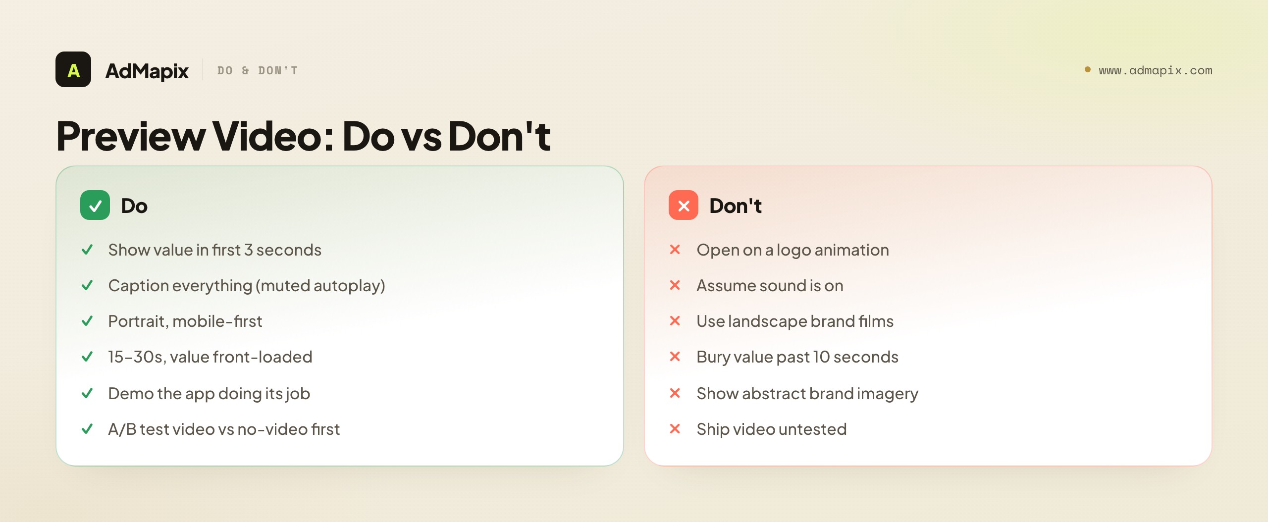
Video optimization checklist:
- First 3 seconds: Show the core value or the product in action, not a logo animation. Users swipe past logos instantly.
- Captions mandatory: Most preview video is watched without sound. Caption everything; assume zero audio.
- Length: 15–30 seconds. Apple auto-plays only the first ~30 seconds; Google Play previews are often shorter. Front-load the value.
- Portrait preferred: Both stores are mobile-first. Portrait video fills more screen real estate and feels native.
- Show, don't tell: Demonstrate the app doing its job. Abstract brand films convert worse than concrete demos for utility and game apps alike.
- A/B test in stages: Apple PPO supports video A/B testing. Test video vs no-video as a page variant first (video sometimes lowers conversion if it's weak), then test different videos against each other.
The single most common preview-video mistake is opening with a logo or a slow brand intro. By the time the brand animation finishes, the autoplay window is half gone and the user has already swiped. Open on motion and value; save the logo for the end card, if at all.
Custom Product Pages & Store Listings: Match Creative to Traffic
A 2026-essential layer most ASO guides still skip. Apple's Custom Product Pages (CPP) and Google Play's custom store listings let you serve different creative sets to different traffic sources — so the screenshots a TikTok-ad clicker sees can differ from what an organic searcher sees.
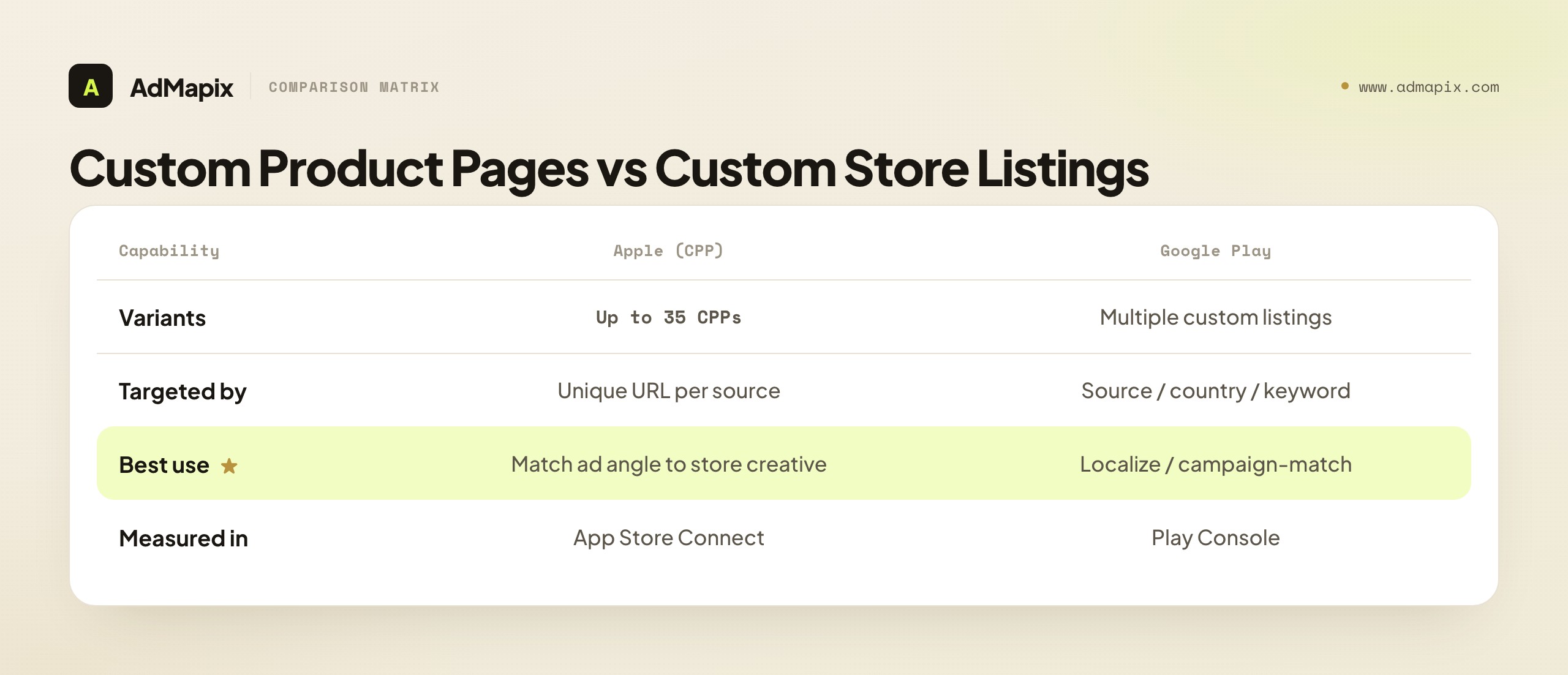
| Capability | Apple (CPP) | Google Play (custom listings) |
|---|---|---|
| Number of variants | Up to 35 custom product pages | Multiple custom store listings |
| Targeted by | Unique URL (per campaign/source) | Install source, country, or keyword |
| Best use | Match ad angle to store creative | Localize or campaign-match creative |
| Measured in | App Store Connect (per-CPP conversion) | Play Console |
Why this matters for creative optimization: message match drives conversion. If your TikTok ad hooks on "study with friends" but the default store page leads with a feature list, you leak conversions in the gap. A CPP whose first screenshot mirrors the ad's hook closes that gap. The high-leverage play: build one CPP per major ad angle, point each ad campaign at its matching CPP, and you'll routinely see double-digit conversion lift versus sending all traffic to a generic default page. This is also where ad-creative intelligence pays off twice — the competitor angles you discover inform both your ads and the CPP creative behind them.
A practical CPP workflow: start by listing your top 3–5 ad angles (the hooks your campaigns actually run — "save time," "study with friends," "track your spending"). For each, build a CPP whose first screenshot and caption restate that exact hook, keeping the rest of the page consistent so you isolate the message-match effect. Generate the CPP's unique URL in App Store Connect and point only the matching campaign at it. Then measure each CPP's conversion in App Store Connect against the default page as a control. The ones that beat the default tell you which message-match pairings work; the ones that don't reveal an angle whose ad promise the store page can't credibly deliver — which is itself useful intelligence about your positioning. Don't try to launch 35 CPPs at once; start with your highest-spend campaigns, prove the lift, then expand. CPPs are also a faster feedback loop than full PPO tests for message hypotheses, because you're matching to a known traffic source rather than waiting on blended organic traffic to reach significance.
Platform-Specific Differences
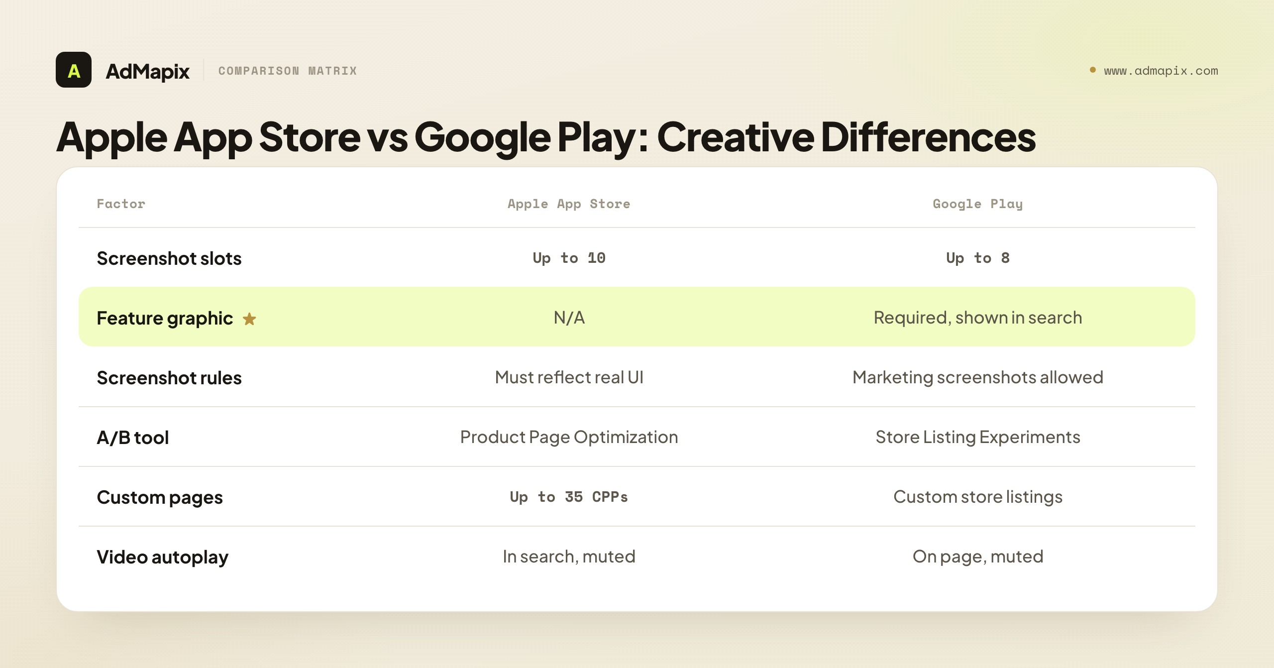
| Factor | Apple App Store | Google Play |
|---|---|---|
| Screenshot slots | Up to 10 | Up to 8 |
| Preview video | Auto-plays in search, muted | Auto-plays on product page, muted |
| A/B testing tool | Product Page Optimization (PPO) | Store Listing Experiments |
| Screenshot requirements | Must reflect actual app UI | More flexible — marketing screenshots allowed |
| Feature graphic | N/A | Required (1024×500), shown in search results |
| Custom pages | Custom Product Pages (up to 35) | Custom store listings |
| Localization | Per-locale product pages | Per-language store listings |
Key difference for creatives: Google Play's feature graphic is unique to the platform and appears prominently in search results. It's functionally equivalent to the App Store's first screenshot — optimize it with the same rigor, and never treat it as an afterthought banner. The second key difference: Apple requires screenshots to reflect real app UI, while Google Play permits more marketing-style screenshots. That means a Google Play set can lean more aspirational/benefit-led, while an Apple set must keep the real interface visible — plan two creative strategies, not one ported across both.
Localization: The Conversion Lever Teams Skip
Localizing creatives is one of the biggest under-exploited levers in ASO, because "localization" is often reduced to translating captions — when the real wins are cultural and visual.
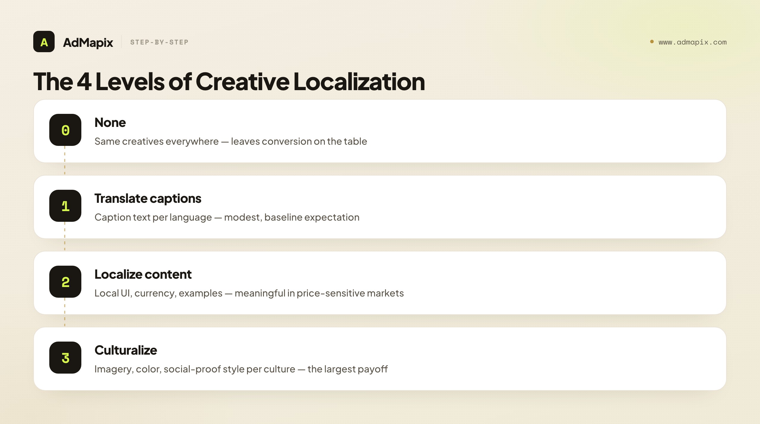
| Localization depth | What changes | Effort | Typical payoff |
|---|---|---|---|
| Level 0 — none | Same creatives everywhere | None | Leaves conversion on the table |
| Level 1 — translate captions | Caption text per language | Low | Modest; baseline expectation |
| Level 2 — localize content | Screenshots show local UI, currency, examples | Medium | Meaningful in price-sensitive markets |
| Level 3 — culturalize | Imagery, color, social-proof style per culture | High | Largest; matches local conversion norms |
Concrete examples of why translation alone isn't enough: Japanese store pages tend to convert better with denser, information-rich screenshots than the minimal Western style; some markets respond strongly to local social proof (local awards, local user counts) that a global screenshot set ignores; and currency/payment cues that look right in one region feel foreign in another. The diagnostic is simple: if conversion varies 30%+ between two markets that share a language, your creatives aren't localized deeply enough. Start culturalizing your highest-traffic non-home market first.
Measuring Creative Impact on Conversion
Creative A/B tests run for 1–2 weeks minimum to reach statistical significance. Track:
- Impression → product page visit rate (for search ads): how well your icon + first screenshot drive clicks
- Product page visit → install rate (conversion): how well your full creative set drives installs
- By-market conversion differences: if conversion varies 30%+ between markets with the same language, your creatives aren't localized enough
- By-source conversion (with CPP/custom listings): which ad angle → store-page pairing converts best
- Retention of installs by creative variant: a screenshot that overpromises can lift installs but tank retention — watch downstream, not just the install
The trap is optimizing the install number in isolation. A misleading first screenshot can win the A/B test on install rate and lose on day-7 retention, because it attracted the wrong users. The healthiest creative optimization watches the full funnel: click → install → activation → retention. A creative that lifts installs and holds retention is a real winner; one that lifts installs while retention slips is a warning, not a win.
A practical note on statistical significance, because it's where most creative tests go wrong. The traffic you need to call a winner depends on your baseline conversion rate and the size of the lift you're trying to detect — a big lift on a high-traffic app resolves in days, while a small lift on a low-traffic app may need weeks or may never reach significance at all. Two rules keep you honest: don't call a test until the platform's experiment tool reports a high confidence level (Apple PPO and Google Play both surface this), and be skeptical of tiny lifts on low volume, where noise easily masquerades as signal. If your app has thin traffic, prioritize bold, high-contrast tests (a completely different first-screenshot archetype) over subtle ones (a caption-position tweak) — bold changes produce larger effects that reach significance with less traffic. Subtle optimization is a luxury of high-traffic apps.
Where to Focus Your Testing First
With limited testing bandwidth, sequence your work by leverage and effort. Plot each potential test on two axes — how much it can move conversion versus how much effort it takes — and you get a clear priority map. The quick wins (high leverage, low effort) come first; the big bets (high leverage, high effort) get planned; the minor tweaks and low-ROI work wait or get cut.
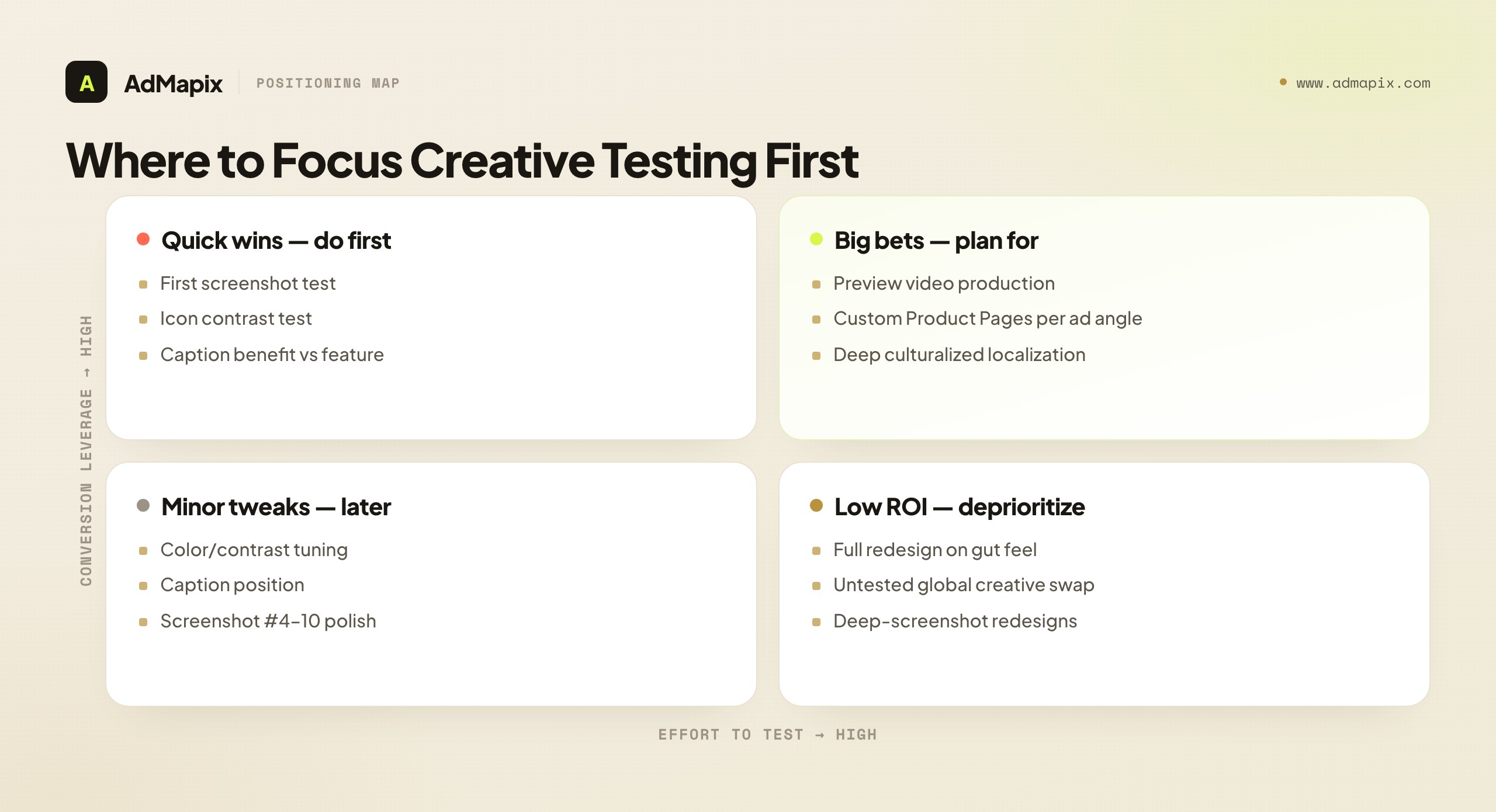
The single highest-priority test is almost always the first screenshot — maximum leverage, minimal effort — followed by an icon contrast test. Resist the temptation to start with a full redesign on gut feel: it's high effort, unvalidated, and the lowest-ROI move on the board. Validate small, compounding lifts instead.
Creative Strategy by App Category
The optimization mechanics in this guide apply everywhere, but the creative emphasis shifts by category, because what a user needs to see before installing is different for a game than for a subscription utility. Pointing your testing at the wrong asset for your category wastes cycles. Here's where the leverage actually sits by app type.
| App category | Highest-leverage creative | What the first screenshot must prove | Common mistake |
|---|---|---|---|
| Mobile games | Preview video + first 2 screenshots | The core loop and the "fun" in motion within 3 seconds | Showing menus/lore instead of gameplay |
| Casual / hyper-casual | Icon + first screenshot | The satisfying mechanic at a glance | Over-designed icons that don't read at thumbnail size |
| Subscription utilities | First screenshot + value framing | The single outcome the app delivers, not the feature list | Listing 8 features instead of one transformation |
| Social / dating | Screenshots + ratings prominence | Real people, real activity, social proof | Generic stock-style imagery that feels empty |
| Finance / fintech | First screenshot + trust signals | Security, clarity, "my money is safe here" | Cluttered dashboards that signal complexity, not control |
| Health / fitness | Preview video + before/after framing | A believable, specific result | Aspirational imagery with no proof of method |
| Productivity / SaaS | Screenshots showing the workflow | How it fits into the user's day, the "aha" | Feature dumps with no narrative |
The pattern: games and visual-result apps (fitness, photo) lean on the preview video, because motion proves the value in a way a still can't; utility and subscription apps lean on the first screenshot's value framing, because the decision is rational and a single clear outcome converts better than a feature list. Identify which side of that line your app sits on, and weight your testing accordingly — a fitness app that buries its transformation video and a finance app that crams its dashboard into screenshot one are both optimizing the wrong asset.
One cross-category rule holds: lead with the outcome, not the interface. Users don't install a screenshot of your UI — they install the result your UI delivers. Whether that result is "win the run," "hit your step goal," or "see all my subscriptions in one place," the first asset's job is to make that result obvious and believable in under three seconds.
Seasonal and Event-Driven Creative Refreshes
Beyond the steady refresh cadence covered earlier, certain moments justify a targeted creative update that the calendar, not your test backlog, dictates. These are high-intent windows where a relevant creative meaningfully lifts conversion — and a stale one quietly costs installs.
The moments worth a planned refresh:
- Major OS or app version launches. When you ship a marquee feature, the first screenshot should show it while the buzz and press traffic are highest. A redesign or headline capability deserves to be the first thing a curious visitor sees, not buried on screenshot five.
- Seasonal and cultural peaks. Fitness apps in January, shopping apps in Q4, travel apps before summer — demand spikes bring colder, less-familiar traffic that needs a sharper, more seasonally-relevant promise. A "New Year, new routine" framing converts January fitness traffic better than your evergreen set.
- Platform featuring. If Apple or Google features your app, the traffic surge is enormous and one-time. Make sure the creative the featured audience lands on is your strongest tested set, not whatever happened to be live. Featuring is the worst possible moment to run unvalidated creative.
- Competitive moments. When a major competitor launches, sunsets, or fumbles (a pricing backlash, an outage), branded and category search traffic shifts. A creative that speaks to the switching moment — clarity, reliability, the thing the competitor lacks — captures intent that's briefly in motion.
The discipline that separates a refresh from a gamble: A/B test the seasonal variant against your control whenever the platform allows, and keep a clean evergreen set to revert to when the moment passes. A seasonal creative that underperforms your control is still a loss, holiday or not. Plan these refreshes in your Week 4 cadence review so they're staged before the window opens — scrambling to ship January creative on January 2nd means you've already missed the most valuable week of cold traffic.
Common App Store Creative Mistakes
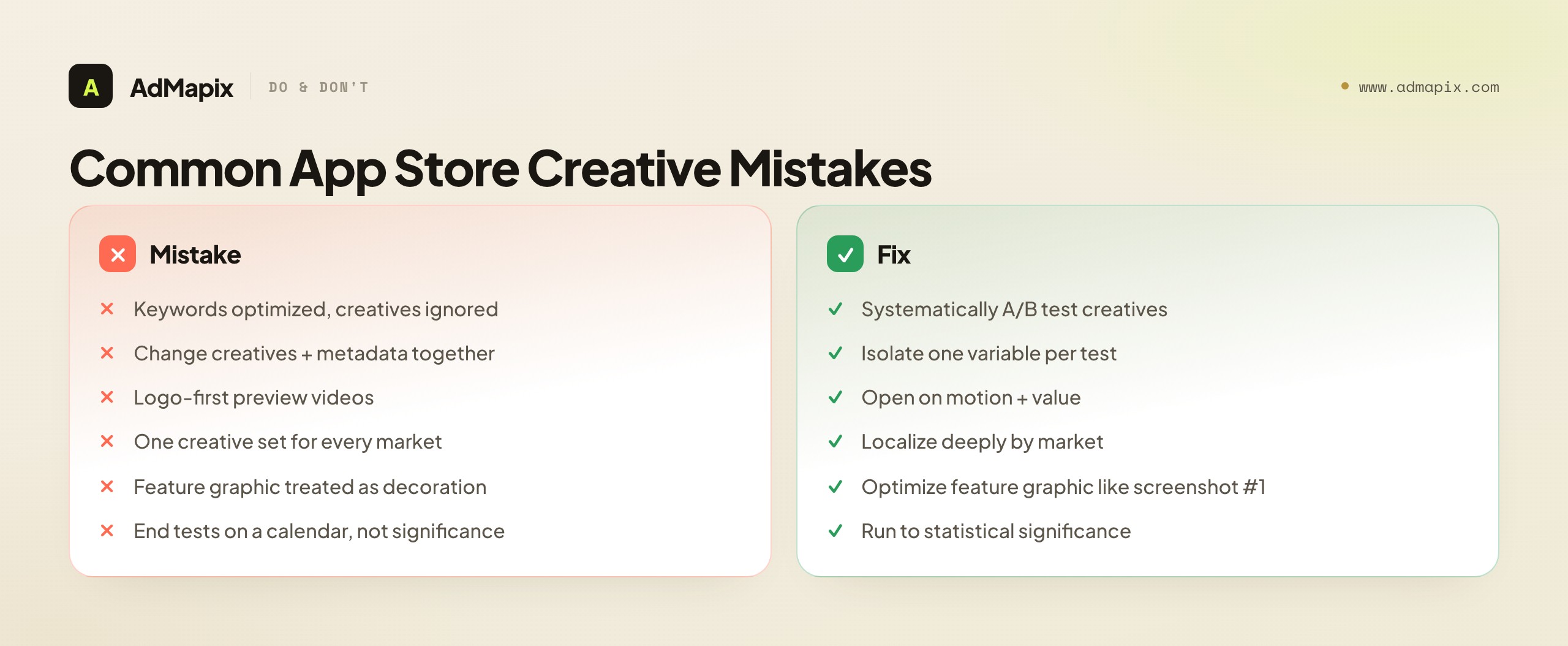
- Optimizing keywords, ignoring creatives. Keywords drive traffic; creatives drive conversion. Teams obsess over the former and never systematically test the latter — leaving the highest-ROI lever untouched.
- Changing creatives and metadata together. You can't attribute a conversion shift if you moved two variables at once. Isolate creative tests from keyword changes.
- Logo-first preview videos. The autoplay window is short and muted; opening on a brand animation wastes it. Open on motion and value.
- One creative set for every market. Same-language ≠ same-culture. Un-localized creatives leave double-digit conversion on the table in non-home markets.
- Treating the Google Play feature graphic as decoration. It's a high-visibility search asset equivalent to the first screenshot — optimize it with equal rigor.
- Ending tests on a calendar, not on significance. A test called early on a few days of holiday traffic gives false confidence. Run to statistical significance.
- Ignoring ad-to-store message match. Sending every ad campaign to a generic default page leaks conversion. Use Custom Product Pages to match the store creative to the ad angle.
- Winning installs while losing retention. An overpromising screenshot can win the A/B test and attract users who churn. Watch retention by variant, not just install rate.
App Store Creative Optimization Tools
You can run a real creative optimization program with the native tools alone, but a few categories of paid tools accelerate the work — especially competitor tracking and pre-launch testing. Match the tool to your bottleneck rather than buying a suite.
| Tool category | What it does | When it's worth it | Examples |
|---|---|---|---|
| Native A/B testing | Run on-store experiments inside the platform | Always — this is your ground truth | Apple PPO, Google Play Store Listing Experiments |
| Competitor creative tracking | History of competitors' screenshots, icons, video over time | You want to spot competitor refreshes early | Sensor Tower, AppFollow, data.ai |
| Pre-launch creative testing | Test creatives with panels before going live | High traffic cost; want to pre-validate | SplitMetrics, Storemaven |
| Ad-creative intelligence | What angles competitors push in app-install ads | Connecting ad hooks to store creative | AdMapix, ad libraries |
| Creative production | Generate screenshot/video variants at scale | Production is the bottleneck | Design tools + AI creative tools |
Two notes. First, native A/B testing is non-negotiable — third-party panel tests (SplitMetrics, Storemaven) are useful for pre-validation, but on-store experiments with real store traffic are the only true measure of conversion. Use panels to narrow candidates, then confirm winners on-store. Second, the competitor-tracking and ad-intelligence categories are where most teams are under-tooled — they test their own creatives diligently but never systematically watch what competitors run, missing the angle shifts that should seed their next tests.
Creative Refresh Cadence
How often you touch each asset matters as much as what you test. Over-refreshing erodes brand recognition; under-refreshing lets creative fatigue and competitor moves erode conversion. A workable default cadence:
| Asset | Test cadence | Full refresh | Notes |
|---|---|---|---|
| First screenshot | Monthly variant tests | As tests win | Highest-leverage; keep iterating |
| Icon | Quarterly at most | Rarely | Stability protects brand recognition |
| Screenshots #2–10 | Quarterly | With UI changes | Refresh when the app UI changes |
| Preview video | Quarterly | When hook fatigues | Re-test against no-video periodically |
| Feature graphic (Play) | Monthly variant tests | As tests win | Treat like a second first-screenshot |
| Localized sets | Per-market, as data warrants | When a market lags 30%+ | Prioritize highest-traffic markets |
The principle: test the high-leverage, search-visible assets often (first screenshot, feature graphic), and keep the brand-anchoring asset (icon) stable. Tie refreshes to triggers — a competitor's visible refresh, a UI change, a new ad campaign, or a market whose conversion is lagging — rather than refreshing on a fixed schedule for its own sake.
A Worked Example: Lifting Conversion 28% in Six Weeks
To ground the playbook, here's a composite example (anonymized from 2026 app-growth accounts) of systematic creative optimization on a productivity app.
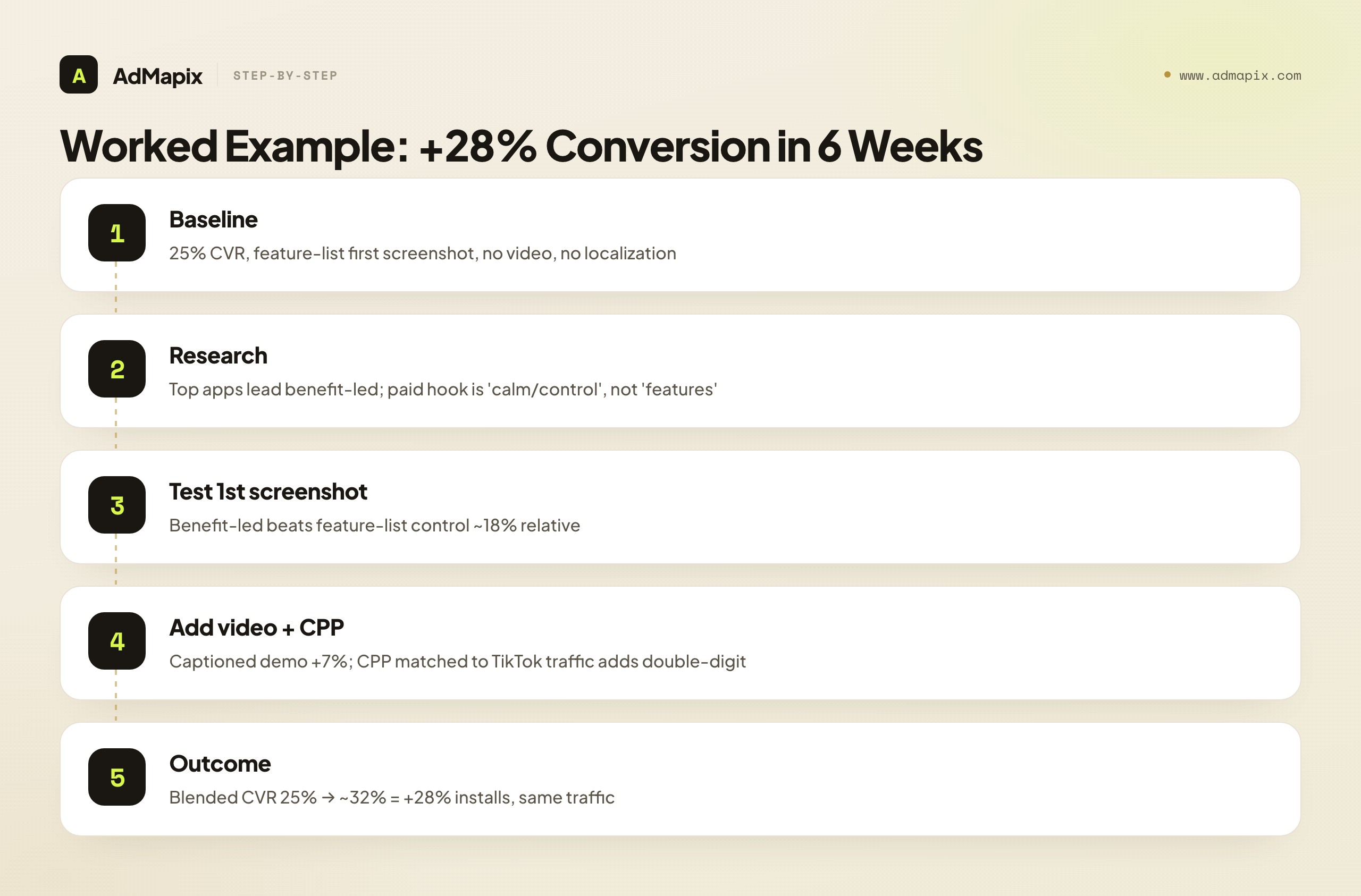
Baseline: Product page converting at 25% (page visit → install). First screenshot was a feature-list with a device frame; no preview video; same creatives in all markets.
Competitor research: Pulling the top 10 category apps showed a clear pattern — the highest-charting apps led with a benefit/outcome first screenshot ("Finally, an inbox at zero") rather than a feature list, and three used preview video. Pulling competitors' app-install ads showed the dominant paid hook was "calm/control," not "more features."
Hypotheses + tests (one variable each):
- First screenshot: benefit-led ("Your calmest workday starts here") vs the feature-list control.
- Preview video vs no video (a 15s muted demo opening on the app in use).
- A Custom Product Page matching the "calm/control" ad hook for paid TikTok traffic.
Results: The benefit-led first screenshot beat the control by ~18% relative on conversion. Adding the captioned demo video lifted a further ~7%. The CPP matched to paid traffic added double-digit lift on that source specifically. Net: blended conversion rose from 25% to ~32% — a 28% relative increase in installs from identical traffic, over six weeks of disciplined, one-variable-at-a-time testing.
The lesson isn't the specific creative — it's the method: research competitors (store + ads), form one-variable hypotheses, test to significance, match creative to traffic source, and watch the full funnel. The winning angle came from competitive intelligence; the win came from disciplined testing.
How AdMapix Fits App Store Creative Optimization
App store creative optimization lives on the store page, but the angles that win there are discovered in the ad auction. AdMapix sits in the competitor ad-creative intelligence layer — it doesn't manage your store listing or run your PPO tests, but it tells you which creative angles, hooks, and offers competitors are paying to push in their app-install ads across networks. That intelligence feeds two things directly: the hypotheses for your screenshot and video tests, and the creative for your Custom Product Pages matched to paid traffic.
In practice: research a competitor's app-install ads to see their dominant hooks, then test a first screenshot and CPP that either match a proven angle or deliberately attack an underserved one. Pair this with the keyword side of ASO — our app store keyword research and app SEO guides cover discovery, while paid user acquisition covers the campaigns your CPPs serve. For turning competitor ad evidence into briefs, see AdMapix reports and the competitor ad analysis framework. For generating screenshot and video variants once you have the angle, our AI ad creative tools guide covers the production side. Compare seats on pricing.
FAQ
What is app store creative optimization?
App store creative optimization is the systematic A/B testing and refinement of the visual assets on your App Store and Google Play product pages — icon, screenshots, preview video, and (on Google Play) feature graphic — to increase the rate at which page visitors install your app. It's distinct from keyword ASO, which drives impressions; creative optimization decides whether those impressions convert. Because traffic is already arriving, it's typically the highest-ROI, lowest-cost work in ASO.
How often should I update app store screenshots?
Test new first-screenshot variants roughly monthly, and do full screenshot refreshes quarterly or whenever your app's UI changes significantly. Don't change screenshots simultaneously with keyword or title changes — if both move, you won't know which drove the conversion shift. Keep the icon more stable than screenshots, since frequent icon changes erode brand recognition for returning users.
What's the most important app store creative to optimize?
The first screenshot, followed closely by the icon. The first screenshot is seen by 100% of product-page visitors and defines your page in about two seconds, while the icon decides click-through from search results before the page even opens. Both appear in the search-results row, so they carry far more leverage than deep screenshots (#5–#10) that most visitors never swipe to. Optimize outside-in: search-results assets first, then the product page, then the deep scroll.
How do I A/B test app store screenshots?
Use the native tools — Apple Product Page Optimization (PPO) for the App Store and Store Listing Experiments for Google Play. Change one variable at a time (first screenshot or caption, not both), run for at least 1–2 weeks to reach statistical significance, avoid overlapping with keyword changes, and read the product-page-visit-to-install conversion rate rather than raw install counts. Calling a test early on a few days of atypical traffic is the most common way to get a false result.
How do I analyze competitor app store creatives?
Manually review the top 10 apps in your category and document each one's first-screenshot pattern, caption style, video usage, icon, and localization depth. Tools like Sensor Tower or AppFollow help with historical creative tracking. Then add the ad side: pull competitors' app-install ads from ad libraries and creative-intelligence tools to see which hooks they're paying to push — those angles often preview their next store refresh and make sharp test hypotheses. Combine store-creative analysis with paid ad-creative intelligence for full competitive visibility.
Does an app preview video actually increase conversion?
In most categories, yes — a typical relative lift of 5–15% — but only if the video is good. A weak preview video (slow logo intro, no captions, unclear value) can decrease conversion. Both stores autoplay muted, so caption everything and show value in the first 3 seconds. Always A/B test video vs no-video as a page variant before committing, because video isn't a guaranteed win in every category.
Can I use the same screenshots for the Apple App Store and Google Play?
Technically yes, but it's not recommended. Google Play requires a feature graphic (which Apple doesn't have) and permits more marketing-style screenshots, while Apple requires screenshots to reflect the real app UI. The optimal creative strategy differs enough that you should plan two sets. At minimum, create a unique, well-optimized feature graphic for Google Play and don't simply port the Apple screenshots over.
What are Custom Product Pages and how do they help creative optimization?
Apple Custom Product Pages (up to 35) and Google Play custom store listings let you serve different creative sets to different traffic sources via unique URLs or targeting. Their value is message match: if your ad hooks on one benefit but the default store page leads with a feature list, you leak conversions in the gap. Building one custom page per major ad angle — with a first screenshot mirroring the ad's hook — routinely delivers double-digit conversion lift on that traffic versus a generic default page.
How do I localize app store creatives effectively?
Go beyond translating captions. The biggest wins come from localizing content (local UI, currency, examples) and culturalizing (imagery, color, and social-proof style that match local conversion norms — e.g., denser screenshots tend to convert better in Japan than the minimal Western style). The diagnostic: if conversion varies 30% or more between two markets sharing a language, your creatives aren't localized deeply enough. Start with your highest-traffic non-home market.
How long does it take to see results from creative optimization?
A single valid A/B test takes 1–2 weeks minimum to reach significance, longer for low-traffic apps. A meaningful conversion lift from a sequence of tests (first screenshot, then video, then localization or CPPs) typically takes several weeks to a couple of months of disciplined, one-variable-at-a-time experimentation. It's iterative by nature — the teams that win compound many small validated lifts rather than chasing one big redesign.
Which app store creative matters most for games vs utility apps?
For games and visual-result apps (fitness, photo, video), the preview video carries the most weight, because motion proves the "fun" or the result in a way a static screenshot can't — followed closely by a first screenshot that shows the core loop, not menus or lore. For subscription utilities and productivity apps, the first screenshot's value framing matters most: the install decision is rational, so a single clear outcome ("see all your subscriptions in one place") converts better than a feature list or a busy UI shot. Identify which side of that line your app sits on and weight your testing budget toward the asset that decides your category's install.
Should I make seasonal app store creatives?
Yes, for high-intent windows where relevance meaningfully lifts conversion — major version launches, seasonal demand peaks (fitness in January, shopping in Q4), platform featuring, and competitive moments. The rule is to A/B test the seasonal variant against your control whenever the platform allows, keep a clean evergreen set to revert to, and stage the refresh in advance so it's live before the window opens. A seasonal creative that loses to your control is still a loss, so treat it as a test, not a guaranteed win — and never run unvalidated creative during a platform-featuring surge, which is the worst possible moment for a guess.
Bottom Line
App store creatives are the highest-leverage, lowest-cost optimization in ASO. The traffic is already arriving — creatives determine whether it converts.
Optimize the icon and first screenshot first, since they work on every search impression. Analyze competitor store creatives and their paid ad angles before designing your own. A/B test one variable at a time, to statistical significance, isolated from keyword changes. Optimize preview videos for muted autoplay, match creative to traffic source with Custom Product Pages, and localize deeply by market rather than just translating captions. And always watch the full funnel — a creative that wins installs but loses retention isn't a winner.
The teams winning at ASO in 2026 aren't the ones with the best keywords. They're the ones with the best-tested creatives.
One closing reframe: treat creative optimization as a compounding program, not a project. A single first-screenshot test that lifts conversion 15% is good; a system that produces a validated lift every month — fed by competitor research, run through native A/B testing, matched to traffic with Custom Product Pages, and localized by market — is how a 25% baseline becomes a 35%+ one over a year. The keyword side gets you the impressions; the creative side decides what fraction of them become users. Build the creative-testing system, keep it fed with competitive intelligence, and it pays back every month from the same traffic you already have.
Sources
See what competitors are really running
Search 6M+ ad creatives, landing pages, and weekly spend across 200+ countries. No credit card, no commitment.
Related Articles

App Store Keyword Research: A Practical Workflow for ASO Teams
A practical app store keyword research workflow for ASO teams: find app store keywords, map intent, monitor rankings, and connect ASO with paid UA.
App SEO: How to Rank App Pages and Support ASO in 2026
App SEO guide for ranking app landing pages, supporting ASO, mapping app store keywords, and connecting SEO with paid user acquisition.
Paid User Acquisition: Strategy, Channels, and Creative Testing
A practical paid user acquisition guide for app teams: channel strategy, creative testing, budget guardrails, measurement, and competitor research workflows.