
Instagram Carousel Ads: Examples for Product Storytelling
Use eight separately captured creative references, clearly labelled hypothetical sequences, production worksheets, accessibility and proof checks, and measurement guidance to plan original Instagram carousel ads.
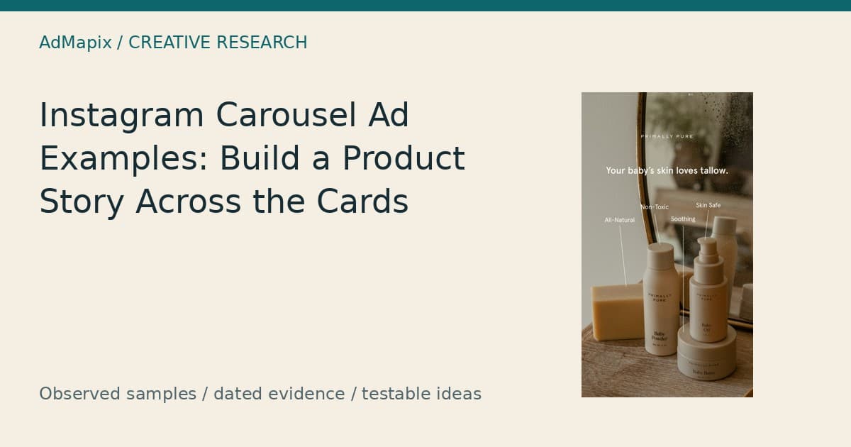
Instagram Carousel Ads: Examples for Product Storytelling
Editorial owner: Brad, AdMapix. Prepared with Codex (AI-assisted) and checked against the dated AdMapix source sample; editorial ownership does not imply personal review. AdMapix is our product. Last updated: September 17, 2026.
Instagram carousel ads help explain a product when each card answers a different buying question. Start with a recognisable proposition, add information that reduces uncertainty, and connect the action to a matching destination. This guide helps ecommerce marketers, creative strategists, agencies, and paid-social teams decide what each card should say, what evidence it needs, and how to test the resulting sequence. The reference material is a dated US skincare search containing eight selected source images. These are separate captured assets, not a verified carousel or confirmed Instagram placements. Their value is concrete: they reveal choices about product labels, educational questions, offers, texture, people, and shopping prompts that can inform original production. Before another creative batch goes live, use those choices to build a clearer brief and a measurable experiment.
Quick Answer
Instagram carousel ads work best as a sequence of useful answers: what the product is, why it matters, what supports the promise, and what to do next. Give each card a distinct job while keeping the product and proposition recognisable. The eight images below are independent references; all proposed sequences are hypothetical. AdMapix supplies the dated research sample, while your product documentation and campaign reporting supply the evidence needed for claims and performance decisions.
Decide What the Viewer Needs to Understand
A product carousel earns its extra cards when it resolves questions that one image cannot answer clearly. A buyer might need to distinguish two products, understand a routine, examine a texture, or check a bundle before clicking. Those are different tasks, and they require different sequences. Decide which uncertainty matters most before choosing a layout, a card count, or an opening line. Otherwise, a carousel becomes a collection of attractive images without a decision running through it.
Start with the action you want a qualified viewer to take. Someone considering a lip product may need to inspect shades. Someone considering an educational course may need to read the syllabus. Someone shopping a limited promotion may already understand the product and need the current terms. A generic instruction to buy immediately is less informative than an action that describes the next useful step.
Then write the question that prevents that action. “Which item does what?” calls for comparison. “How would I use it?” calls for instructions. “What makes this credible?” calls for evidence. “What exactly is included?” calls for a clear offer. This exercise also identifies unnecessary cards. A mood photograph may be valuable for establishing context, but it cannot resolve a bundle eligibility question.
Keep a distinction between narrative order and practical independence. A sequence should make more sense when read in order, yet an individual card should still identify its product and purpose. Viewers may stop early, overlook text, or encounter a different presentation depending on the configuration. Avoid a card that says only “And that is why it works” without identifying what “it” means.
For a broader research process, the Competitor Ads Guide explains how to connect public examples to business questions. Here, the narrower task is deciding what information belongs on each card and what makes the transition worthwhile.
How the Examples Were Evaluated
The evidence consists of a bounded AdMapix search for “skincare,” fetched on September 16, 2026, with explicit query dates of 2026-08-18 through 2026-09-16, and a US country filter. Three pages of ten records produced 30 returned ad instances. The supplied package reports 28 unique image fingerprints, one unique video fingerprint, and zero playable fingerprints after flattening the fingerprint arrays. Eight static images were selected for detailed reading; no complete carousel sequence was supplied.
An ad instance is a returned advertising record. A fingerprint identifies an indexed media file for deduplication. Neither unit automatically identifies a unique campaign, and a set of image fingerprints does not establish card order. The single video fingerprint belongs to the wider search sample; this article does not claim to have watched that video or inferred its temporal structure.
The saved requests used impression-descending sorting and a media filter identified as “1007.” That request setting is not sufficient evidence that each record appeared on Instagram. The displayed records do not provide verified source-network attribution or an original placement URL. Accordingly, this guide applies visual lessons to Instagram carousel planning without relabelling the references as authenticated Instagram carousel ads.
The returned impression fields are not used to rank these examples. The supplied records show the same value in those fields, which provides no useful differentiation for this analysis. More generally, the package describes impressions as third-party model estimates for the specified window, not observed delivery or lifetime totals. There is no conversion, spend, profitability, or audience-targeting evidence here.
The public research snapshot preserves request parameters, source records, and media references. Its scope supports an auditable visual workflow: identify the image, transcribe material text, describe the composition, propose a communication role, and specify what another team would need to verify before production.
Sample inventory and interpretation
| Evidence item | Supplied value or status | Permitted interpretation |
|---|---|---|
| Returned records | 30 | Records in this bounded query |
| Unique image fingerprints | 28 | Distinct indexed image fingerprints across the sample |
| Unique video fingerprints | 1 | One distinct indexed video fingerprint |
| Unique playable fingerprints | 0 | None returned in the sample |
| Images examined here | 8 | Selected static references |
| Query dates | August 18–September 16, 2026 | Explicit research bounds |
| Fetch timestamp | September 16, 2026, 16:05:17 UTC | Time of the supplied retrieval |
| Country parameter | US | Requested geographic filter |
| Platform attribution | Unverified per record | No confirmed Instagram placement claim |
| Carousel membership and order | Not supplied | No reconstruction of an actual carousel |
The query retrieves more than skincare products. The eight selections include baby care, cosmetic-science education, hair care, a sheet mask, an eye product, and lip products. That mixture is useful for studying communication, but it is not a representative category survey. It also explains why the educational graphic should be analysed as a course invitation rather than treated as a skincare pack shot.
Brand text visible in an image and a product listing associated with a record are separate evidence fields. For example, the Lolavie creative visibly names both the product brand and Ulta Beauty, while the record associates an Ulta listing. That does not establish the paying account. Preserve both observations instead of collapsing them into an unsupported ownership statement.
A Framework for Assigning Card Jobs
Assign card jobs according to the buyer question each image can actually answer. A price badge can clarify an offer; it cannot substantiate efficacy. A texture photograph can show appearance; it cannot establish a treatment outcome. A person using a brush can establish an application setting; it cannot prove professional endorsement. Separating these functions makes the sequence more persuasive because the evidence is matched to the question instead of being stretched beyond its scope.
| Card job | Buyer question | Useful material | Completion test |
|---|---|---|---|
| Relevance | Is this about a need I recognise? | A precise situation or product purpose | Viewer can name the topic |
| Identification | What is being offered? | Product name, category, package, or course title | Viewer can identify the item |
| Explanation | How does it fit my decision? | Comparison, instructions, or supported mechanism | Viewer learns one practical fact |
| Demonstration | What can I see for myself? | Texture, application, opening, or scale | Visible action supports the description |
| Substantiation | Why should I accept this claim? | Relevant documentation and accurate qualification | Claim and evidence have matching scope |
| Offer | What do I receive on what terms? | Included items, current price, eligibility | Viewer understands the transaction |
| Action | Where should I go next? | Specific CTA and matching destination | Click continues the same promise |
A card can perform a secondary job, but it should have one primary job. A photograph may identify the product while its headline introduces a benefit. The problem begins when identity, five benefits, a review, a discount, and instructions all compete equally. Hierarchy is a decision about what the viewer should understand first.
Card count should follow this framework. If three questions remain after the opener, three additional cards may be enough. If a comparison needs several distinct product views, additional cards may help. The planning counts in this article are editorial examples, not current platform limits or a universal recommendation.
The Ad Creative Analysis guide provides a broader vocabulary for describing hooks, proof, and offers. For carousel work, add one extra field to any analysis sheet: “What new knowledge does this card contribute?” That field exposes duplication faster than a purely visual score.
Eight Separate Image Readings and Their Production Lessons
These eight readings describe what is visible in each source image before suggesting a possible role in an original carousel. The image numbers identify references in this article, not positions in an observed ad. Each reading considers composition, message hierarchy, evidence strength, and a practical adaptation. The goal is to extract a communication decision that another team can reproduce with its own products, photography, permissions, and substantiation.
Image 1: Primally Pure baby care uses labels to organise a product scene
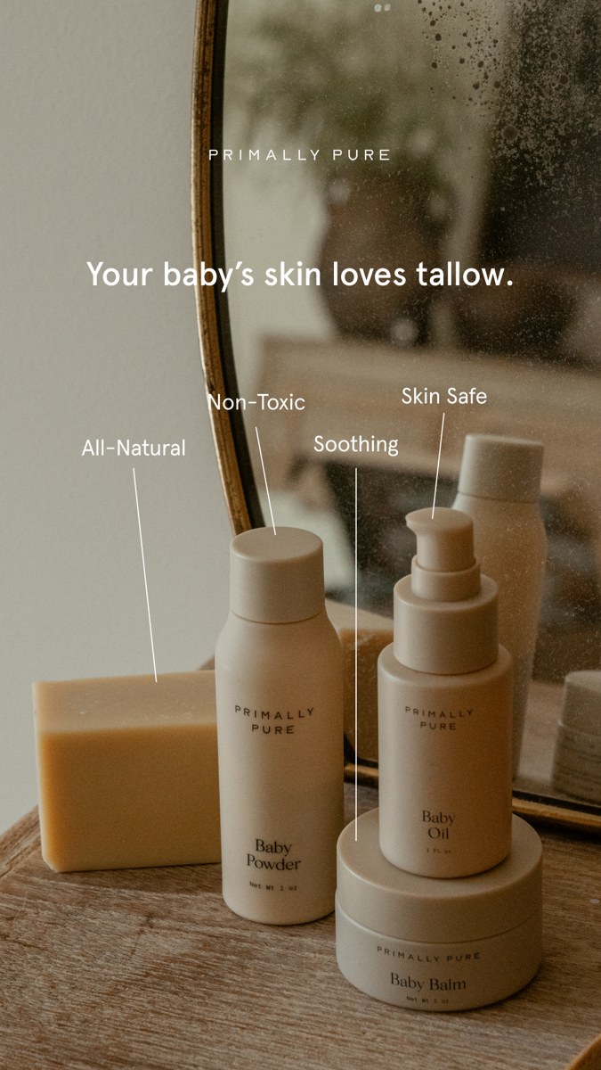
Source record: 5279249aa29a60620878676656465ab1. Static source image from the September 16, 2026 package.
The scene places pale containers and a rectangular bar on a wooden surface beside an aged mirror. The visible labels include Baby Powder, Baby Oil, and Baby Balm. Above them, the headline says, “Your baby’s skin loves tallow.” Four white attribute labels, “All-Natural,” “Non-Toxic,” “Soothing,” and “Skin Safe,” connect to the scene through thin lines. Warm brown and cream tones tie the packaging to the environment.
The communication structure moves from a broad headline to a grouped product range and then to individual labels. The lines give the viewer a way to scan without reading a paragraph. The mirror also makes the setting feel deeper while keeping the products together. This is a useful reference for a range introduction, where the first task is recognising that several items belong to one family.
However, the attribute labels create an interpretation problem. A viewer may read each label as describing the nearest item, the entire range, or the brand. The line endpoints do not establish the scope of a safety claim. The headline likewise does not tell us which displayed formulations contain tallow. Packaging and visual proximity cannot answer an ingredient question.
An original adaptation could retain the quiet environment and connecting lines while labelling verified product functions or names. A second card could show one item with its exact role and current directions. That separates “what is in the range?” from “what does this particular product contain?” It also avoids making the opening photograph responsible for an entire substantiation file.
The production check is concrete: cover the headline and ask a reviewer to identify each item from the remaining labels. Then uncover it and ask which claims they believe apply to which products. If their answer differs from the approved claim scope, revise the lines or wording before testing. The hypothesis concerns comprehension of the range, not whether the products are safe or effective.
Image 2: The cosmetic-science question creates an educational opening
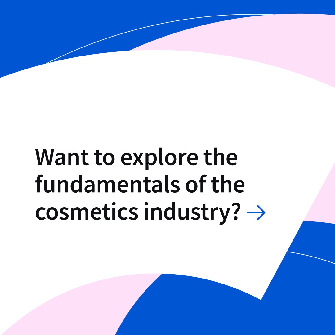
Source record: f21082d6329de81a26bf6cf77021d0d5. The associated record describes an OLAY cosmetic-science specialisation on Coursera.
This image uses a large black question inside a white field framed by blue and pink curves. A blue arrow points right at the end of the sentence. The wording asks about exploring “the fundamentals of the cosmetics industry.” There is no visible product bottle, application scene, price, or course syllabus in the supplied image. Its primary job is inviting curiosity about learning.
The surrounding record provides information that the image alone does not: the offer concerns an OLAY specialisation on Coursera. This distinction matters for a carousel brief. If the creative relies on surrounding interface text for identity, a standalone reuse could become ambiguous. A production team should specify where the course name and provider are visible rather than assuming that a question identifies the offer.
The arrow offers a directional cue, but it does not prove that another carousel card existed. In a hypothetical sequence, it could point conceptually toward an answer. A useful next card would state what the learner can explore, using verified syllabus topics. A weak next card would merely ask a second broad question and postpone the promised information again.
For an original educational carousel, retain the clear question structure while narrowing the subject. “What will you study in this cosmetic-science course?” creates an expectation that can be answered with course content. Claims about completion speed, experience requirements, or trial access require current course information; they should not be copied from the historical record into a new advertisement.
The image also shows the value of contrast and generous space. The main sentence is much easier to distinguish than packaging microtext in several other references. Yet the sentence is relatively long, so a team should test line breaks at the intended preview size. Ask reviewers to name the topic and expected next step after a brief look. That is a practical check of the opening, not evidence that the design produces more enrolments.
Image 3: Lolavie and Ulta combine product identity, a person, and an offer

Source record: 58f363b8162d276584a6ffe9481fce71. The displayed “2 for $42” promotion is historical source copy.
The upper portion identifies “LOLAVIE at ULTA BEAUTY,” followed by the italic headline “From Jen’s Shower To Yours” and the category line “RESTORATIVE SHAMPOO & CONDITIONER.” A person in a dark robe holds two containers in a bathroom setting. A circular badge places “2 for $42” inside repeated “LIMITED TIME” text. These elements supply identity, use context, and a transaction in one frame.
The role of the person is relational: the pose and shower wording connect the products to a personal routine. The bottles remain visible, so the human image does not entirely replace product identification. The promotional badge is visually separate from the main headline, allowing a viewer to notice price without reading every line.
This is an offer and context reference, not a mechanism demonstration. The word “restorative” is part of the category wording, but the image does not explain a biological mechanism or show a measured change. The photograph also does not establish the current endorsement arrangement, usage history, or rights available to another advertiser. A team can study the composition without borrowing the person or implying the same relationship.
A hypothetical original hair-care carousel might open with its own authorised routine photograph, follow with a clearly labelled view of the two included products, and finish with verified offer terms. The key adaptation is separation of buyer questions: first recognise the pair, then understand what is included, then decide whether the offer applies.
For production, check whether the circular badge stays readable after resizing. Repeated curved text is decorative until it carries a material condition; then it must remain understandable. A reviewer should be able to explain whether the price covers any two items, a specified pair, or another bundle. The source image does not fully resolve that detail, so a new ad needs current terms rather than an assumption.
Image 4: Wish+ and MEDIHEAL demonstrate the complexity of promotional hierarchy
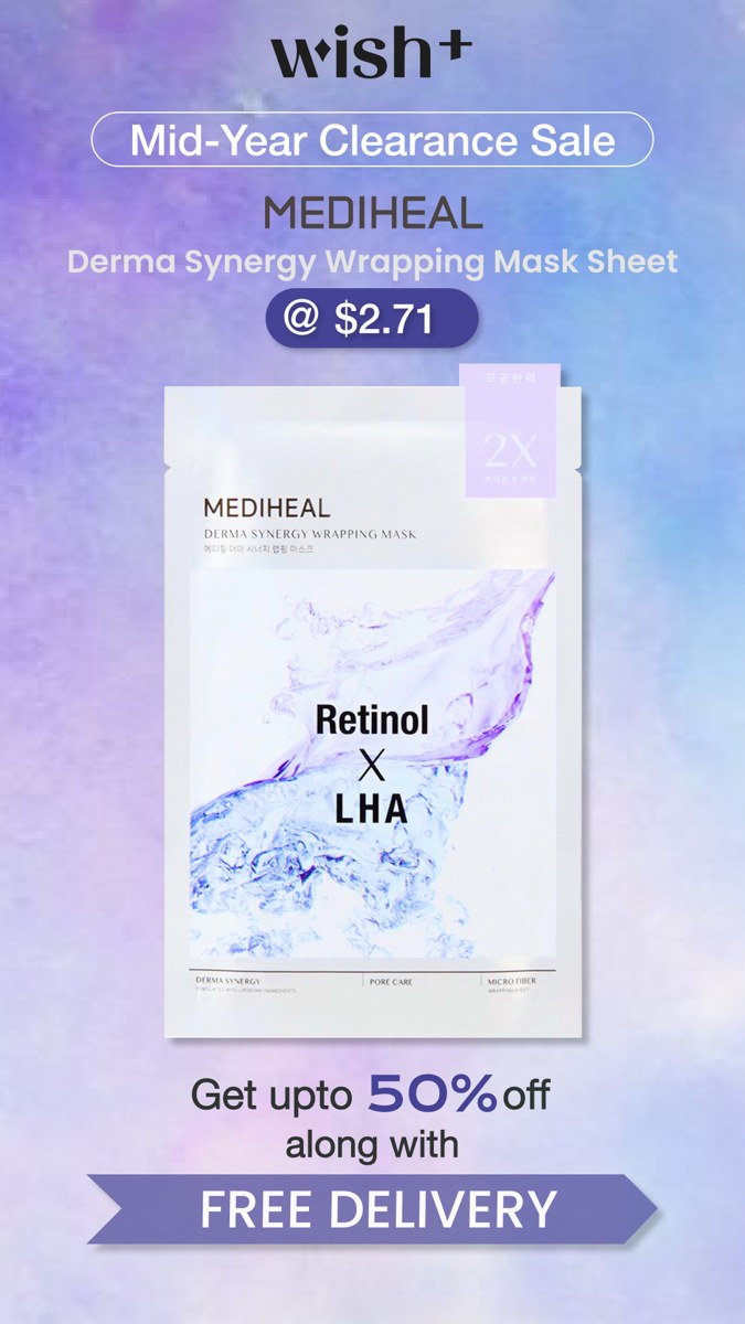
Source record: 739ad89a59322ab60970f97880aa0c31. Prices, discounts, and delivery language are captured promotional claims, not current offers.
The image presents several levels of information: the Wish+ name, a “Mid-Year Clearance Sale” headline, MEDIHEAL branding, the product description, a price capsule, a large mask packet, a discount line, and a “FREE DELIVERY” ribbon. The packet itself includes “Retinol X LHA.” Purple and blue tones connect the background, price capsule, and ribbon, while the mostly white package sits at the visual centre.
This is a useful example of a commercial message with competing priorities. The product needs identification, but the price and delivery statement also demand attention. The large packet makes the item visible; the smaller descriptive text has more competition. A viewer may remember the discount while forgetting the precise variant or quantity.
Three different questions must be resolved before adapting this structure. Does the displayed price apply to the pictured item and package quantity? Does “up to 50% off” describe that item or the wider sale? Does free delivery depend on region, basket value, membership, or another condition? The captured image does not supply enough detail to answer all three.
A hypothetical carousel can distribute those questions across separate cards, but distribution must not hide conditions. If the opening card presents a price, material qualifications needed to interpret that price should remain close to it. A later card can expand the terms; it should not quietly reverse the opening impression.
For a practical comprehension test, show reviewers the offer card and ask them to describe the expected basket before revealing the landing page. Compare their interpretation with the real basket configuration. A disagreement reveals an offer-clarity problem even before paid delivery begins. This test is especially valuable for sale designs because a strong visual hierarchy can make an incomplete offer feel more definite than it is.
Image 5: Facetheory places a concern list beside a large product detail
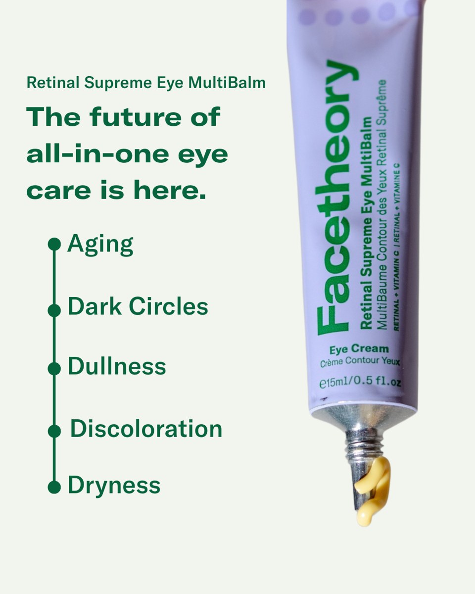
Source record: 773f6c9d2114dab0489270ddfbef9f57. The visible product wording is “Retinal Supreme Eye MultiBalm.”
The left side introduces the product and states, “The future of all-in-one eye care is here.” Below that, five concerns run down a green line with circular markers: Aging, Dark Circles, Dullness, Discoloration, and Dryness. The right side is occupied by a large lavender tube, ending in a visible yellow cream curl at the nozzle. Green lettering connects the headline, concern list, and package identity.
The product name matters. The image says “Retinal,” so a source reading should not silently change it to “retinol.” Similar-looking ingredient names are not interchangeable editorial shorthand. Accurate transcription is a small production task with a large effect on whether the finished brief matches the actual item.
The line and dots organise five concerns as a scannable set. They do not establish a sequence of use or the relative importance of those concerns. Nor does their presence demonstrate that each outcome has equivalent supporting evidence. In an original carousel, splitting the list into five cards would multiply the number of claims requiring support.
The cream curl supplies a visible texture detail, but the still does not show spreading, absorption, wear, or application quantity. Its role is making the product tangible. A separate demonstration card would require additional photography or video with the actual product and directions. Enlarging the curl in a crop would not create that missing evidence.
A useful creative hypothesis is whether a focused opening communicates the proposition more clearly than the broad list. Test one supported concern against the full approved concern set while holding the remaining story constant. Document both the difference in information breadth and the resulting customer interpretation. If the focused card produces clicks from people expecting a different product outcome, improved attention alone would not justify keeping it.
Image 6: OWAY uses a salon scene and heritage language to suggest craft

Source record: 4fd86a9cd8d07158464922d891df63a2. The image contains OWAY branding and a visible heritage statement.
The monochrome composition shows a person in profile with long dark hair. A hand holds a long brush above the hair, and another hand holds a dark bowl near the right edge. The top area contains “Pure Beauty, Since 1948,” the OWAY mark, and a thin horizontal rule. Large areas of grey space keep the scene restrained.
The brush and bowl provide context associated with a salon application. Calling this simply a makeup demonstration would miss the visible relationship between the brush, hair, and bowl. At the same time, the still does not establish which treatment is being performed, what formula is in the bowl, or whether an application occurs after the captured moment.
The heritage line and controlled styling suggest continuity and craft as advertising themes. Those are interpretations of the communication, not independently verified statements about product history or quality. The photograph supplies a mood and a setting. A supporting card would need to identify the actual product or service before a viewer could make a concrete purchase decision.
For an original professional-care sequence, a team could pair its own authorised service photograph with a plain explanation of what the appointment or product includes. If the campaign concerns home use, it should explain that difference explicitly. Otherwise, a salon visual may lead people to expect professional application when the destination sells an item for home routines.
The main production lesson is that atmosphere needs a functional partner. A quiet photograph can open a story effectively when the next card resolves the missing detail. In a review, ask what service or item viewers believe they can buy and who they think applies it. Those answers reveal whether the scene adds useful context or creates a mismatch with the actual offer.
Image 7: Primally Pure combines several lip-product textures in one composition
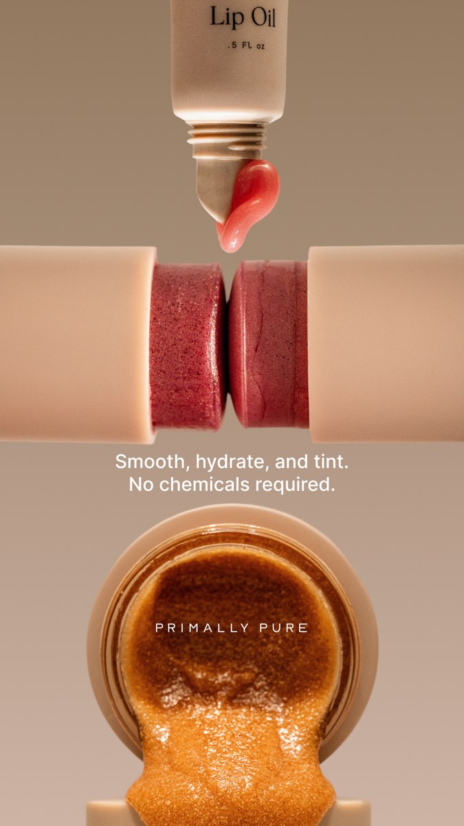
Source record: 0d63bc50e707727e9ea009bb6fcf2e50. This is a separate captured image from Image 8.
An inverted Lip Oil tube enters from the top with a red, glossy product curl at its opening. Across the middle, two exposed tinted product ends face one another. Below them, an open container displays an amber, granular texture spilling toward the foreground. The white copy reads, “Smooth, hydrate, and tint. No chemicals required.” The Primally Pure name appears over the lower product.
The composition presents variety through material differences: glossy, solid, and granular surfaces. Warm packaging colours connect those different textures without requiring identical photographs. This can inform a range-comparison card because the visual distinctions help establish that the items have different roles.
However, the image does not provide a complete map from each verb to each product. A viewer may infer that one product performs all three jobs, that the set is sold together, or that the image describes a routine. None of those commercial relationships should be assumed from the composition alone. A follow-up comparison card would need product names and verified descriptions.
The phrase “No chemicals required” should not be adopted as a scientific explanation. Cosmetic ingredients are chemical substances, including ingredients described as natural. More precise ingredient language, when supported by the current formula, communicates a usable distinction without implying that a physical product contains no chemicals. This is a wording problem separate from whether the photographs are attractive.
A hypothetical adaptation could show the brand’s own three products, label their approved roles, and lead to a collection page where they are clearly available individually or together. The test question would be whether viewers understand the range better with labels than with a shared benefit line. The photograph’s sensory appeal would remain constant, making the change interpretable.
Image 8: Primally Pure gives one product and one action visual priority
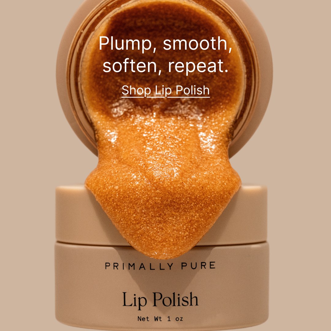
Source record: 9e4de657e19709ee3132d42d762dce03. Its relationship to Image 7 is visual and record-level similarity, not verified carousel order.
The square composition focuses on a Lip Polish jar and an open container above it, with an amber, granular mass extending downward. The headline “Plump, smooth, soften, repeat” occupies the upper part of the texture. “Shop Lip Polish” appears directly below as underlined text. The product name remains readable on the jar near the bottom.
Compared with Image 7, this image narrows the subject. One product name and one shopping instruction make the intended next step easier to identify. The texture is still the dominant visual, but it supports a specific item rather than a broad collection. This is why the image is a useful reference for a closing card or a direct product introduction.
The underlined text is a visual action cue inside an image. It should not be mistaken for an independently verified clickable interface element. A production team must configure the actual destination and CTA available in its chosen setup. The image alone cannot tell us where a click went, whether the page loaded, or which commercial terms applied.
Images 7 and 8 share a brand, related visual language, and identical surrounding title copy in their supplied records. They also have distinct record identifiers and image fingerprints. Those facts support a comparison of related assets, but they do not reveal whether the images appeared together, in which order, or under one campaign.
For an original closing card, retain the principle of product-name and destination alignment. If the card invites shopping for one polish, the landing page should initially identify that polish. A texture photograph may establish appearance, while claims such as “plump” require their own appropriate support. Review those two layers separately so that a clear CTA does not conceal a broader promise than the product evidence allows.
Turn one reference into a brief: search skincare creatives in AdMapix, record the visible message, and write the buyer question it could help answer. Keep your proposed card order in a separate column from the source observation.
Hypothetical Card Sequences for Different Buying Decisions
The following sequences are original planning examples, not reconstructions of the sampled advertisers’ campaigns. Each uses a different buying question to determine order and length. The copy is illustrative and must be adapted to a real product, current directions, available evidence, and the chosen advertising setup. Notice that none requires using all eight reference images. A coherent product story selects the information it needs rather than assembling unrelated brands into one carousel.
Hypothetical sequence A: Explain a small lip-care range
This sequence suits a brand whose customers cannot easily distinguish several lip products. The starting observation comes from Image 7: several textures can attract attention while leaving individual roles unclear. The hypothetical campaign would use the advertiser’s own products and photography. It would not reuse Primally Pure branding or claim that the source advertised this sequence.
| Proposed card | Main message | Original visual to produce | Required input |
|---|---|---|---|
| 1 | “Explore the lip-care collection” | Group image with readable product names | Current collection membership |
| 2 | “Meet the polish” | One item and a controlled texture detail | Approved product description |
| 3 | “Meet the oil” | One item with packaging and applicator | Verified directions and category |
| 4 | “Choose the finish you prefer” | Accurately labelled available options | Current variants and representative photography |
| 5 | “See the collection” | Range recap with a specific destination | Collection page and stock check |
The opener establishes that the subject is a collection. The middle cards identify products before asking the viewer to select one. The final card restores the overview so the click feels like a continuation rather than an abrupt sales demand.
An alternate version could begin with a labelled comparison instead of an atmospheric group shot. That would test the opening approach while keeping the remaining cards unchanged. The hypothesis is that explicit identification helps visitors arrive with a clearer understanding of the collection. Relevant evidence would include what they select on the landing page and whether they continue toward the intended business event.
Do not imply a required routine unless the product documentation supports one. A collection may contain alternatives rather than sequential steps. If items are sold separately, communicate that where the presentation could otherwise suggest a bundle. The sequence should make choosing easier without creating a purchase relationship that does not exist.
Hypothetical sequence B: Explain an educational offer before asking for enrolment
This sequence develops the question-based structure in Image 2. The product is a course, so the information priorities differ from skincare shopping. A learner needs to understand the subject, level, structure, and current enrolment conditions. Attractive cosmetic imagery cannot substitute for those details.
| Proposed card | Main message | Original visual to produce | Required input |
|---|---|---|---|
| 1 | “What will you study in cosmetic science?” | A clear question with provider identity | Approved course title and provider name |
| 2 | “Explore the course topics” | A short map of actual syllabus areas | Current syllabus |
| 3 | “See how learning is organised” | Authentic lesson or module example | Permission and current course structure |
| 4 | “Check the entry requirements” | Plain explanation of prerequisites | Current eligibility details |
| 5 | “View the syllabus and enrolment options” | Course recap and clear CTA | Matching course page and live terms |
The sequence answers the opening question immediately on card two. It then moves from subject matter to practical participation. This is a stronger informational connection than following the first question with general claims about career transformation.
If the course offers exercises, demonstrate only exercises that actually exist. If the historical ad mentions a free trial, verify whether that offer is still available and under what conditions. The captured record cannot establish current billing or cancellation terms. A carousel can explain those conditions, but a commercial promise should not be added merely because a previous advertiser used one.
An appropriate test could compare a question opener with a direct syllabus opener. Keep the course, landing page, eligibility explanation, and enrolment terms constant. Measure progress toward the selected enrolment event rather than assuming that additional swipes indicate better learner fit.
Hypothetical sequence C: Make a two-product offer easy to understand
This sequence draws a structural lesson from Image 3 without reproducing its historical price or personal imagery. The buyer already recognises the product category. The outstanding question is what the pair contains and what the offer requires.
| Proposed card | Main message | Original visual to produce | Required input |
|---|---|---|---|
| 1 | “Explore the shampoo and conditioner pair” | Both included items clearly named | Exact product identifiers |
| 2 | “What is included” | Separate product views with sizes | Current package quantities |
| 3 | “How each item fits the routine” | Simple, approved directions | Current labels and instructions |
| 4 | “See the current pair offer” | Price and material terms in a clear hierarchy | Active offer, eligibility, and destination |
The sequence keeps routine explanation distinct from the transaction. It can also work with the offer first if the research question is whether a commercially explicit opener attracts qualified shoppers. That alternative is a proposed experiment, not a claim that offer-first sequencing is generally superior.
A useful prelaunch exercise is a basket reconstruction. Give a reviewer the cards and ask them to describe the products, quantities, total stated price, and any eligibility conditions. Then compare their answer with the actual destination. If they expect a larger size or a different combination, change the creative before considering a media test.
The historical “2 for $42” text should remain only in the source analysis. New copy needs the advertiser’s actual offer. The same principle applies to “limited time”: a production brief needs a real expiry rule, an owner responsible for withdrawal, and a destination that changes consistently when the promotion ends.
Hypothetical sequence D: Build an eight-card explanation only when complexity warrants it
An eight-card sequence can suit a product with several distinct questions, but every additional card should justify its place. Consider a hypothetical product with approved ingredient information, documented directions, a useful texture demonstration, and a destination that explains suitability. The longer format exists to present those materials clearly, not to make a simple product appear more scientific.
The proposed order is: identify the product and purpose; show the package and quantity; explain one supported product feature; provide the relevant evidence; show an accurate texture detail; explain approved use; answer one documented purchase objection; and link to the product details. Each step resolves a different question.
The evidence card should identify what the evidence actually measures. The demonstration card should describe only what is visible. The usage card should preserve material instructions rather than paraphrasing them into a broader recommendation. The objection card should come from real customer questions or a documented support issue, not an invented fear designed to make the product seem necessary.
Run a removal review before committing to eight designs. Temporarily delete each middle card and ask whether the final decision becomes less informed. If removing a card changes nothing, combine it with a neighbouring card or remove it permanently. A shorter sequence with complete information is a valid result of thoughtful planning.
A Practical Production Worksheet
A useful carousel worksheet connects every card to a buyer question, an approved message, a producible asset, and a measurable purpose. It should also identify who resolves missing inputs. A designer cannot repair an unverified offer through layout, and a media buyer cannot infer approved directions from a reference image. Complete the worksheet before final artwork so that production decisions rest on available facts rather than assumptions made during export.
Campaign worksheet
| Field | What to enter | Example for a hypothetical collection campaign |
|---|---|---|
| Business decision | The action the campaign should support | Help visitors choose between available lip products |
| Intended audience context | What the viewer is assumed to know | Familiar with the category, unfamiliar with this range |
| Central question | The main unresolved uncertainty | Which item serves which purpose? |
| Proposition | One supported sentence | Explore the current lip-care collection |
| Product scope | Exact items included in the story | Approved product list with variants |
| Destination | Page that continues the proposition | Current collection page |
| Evidence folder | Source for each material assertion | Labels, product descriptions, directions, offer terms |
| Reference observation | What the sampled creative visibly does | Groups distinct textures in one image |
| Proposed change | What your team will test | Labelled comparison opener versus group photograph |
| Primary outcome | Business event selected before launch | Completed purchase under the chosen reporting definition |
| Diagnostic outcomes | Signals that help explain results | Outbound visits and product selection |
| Owners | People responsible for decisions | Named production, product, media, and analytics owners |
| Launch dependencies | Items that must be resolved first | Final stock check and destination approval |
The audience-context field is a planning assumption, not an inference about the sampled advertisers’ targeting. State the assumption plainly so the media team can decide whether the experiment actually reaches the intended group. “Interested in skincare” is often too broad to explain why a particular card order should matter.
The product-scope field prevents range confusion. Record exact names and variants rather than a broad brand label. If packaging changes during production, the photographer, copywriter, and destination owner should all receive the same revised product reference.
Worksheet for each card
| Field | Completion requirement |
|---|---|
| Card identifier | Stable identifier that survives revisions |
| Buyer question | One question this card resolves |
| Main sentence | Approved wording with one primary message |
| Visible product identity | Name or recognisable package that provides context |
| Asset instruction | What must be photographed, illustrated, or demonstrated |
| Claim reference | Document and location supporting the wording |
| Necessary qualification | Conditions needed to interpret the message |
| Transition | Information the following card will add |
| Standalone check | Whether this card remains understandable by itself |
| Accessibility check | Contrast, reading order, text size, and descriptive context |
| Destination mapping | Exact page or section associated with the action |
| Approval status | Approved, revise, or blocked, with a responsible person |
A completed card entry should read like an instruction another person can execute. “Make it premium” is not sufficient. “Photograph the closed package and a separate texture detail under consistent lighting, keeping the product name unobstructed” identifies an asset and a checkable result.
Likewise, “add proof” is incomplete. Specify the claim, the evidence source, the appropriate qualification, and the person responsible for verifying the match. If that field remains empty, rewrite the message around a supportable description instead of asking the designer to create a badge that looks authoritative.
Handoff and revision rules
Keep the source reference, working design, and final export as separate items. The source reference documents the idea. The working design contains the advertiser’s original material. The final export is the approved file actually uploaded. This separation reduces accidental reuse of a competitor’s packaging, person, or historical offer.
Use a revision log that records substantive changes. A new product quantity, different claim, revised destination, or changed card order can affect interpretation and measurement. A spelling correction matters operationally but does not necessarily create a new strategic concept. The log should help the team understand what changed without multiplying meaningless variant names.
Before handoff, ask the copywriter, designer, and media buyer to summarise the same sequence independently. If one describes a bundle, another describes three alternatives, and the third expects a routine, the brief is not ready. Resolve the commercial meaning before polishing the visual treatment.
Finally, assign a launch owner to reconcile the exported cards with the uploaded preview. File approval does not prove that the intended files, order, links, and settings were used. The final review should inspect the actual configuration and record the version that entered the experiment.
Design Measurement Before Launch
Measure a carousel against the business decision it is intended to improve, then use interaction data to explain the result. A sequence that attracts more browsing may still bring fewer qualified buyers. A shorter sequence may generate fewer interactions while helping visitors choose correctly. Define the primary outcome, reporting window, comparison, and decision rule before launch so that the team cannot declare success by selecting whichever metric happens to look favourable afterward.
Separate research evidence from campaign evidence
The supplied AdMapix sample can support a hypothesis about communication structure. It cannot supply the conversion baseline, sample size, or expected improvement for your campaign. Those inputs must come from your own measurement system or a clearly identified planning assumption.
Write the experiment in one sentence: “For the selected audience and offer, replacing the group-photo opener with a labelled comparison opener will improve the predefined purchase outcome because visitors will understand the range earlier.” This sentence specifies a change, an outcome, and a proposed explanation. It also makes the hypothesis falsifiable: better comprehension or more clicks without the required business improvement may not support adoption.
The explanation remains a hypothesis even if the variant wins. Campaign results can support the effect of the tested configuration, while a separate comprehension exercise helps investigate the proposed reason. Avoid claiming that a psychological mechanism has been proved merely because one variant produced more purchases.
Choose an interpretable comparison
For an opener test, keep the remaining cards, offer, destination, and measurement settings consistent. For a card-order test, keep the assets and messages constant while changing their sequence. For a format test, compare the carousel with a single image expressing the same central proposition; recognise that this tests an overall format package rather than one isolated sentence.
Where a suitable randomised experiment is available, use it to reduce audience and timing differences. Record the assignment unit and how overlap is handled. If the comparison instead relies on ordinary delivery or different time periods, label it observational. Unequal delivery, auction conditions, and audience selection can influence apparent differences.
Avoid changing the landing page during a creative-only test. If that change is unavoidable, record the time and assess whether the comparison can still answer the original question. A result from two different checkout experiences should not be presented as clean evidence about carousel order.
Define metrics and denominators
| Measure | Definition to record | Useful interpretation |
|---|---|---|
| Primary business event | Exact purchase, qualified lead, or enrolment event | Whether the campaign supported the selected goal |
| Cost per event | Spend divided by counted primary events | Efficiency under the chosen reporting rules |
| Outbound click rate | Outbound clicks divided by the specified impression measure | Movement toward the destination |
| Landing-page continuation | Selected downstream action divided by eligible measured visits | Whether visitors continue after arrival |
| Conversion rate | Primary events divided by a clearly named eligible population | Outcome frequency for that population |
| Card interaction | Exact event and denominator available in the reporting interface | Diagnostic engagement, when available |
| Quality guardrail | Refunds, invalid leads, cancellations, or another relevant measure | Whether apparent volume creates downstream problems |
Do not label all ad interactions “click-through rate.” Expanding an image, opening a profile, and visiting the destination are different behaviours. Use the event definition available in your reporting system and preserve it in the test record.
Card-level reporting needs similar care. A card click does not establish that the viewer read preceding cards. A visit through a tagged card link identifies the clicked destination path, not a complete swipe history. If card exposure or progression is unavailable, leave that measure unavailable rather than manufacturing a “completion rate” from unrelated totals.
Plan duration, uncertainty, and decisions
Choose the observation period using the business cycle, expected event volume, attribution delay, and the smallest improvement that would justify production or budget changes. A universal number of days or purchases would be misleading. If conversion volume is low, reduce the number of simultaneous variants or use an earlier qualified event while clearly naming the narrower conclusion.
Set a spending boundary and rules for operational interruption. Broken tracking, an unavailable product, a misleading offer, or a destination failure justify pausing. Ordinary daily fluctuations do not automatically justify stopping early. Repeatedly checking for a favourable result and ending at the first apparent win can distort the conclusion.
Record uncertainty alongside the point estimate when the experiment and analysis support it. If the result is inconclusive, preserve that status. “No reliable difference detected” does not mean the variants are identical, and “higher observed rate” does not automatically mean a repeatable advantage.
The final readout should identify what the team will do: adopt the tested variant, retain the existing version, investigate a funnel problem, or collect more evidence under a justified plan. Store the decision with the exact creative files and settings so the learning remains useful after the campaign has ended.
Accessibility and Proof Checks Before Export
Accessible carousel production makes the main message understandable across different viewing conditions and keeps important qualifications connected to the claims they explain. Check each card at realistic display size, inspect the reading order, and provide equivalent context wherever the publishing setup supports it. At the same time, verify that every factual statement matches its evidence. These checks belong in production because poor legibility and unsupported precision can both change what a viewer reasonably understands.
Readability and visual access
Start with the information that cannot be lost: product identity, central proposition, material offer terms, and next action. Reduce decorative competition around those elements. In Image 4, the sale headline, item price, discount, and delivery ribbon compete for attention. In an original design, establish a deliberate hierarchy rather than relying on all four to be noticed equally.
Inspect text against the actual background beneath it. A white headline may look clear over one part of a textured photograph and disappear over another. Use a consistent panel, quieter crop, or other design adjustment when needed. Check contrast with an appropriate tool rather than assuming that a brand colour combination is readable.
Do not communicate product categories or sequence steps through colour alone. Add names, labels, shapes, or clear numbering. If two variants use similar packaging, textual identification becomes especially important. A viewer should not need perfect colour discrimination to understand which item is being discussed.
Keep essential wording as accessible text where the available format allows. Where image-description fields are supported, describe the product, relevant action, and material message concisely. Where they are unavailable or constrained, provide equivalent context in supported caption or destination content. Verify the actual experience rather than assuming every placement exposes the same accessibility controls.
Avoid turning image descriptions into keyword lists. “Amber granular product extending from an open Lip Polish container; text invites shopping for Lip Polish” conveys the relevant visual and action. Repeating every decorative feature can obscure the useful information.
Sequence and motion access
Read the sequence without the images, using only the planned text and descriptions. It should still identify the offer and explain the decision. Then review each card out of order. A card that relies entirely on “this,” “that,” or “the next step” may need a product name or a clearer label.
If the original campaign includes video cards, prepare captions for meaningful speech and ensure that essential information is not carried only by sound. Review on-screen timing so that the message and qualifications can be understood. These are production recommendations for future assets; the eight source images here provide no evidence about audio, motion, or playback.
Directional arrows should support navigation without carrying the entire meaning. The arrow in Image 2 complements an intelligible question. An arrow by itself would not identify the topic or explain what another card adds.
Claim and proof review
Create a claim register containing the exact wording, implied meaning, evidence reference, qualification, and approval owner. Include statements made visually. A package beside a “safe” label, a person in a professional setting, or a before-and-after arrangement can communicate more than the written sentence.
Match evidence to the marketed product and claim. Ingredient information does not automatically substantiate a finished-product outcome. A texture photograph supports a description of appearance. A customer quotation documents a reported experience when authentic and properly used. A study needs relevant conditions and an accurate account of what was measured before its findings can support advertising language.
Treat “dermatologist-reviewed,” “clinically tested,” and similar expressions as specific claims requiring specific documentation. They should not be converted into broader statements of endorsement, universal safety, or guaranteed results. The same discipline applies to “all-natural” and other broad category language: define what the advertiser actually means and can substantiate.
For a hypothetical before-and-after card, document the subject, consent, product use, interval, conditions, and permitted editing. Comparable framing and lighting matter because visual changes can alter the impression of the result. Do not create a stronger outcome through retouching than the supporting evidence establishes.
Commercial and rights review
Verify the current price, currency, included quantity, eligibility, stock, shipping conditions, and expiry handling. If a promotion changes, update the affected cards and destination together. A claim may be historically accurate and still be unsuitable for a new campaign.
Confirm rights for photography, people, quotations, logos, and other supplied material. Public visibility is not permission for commercial reuse. The reference images in this article are research evidence; an original campaign needs its own authorised assets.
Complete the review against the uploaded preview and the actual destination. Check cropping, text visibility, link behaviour, and the settings available in the selected configuration. Consult current platform guidance for technical limits at implementation time; the dimensions of a captured reference image are not an authoritative specification.
Example Workflow: Turn the Supplied Search Into a Production Decision
The practical output of this research is an original brief with a traceable reason for each design choice. The supplied search already provides the evidence collection: 30 records within explicit dates and eight selected images for inspection. The workflow below shows how a team could use that material to decide what to produce. It is a worked planning example, not a customer case study or a report of a campaign that was launched.
First, state the question: “How can our lip-care collection make the roles of its products easier to understand?” Select Image 7 because it visibly groups different textures, and Image 8 because it gives one product and one action priority. Save their distinct record identifiers with those observations.
Second, describe the gap. The collection composition communicates variety, but the individual product roles are less explicit. The single-product composition communicates a narrower shopping action. This is a comparison of visual structure, not a claim about which source performed better.
Third, draft the hypothetical collection sequence described earlier. Gather your own product photography, current descriptions, variant information, and destination. If the products are alternatives, use comparison language. If they are an approved routine, use the documented order and directions.
Fourth, create two openers: a range photograph and a labelled comparison. Keep the later cards identical. Complete the claim register, review comprehension, and check the uploaded configuration.
Finally, record the proposed experiment and decision rule before launch. The deliverable is a brief, a pair of approved variants, and a measurement plan. This progression is what makes a reference useful: a visible feature becomes a specific production choice whose effect can be investigated.
Common Mistakes That Weaken Carousel Stories
The most damaging carousel mistakes disconnect the message from either its evidence or its destination. They can occur in an attractive design with polished typography and good photography. Review the sequence as a chain of customer expectations: what the opener promises, what the middle establishes, and what the click delivers. A broken connection is often more important than a small visual improvement.
Assigning every reference a predetermined card number. The original material includes education, offers, range imagery, and salon context. Those functions do not form one observed product story. Classify the assets first, then choose a sequence for your own product.
Using an offer as proof of efficacy. A discount reduces a transaction cost. It does not establish that a formula works. Keep the evidence card and offer card distinct in the brief even if a final design combines them.
Hiding essential information until the end. A late explanation cannot reliably repair an ambiguous opening price or product identity. Let later cards expand the promise while keeping the initial impression accurate.
Copying repeated phrases as if repetition validates them. Related records may reuse copy, and a phrase may recur across assets. That supplies a wording observation, not evidence of customer preference or substantiation.
Treating research popularity as a budget recommendation. Record counts, indexed dates, and visible similarity do not show profitability. Production priorities should also reflect your customer questions, available evidence, and cost of testing.
Keeping a weak card because the template has space for it. A useful template supports decisions; it does not require filler. Remove a card when it adds no new information, and recheck the transitions.
When to Use AdMapix and When Another Source Is Needed
AdMapix fits the discovery and evidence-organisation stage of carousel production: finding indexed creative references, inspecting their recorded context, and turning observations into briefs. Its role in this article is demonstrated by the supplied dated search and linked source package. Your own advertising account, analytics, product documentation, and rights records remain necessary for decisions about delivery, conversion, claims, and permissions. Choose the source according to the question you need to answer.
Use the AdMapix methodology to understand how to interpret the research layer. Use your account reporting to assess the experiment. Use the product team’s approved documentation to determine what can be claimed. Keeping those responsibilities explicit prevents a competitor screenshot from becoming an accidental substitute for evidence.
For recurring research, the Creative Ads Library guide explains how to organise references beyond a temporary screenshot folder. For surrounding copy, use the Facebook Ad Copy Examples guide to examine how image text, primary text, and offer wording need to agree.
Build My Carousel Research Brief
Start with one product question and one reference you can explain. Check current AdMapix pricing for available access and commercial terms. The supplied product-facts review, dated August 13, 2026, states that no paid-plan trial was offered; this guide does not promise a trial or unverified signup conditions.
FAQ
The questions below address decisions that arise when planning, producing, and assessing a product carousel. The answers distinguish flexible creative choices from evidence requirements. Card count, sequence, and CTA placement can change with the campaign. Product identity, accurate claims, a matching destination, and honest measurement remain necessary. These are editorial planning questions, not a claim that the wording came from a search-console export or verified customer-query dataset.
How many cards should an Instagram carousel ad use?
Use the number needed to resolve the buyer’s questions without repeating information. Draft the sequence in sentences first, then remove any card whose absence would not affect understanding. The four-, five-, and eight-card plans in this guide are hypothetical structures, not platform limits. Verify the current technical requirements for your chosen setup before export and upload.
Are the eight images in this guide a real Instagram carousel?
No. They are eight separate static assets selected from a bounded AdMapix skincare query. The package does not verify their carousel membership, order, or individual Instagram placement. Related branding and shared record copy can support visual comparison, but they cannot reconstruct a campaign. Every proposed card sequence in this guide is explicitly hypothetical.
What should the first card communicate?
The first card should identify a relevant product proposition and create an understandable reason to continue. A question can work when the following card answers it; a direct product or offer opening can work when that is the buyer’s immediate need. Keep the initial impression accurate even if the viewer never reaches later cards.
Should every card include a call to action?
Each card should provide enough context to make sense, but not every card needs a prominent shopping instruction. Use navigation language when it helps and a clear commercial action where it fits the decision. If individual cards link to different destinations in the chosen setup, ensure each destination matches that card without fragmenting the overall proposition.
Do carousel ads perform better than single images?
The supplied examples cannot establish that. Compare the formats in your own campaign using a consistent proposition, offer, audience approach, and measurement definition. A format test evaluates the complete presentation, including the extra information and interaction it enables. Judge the result against the chosen business outcome rather than treating additional browsing as automatic improvement.
Can a product texture photograph count as proof?
It can document visible appearance under the photographed conditions. It does not by itself establish absorption speed, safety, clinical efficacy, or long-term results. Pair the image with language that describes what viewers can actually observe. Broader claims require relevant substantiation, and application instructions should come from current product documentation rather than the amount staged for a photograph.
How should a team measure card-by-card performance?
Use card-level events only when the reporting interface supplies them with understandable definitions. Record the event, denominator, and limitations. A click on a later card does not reveal every preceding exposure, and destination tags do not reconstruct a swipe sequence. When progression data is unavailable, use available campaign and website outcomes without inventing a completion metric.
Can AdMapix reveal a competitor’s conversions or exact spend?
This supplied research package does not reveal competitor conversions, exact spend, profit, targeting, or return on ad spend. It provides indexed records, media references, and fields whose interpretation is bounded by the stated methodology. Use those records to formulate creative hypotheses, then rely on your own campaign and business systems to evaluate results.
Key Takeaways
A useful carousel connects a clear proposition to evidence and a matching next step, with every card adding information. The supplied sample provides eight concrete visual references and an auditable research scope, but the proposed sequences remain original planning examples. Use that distinction to produce work that is both practical and honest: preserve the observations, verify the claims, and measure the campaign you actually build.
- Give every card a buyer question, one main message, and a reason to exist.
- Keep separate source images separate; related assets do not establish a verified carousel.
- Match proof to the claim, and recheck historical offers before using any commercial language.
- Complete the production worksheet, accessibility review, and uploaded-preview check before launch.
- Define the primary business outcome and experiment rules before evaluating creative performance.
Sources
The dated AdMapix snapshot is the source for the sample counts, record associations, visible copy, and eight image readings. The linked product pages provide routes to methodology, research, and commercial information; they are not evidence that a sampled ad converted or appeared in a particular Instagram placement. No external efficacy study or advertiser account result was supplied, and none is asserted in this guide.
- AdMapix research snapshot, fetched September 16, 2026: public JSON source package. Research scope: US country parameter, “skincare” query, August 18–September 16, 2026, three pages of ten records, 28 unique image fingerprints, one unique video fingerprint, and zero playable fingerprints.
- AdMapix interpretation guidance: methodology. Referenced for source scope and evidence boundaries; the article’s reproducible observations are tied to the September 16 snapshot.
- AdMapix research entry point: skincare creative search. Current results can differ from the saved sample.
- AdMapix commercial terms: pricing. The supplied product-facts review is dated August 13, 2026; consult the current page for purchasing decisions.
- Related production reading: Facebook Ad Copy Examples, Ad Creative Analysis, Creative Ads Library, and Competitor Ads Guide.
Last updated: September 17, 2026.
Turn these observations into your next creative study
Open the creative library and select samples for your market, network and research question.
Related Articles
Kingshot Ad Strategy: Hooks, Video Reuse, and Playable Links
A verified US iOS sample connects 30 Kingshot advertising records to 19 video files and 12 playable files, with eight timestamped visual analyses and practical briefs that separate creative observations from unmeasured performance.
Kalodata vs TikTok Creative Center: Choose by Research Task
Choose between creative inspiration and product commerce research using eight skincare examples, a dated US sample, and a practical workflow that separates observations, estimates, and testable ideas.
Facebook Ad Copy Examples: Match Copy, Visuals, Proof and Offers
Compare complete Facebook ad headlines and bodies with eight source images, archived offers and bounded video observations, then turn the findings into an original creative brief.