
Halloween Ads: Seasonal Hooks That Keep the Product Clear
Analyze eight dated Halloween advertising examples and turn seasonal artwork, product demonstrations, and visible claims into original briefs with clear evidence limits and practical testing steps.
Halloween Ads: Seasonal Hooks That Keep the Product Clear
Halloween ads can make the season recognizable while leaving the product difficult to identify. The useful creative decision is where to connect the seasonal image to something the customer can actually do: place a puzzle piece, choose a coloring page, or play a bingo card. The eight examples below show different ways to make that connection, along with places where the product explanation remains incomplete.
This guide is for user acquisition managers, creative strategists, and production teams preparing seasonal app advertising. It uses a dated US advertising sample and timestamped screenshots to turn visible creative choices into original briefs. With October production underway, the immediate task is to choose a seasonal treatment that your product can support. These examples provide reference structures and test hypotheses; they do not establish which campaign converted best.
Last updated: 2026-10-12.
AdMapix Research — prepared with Codex and checked against the dated source sample. Editorial ownership: Brad at AdMapix. This preparation disclosure does not imply personal human review. AdMapix is our product.
Quick Answer
Useful Halloween ads connect a seasonal cue to a recognizable product action and an accurate destination promise. In this sample, puzzle gaps, coloring palettes, content galleries, and bingo boards supply that connection more directly than seasonal scenery alone.
- Preserve the product action when changing the artwork, character, setting, or opening line.
- Treat visible claims such as “Daily Updated” and “No Annoying Ads” as advertiser statements requiring separate verification.
- Use the examples to formulate hypotheses about clarity, mood, and demonstration order.
- Evaluate those hypotheses with your own creative checks and campaign results; estimated competitor impressions cannot settle them.
What a Seasonal Hook Needs to Explain
A seasonal hook should help the viewer understand why this particular product belongs in the Halloween moment. A pumpkin can establish the occasion, but it cannot explain whether the advertised experience is a puzzle, a coloring book, a shopping collection, or a party game. The creative needs a bridge between the seasonal image and the customer’s action.
For the apps pictured here, that bridge can be physical and visible. An empty jigsaw space suggests a placement task. A numbered palette suggests choosing a color. A bingo board supplies recognizable rules and a result. These elements give the seasonal artwork a product context without requiring a long explanation.
The examples also show that Halloween is not a single visual treatment. Some frames use skulls, masks, sharp teeth, and neon green light. Others use friendly ghosts, candlelit rooms, autumn foliage, or a costumed presenter. Those are different creative choices. The supplied evidence does not identify the audiences who received them or establish which mood those audiences preferred.
Before commissioning a seasonal variant, complete this sentence: “The viewer will recognize Halloween through ___ and understand our product through ___.” If both blanks describe decoration, the brief still lacks a demonstration. If the product blank describes a feature that your app does not provide, the seasonal treatment has moved beyond a faithful adaptation.
The broader mobile game ads guide provides the parent framework for formats and creative research. Here, the narrower question is how to change the seasonal expression while keeping the underlying activity legible.
A successful production review should therefore produce a specific decision: retain the interface, move the demonstration earlier, simplify the claim, or replace the seasonal scene. “Make it more Halloween” is too open-ended to guide an editor or to evaluate after delivery.
Methodology: What This Halloween Sample Contains
This analysis covers a bounded US keyword sample for 2026-09-12 to 2026-10-11, retrieved on 2026-10-12. The query was Halloween. The supplied collection requested three pages of ten advertising records each, with impression-descending sorting. It is a search sample, not a complete inventory of Halloween advertising or any individual app’s campaigns.
The dated sample contains 30 advertising records, 24 distinct video fingerprints, and 10 distinct playable fingerprints. Video appears in 29 records, while playable associations appear in 11 records. These categories overlap, so they should not be added together as mutually exclusive formats. The supplied records include one entry with a playable association and no video. No standalone image fingerprints were reported; that does not mean the videos lacked still artwork or thumbnails.
An advertising record is an indexed instance. A video fingerprint identifies a particular underlying video file in the supplied data. A playable fingerprint identifies an associated interactive asset. Multiple instances can reuse a video while carrying different associated assets. Consequently, the record count does not describe the number of original concepts, production projects, or unique videos.
The eight numbered images are contact sheets from eight distinct video files. Each contact sheet shows frames labeled 0, 2, 5, and 10 seconds. The analysis is restricted to those visible timestamps. It does not describe complete playback, unseen transitions, audio, interactions with the apps, or the behavior of associated playables. A frame showing a puzzle interface is evidence of that advertised presentation, not confirmation that the installed app behaves identically.
The table below preserves each example’s reported linked store listing and its identifier. Listing names are descriptive labels; identifiers anchor the association. For example, the record titled “Pet Color Paint By Number” is linked in this sample to Halloween Color By Number Book, store ID 6484507868. That difference is retained rather than resolved through a name guess. These associations do not independently identify the advertising buyer or establish relationships between businesses.
Every impression figure below is a third-party model estimate for the stated measurement window. It is not observed delivery, spend, installs, revenue, profit, or a lifetime total. Product-level impression and spend aggregates are excluded. No daily rates, return estimates, or performance rankings are calculated.
The supplied source information does not establish a named advertising network for these examples. The article therefore makes no claim that the sample represents Meta, TikTok, YouTube, or another particular network. Portrait and landscape layouts describe the visible media, not where they ran.
The public frozen source package linked in Sources includes the collection batches, request parameters, and checksums. Those materials allow readers to reproduce the sample’s composition and inspect its provenance. A later live query can return different results; the frozen package is the reference for this article. Its reproducibility does not validate the underlying impression model or turn screenshots into performance evidence.
Evidence Table: Eight References and Their Product Anchors
The examples differ most usefully in how they connect Halloween imagery to an advertised activity. The table is a navigation aid for the visual analysis, not a league table. Each estimate belongs to the identified record, and repeated appearances elsewhere in the sample have not been combined into an asset-level total.
| Image | Reported linked listing and identifier | Record reference | Visible product anchor | Estimated impressions, 2026-09-12 to 2026-10-11 |
|---|---|---|---|---|
| 1 | Halloween Jigsaw-JigsawPuzzles — com.dark.happy.art.jigsaw.puzzle.free.game | ea70c4abc5ad26af22015e1cd79b3141 | Missing puzzle pieces and a piece tray | 17,024,259 |
| 2 | Spooky Halloween Color — 6459738674 | ad4eaa4db9d13e533f44cdf9aa603889 | Line-art gallery and numbered palette | 8,059,840 |
| 3 | Ghostly Halloween Jigsaw — com.ghostly.halloween.happy.art.jigsaw.puzzle.free.game | a128d0ed35853bbbab934b7a3c8ed892 | Puzzle invitation, then artwork with jigsaw outlines | 5,857,869 |
| 4 | Halloween Jigcard Puzzle — 6798938110 | 97b13c99daafc58911ec4dd86a2a76a1 | Puzzle category label and grid over artwork | 4,464,715 |
| 5 | Halloween Color By Number Book — 6484507868 | e72e4bc9787c6483d997de8c10fd60ca | Grayscale/color contrast and numbered palette | 2,708,029 |
| 6 | Halloween Color By Number Book — 6484507868 | 282dcba590d60d4fe57b749103346459 | Coloring-game copy and an inset artwork panel | 2,618,348 |
| 7 | Halloween Bingo — com.dynamicgames.bingohalloween | e9db9db7fa6e38304359f478f95c96ff | Bingo cards, numbered balls, and a result graphic | 2,597,195 |
| 8 | Halloween Jigcard Puzzle — 6798938110 | bbe2b1d760546418e0694053000dcafd | Puzzle category label and grid over an autumn scene | 2,298,377 |
The impression estimates explain the quantitative field supplied with these references. They do not explain why the advertisers chose the imagery. The practical reading starts with the visible product anchor: what can a viewer identify without knowing the app beforehand?
Example 1: Put the Seasonal Artwork Inside the Puzzle
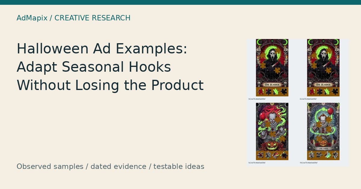
The first example makes the puzzle task visible inside the Halloween image. A masked figure, skull ornamentation, and green illumination establish the mood, while missing pieces and a tray establish the activity. This is a useful reference for integrating seasonal art with an existing mechanic because the product explanation occupies the same visual space as the hook.
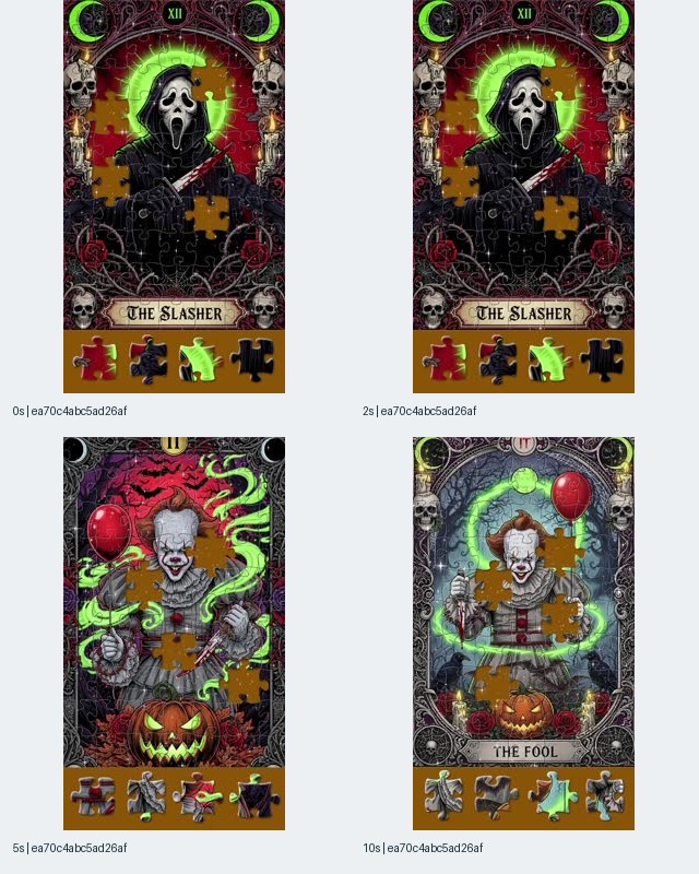
Image 1. Reported listing: Halloween Jigsaw-JigsawPuzzles, Android package com.dark.happy.art.jigsaw.puzzle.free.game. The supplied frames show puzzle artwork at 0, 2, 5, and 10 seconds. They do not establish how a player selects or places a piece.
At the opening timestamps, the central figure sits within an ornate card-like composition labeled “THE SLASHER.” Puzzle outlines cross the artwork, several spaces are visibly unfilled, and separate pieces appear below. At the later timestamps, clown illustrations replace the opening image while the missing-piece presentation remains recognizable.
The product lesson is the relationship between the gaps and the tray. The artwork supplies a reason to look, while the incomplete image supplies a task. A production team could borrow that relationship using its own licensed or original seasonal art. It does not need to reproduce the character, card title, decorative frame, or specific composition to preserve the structural idea.
There is also a legibility question. Detailed borders, faces, decorative objects, puzzle outlines, and loose pieces all compete for attention in the same portrait frame. The contact sheet is enough to identify that density; it is not enough to determine whether viewers found it confusing. That would require a separate comprehension check or campaign experiment.
An original adaptation could begin with a clearly visible empty space in a haunted-house illustration. The next shot could show a real piece placement from the product, followed by the completed detail. Suggested copy might be “Find the piece that finishes the scene,” provided that accurately describes the game. The essential deliverable would be a visible action and result, not simply another finished Halloween picture.
Test hypothesis: keeping the seasonal artwork and the puzzle action together may improve recognition of the advertised activity compared with opening on artwork alone. To evaluate it, hold the puzzle, claim, destination, and overall production treatment constant while changing whether the opening includes the missing-piece task.
Do not label the pictured choices a playable demonstration. The associated record contains a video, and the supplied image is a screenshot of that video. Nor does the larger impression estimate establish that this composition is the sample’s strongest commercial performer. Its value here is specific: the seasonal hook and the product task can be inspected in the same frame.
Example 2: Use the Content Library as the Seasonal Promise
The second example presents Halloween as something the viewer can choose from a visible coloring library. A seasonal banner sits above rows of line-art thumbnails, and a later frame shows a haunted house with a numbered palette. The reference is useful when the product’s appeal depends on content selection as well as the activity performed on that content.
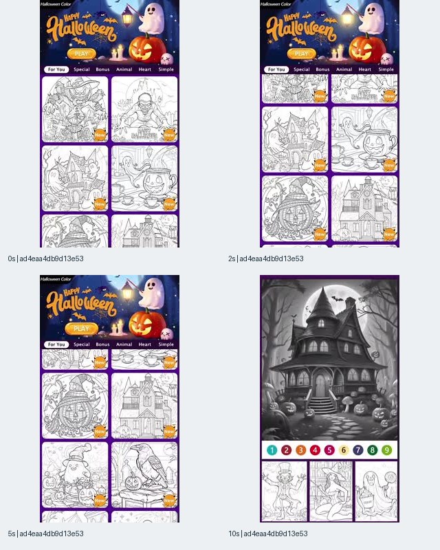
Image 2. Reported listing: Spooky Halloween Color, iOS store ID 6459738674. Different gallery rows are visible at the opening timestamps; the 10-second frame shows a haunted-house image above a numbered palette. Only those sampled states were inspected.
The header includes “Happy Halloween” and a “PLAY” label. Beneath it, the gallery shows recognizable seasonal subjects: a haunted building, a witch, a pumpkin, and other outlined scenes. Category tabs and “New” badges frame these images as items within a collection rather than unrelated illustrations.
At 10 seconds, the larger haunted-house image occupies most of the frame. A row of numbered colors and additional thumbnails remain visible below it. This supplies a more specific product cue than the banner alone. The image still does not show every step between choosing a picture and coloring it, so the analysis should not fill in that interaction from assumptions about similar apps.
The production choice is whether to lead with selection or with action. A gallery can establish that the user has options. A close view of an actual coloring action can establish what happens after selection. Neither sequence is automatically preferable; the appropriate order depends on the question your creative needs to answer.
For an original brief, specify the exact content items that are available in the current product. Then ask the editor to show a selected item continuing into its real activity screen. If a pumpkin thumbnail is chosen, the demonstration should retain that pumpkin rather than switch without explanation to a different illustration. That continuity makes the handoff inspectable during review.
Test hypothesis: a gallery opening may communicate seasonal variety more clearly than a single-picture opening, while the single-picture version may make the activity easier to identify. A matched test should therefore examine the intended message, not assume that additional thumbnails always help.
This example also illustrates why deduplication matters. The same underlying video appears in the supplied records under additional instances associated with different playable fingerprints. Those repetitions are not separate video concepts. A research board should retain the instance relationships while grouping the repeated video so the creative team does not mistake distribution records for a larger idea library.
For your own adaptation, “New” should describe a supportable content state. It should not become a permanent decorative badge that remains after the underlying update is no longer new.
Example 3: Make an Atmospheric Opening Hand Off to the Product
The third example uses a witch, a black cat, and a moonlit village before the sampled frames show a puzzle image. Its creative question is the handoff: how does an atmospheric invitation become an understandable product proposition? The contact sheet supplies an observable sequence of states, but it cannot establish the exact transition or the audience’s response to the opening.
Image 3. Reported listing: Ghostly Halloween Jigsaw, Android package com.ghostly.halloween.happy.art.jigsaw.puzzle.free.game. The 0-, 2-, and 5-second frames show an atmospheric scene; the 10-second frame shows artwork with jigsaw outlines and a “Daily Updated” claim.
The opening text reads “Hey, Halloween lovers!” At 2 seconds it reads “Ready for some magic?” At 5 seconds the visible invitation becomes “Come join my spooky puzzle!” These lines progressively narrow the subject from seasonal affinity toward a product category. The 10-second frame supplies a colorful haunted-village picture with puzzle outlines and a strip of additional artwork.
That progression offers a useful scripting distinction. The first line names an interest. The later line names an activity. A team can decide whether its own opening needs both steps or whether the activity should be named immediately. The source does not establish that viewers needed the longer introduction, that they stayed for it, or that a shorter introduction would work better.
The witch-and-cat scene and the puzzle scene share a seasonal world, but the sampled frames alone do not demonstrate that they depict the same location. For an original adaptation, stronger visual continuity could be planned deliberately: show a detail in the atmospheric scene, then show that exact detail inside the product’s puzzle. That is a proposed production technique, not an observed transition in this reference.
Test hypothesis: retaining a recognizable object across the atmospheric opening and the product demonstration may help viewers connect the mood to the activity. A suitable brief would identify the object, the matching product screen, and the point where the activity is named. The team would then check whether viewers can explain the connection without additional context.
“Daily Updated” is a separate claim. The screenshot establishes that the advertiser displayed it; it does not establish an actual publishing schedule. If your product cannot support a daily update promise, the phrase should not enter the adapted script. Showing available examples can communicate variety without making a frequency commitment.
The reference is also a reminder to distinguish illustration style from production provenance. These frames do not establish how the images were created. The analysis does not identify a generation tool, production cost, or creator workflow from visual appearance alone.
To inspect more indexed references, open the Halloween creative search. Keep the market, dates, listing identity, and duplicate-video checks explicit; a live result set may differ from this frozen sample.
Example 4: Let Friendly Halloween Art Carry a Puzzle Label
The fourth example combines friendly seasonal artwork with an explicit puzzle category label. A ghost reading on a crescent moon gives the ad a recognizable Halloween subject, while “Classic Jigcard Puzzle” identifies the advertised category. It is a useful reference for a gentler seasonal treatment, although the sampled frames provide less action detail than the missing-piece presentation in Example 1.
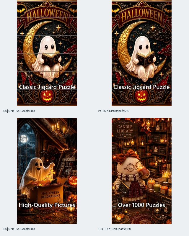
Image 4. Reported listing: Halloween Jigcard Puzzle, iOS store ID 6798938110. The opening frames display “Classic Jigcard Puzzle”; the later sampled frames display “High-Quality Pictures” and “Over 1000 Puzzles.” Those phrases are claims visible in the ad.
At 0 and 2 seconds, the main composition contains a white ghost holding a book, a gold crescent moon, stars, and a decorative Halloween heading. A grid crosses the picture at 0 seconds but is not apparent at 2 seconds. At 5 seconds, a different ghost stands beside a box labeled for Halloween decorations in a warmly lit room. At 10 seconds, a character appears within a detailed candlelit library scene.
The opening category label performs meaningful work because the artwork could otherwise serve several purposes. A viewer seeing the ghost alone might reasonably read it as an illustration, a decorative print, or entertainment content. The puzzle wording narrows the intended interpretation. The grid adds a visual clue, but the sampled frames do not establish the exact mechanic of moving or arranging the cards.
An adaptation should preserve that distinction between naming the category and demonstrating it. If the product uses movable rectangular tiles, show a real tile moving. If it uses conventional jigsaw pieces, show that interaction instead. Do not infer the mechanic from the word “Jigcard” and then commission a demonstration that the product cannot reproduce.
The later text changes the message from category to picture quality and catalog size. Those are different proof tasks. “High-Quality Pictures” expresses a qualitative promise supported visually by the detailed artwork, but actual in-app rendering remains untested here. “Over 1000 Puzzles” is a quantitative catalog claim that the contact sheet cannot verify.
Test hypothesis: friendly ghost imagery may communicate a different seasonal mood from threatening mask imagery while allowing the same puzzle action to remain recognizable. That is a reason to create a mood comparison, not evidence about which demographic prefers either treatment.
For a controlled original comparison, keep the demonstration and copy stable and change the artwork’s mood. If the friendly version also receives a new benefit, a larger catalog claim, and a different destination, the team will be unable to isolate the contribution of the artwork.
The practical takeaway is to give gentle seasonal creative enough product specificity. Warm light and a friendly character can define the atmosphere, but the activity still needs a label, a visible interaction, or both.
Example 5: Preserve the Coloring Interface Through the Reveal
The fifth example keeps a numbered palette and thumbnail strip visible while the artwork changes. That repeated interface helps connect the gothic imagery to coloring. The contrast between the opening grayscale image and the later colored treatment also provides a transformation reference, although the supplied timestamps do not show a complete coloring session or establish how the transition was produced.
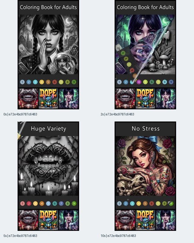
Image 5. Reported listing: Halloween Color By Number Book, iOS store ID 6484507868. The source record’s title is “Pet Color Paint By Number.” The listing association is preserved by ID; the image analysis concerns the visible coloring presentation.
At 0 seconds, “Coloring Book for Adults” sits above a grayscale portrait with gothic surroundings. A numbered color row and small artwork choices occupy the bottom area. At 2 seconds, a diagonal division separates colored and grayscale portions of the composition. Later sampled frames show different artwork under “Huge Variety” and “No Stress.”
The stable interface is the useful structural feature. Even when the dominant subject changes, the palette and thumbnails provide recurring category cues. A production team adapting this idea could change the seasonal subject while keeping the real product controls in a consistent position. That creates a clear constraint for design review: the seasonal treatment must not obscure the interaction area.
The diagonal reveal should be described carefully. It is visible in the 2-second frame, but the contact sheet does not establish whether the effect corresponds to a user action, a demonstration overlay, or an editorial transition. If an adaptation uses a reveal that is unavailable in the app, the brief should distinguish the visual transition from the real coloring action rather than present them as equivalent.
The copy also carries different kinds of meaning. “Coloring Book for Adults” names an intended product category. “Huge Variety” makes a breadth claim. “No Stress” frames an emotional experience. None identifies the actual targeting settings, proves a catalog count, or establishes a health benefit.
Test hypothesis: retaining a recognizable palette during a visual transformation may help viewers identify the coloring activity compared with showing only the finished art. The comparison should preserve the same illustration and message so the palette’s contribution can be examined separately.
An original script might show an uncolored section, the actual color selection, and the resulting filled region. Copy such as “Bring your midnight garden to color” would keep the seasonal mood tied to a visible action, assuming the depicted garden is available. The production brief should require the same artwork across these beats so the transformation can be followed.
The naming difference in the record is also operationally useful. Save the reported title and the linked listing separately. Replacing one with the other can erase context that a later researcher needs to understand the reference.
Example 6: Keep Objection Copy From Hiding the Product
The sixth example places a strong seasonal character behind an increasingly dense product message. A dark fairy-tale figure and glowing apple establish the visual hook, while the copy asks viewers to switch from an unsatisfying coloring game. The creative question is whether the claims and product evidence remain readable together, particularly when an inset panel appears over the existing composition.
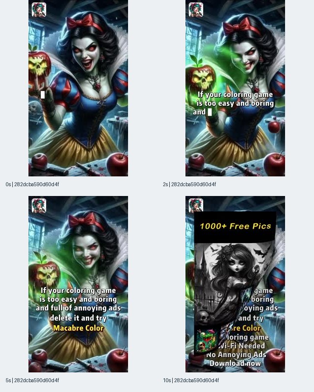
Image 6. Reported listing: Halloween Color By Number Book, iOS store ID 6484507868. The sampled copy names “Macabre Color” and includes claims about free pictures, connectivity, and advertising. These are observed advertiser statements, not verified product facts.
At 2 seconds, the visible message begins, “If your coloring game is too easy and boring…” At 5 seconds, the copy also references annoying ads and invites the viewer to try Macabre Color. The 10-second frame includes a separate central panel with “1000+ Free Pics,” an artwork preview, and additional lines including “No Wi-Fi Needed” and “No Annoying Ads.”
This is a reference for an objection-led structure: identify a frustration, name an alternative, and provide reasons to switch. That structure can be useful to brief without adopting the specific assertions. The source does not establish that other games are boring, that this product is more challenging, or that its advertising experience matches the wording.
The final sampled composition also presents a concrete readability issue for inspection. Background copy and the inset panel compete within the same area. A screenshot can reveal overlapping message layers; it cannot tell us how long that arrangement persists or whether viewers understood it during playback. The appropriate production response is a layout check, followed by a real comprehension check if the format is retained.
For an original adaptation, choose one objection that your product can answer with visible evidence. If the objection is limited seasonal content, show the actual available collection. If it concerns task complexity, show the relevant product behavior and describe it accurately. Avoid stacking unrelated claims merely because they appeared together in a reference.
Test hypothesis: a single supported objection followed by a readable demonstration may communicate the switching reason more clearly than a character background carrying several simultaneous promises. The hypothesis concerns comprehension; it does not predict lower acquisition cost from the screenshot alone.
A claim worksheet is especially useful here. Record the proposed sentence, the exact product condition it describes, any exceptions, the destination wording, and the person responsible for maintaining its accuracy. If the condition cannot be verified, remove or narrow the sentence before production.
The lesson is not that character-led creative should be avoided. It is that the character, objection, evidence, and invitation each need enough space to do a defined job. A striking seasonal image should not require the product explanation to become a pile of small text.
Example 7: Connect a Costumed Presenter to Recognizable Gameplay
The seventh example connects a person in Halloween costume with a visibly recognizable bingo interface. The opening sampled frames show a witch-costumed presenter holding a phone; the later frames show bingo cards and a result graphic. This makes it a useful reference for the handoff between a human opening and a product screen without establishing a genuine testimonial or a complete recorded play session.
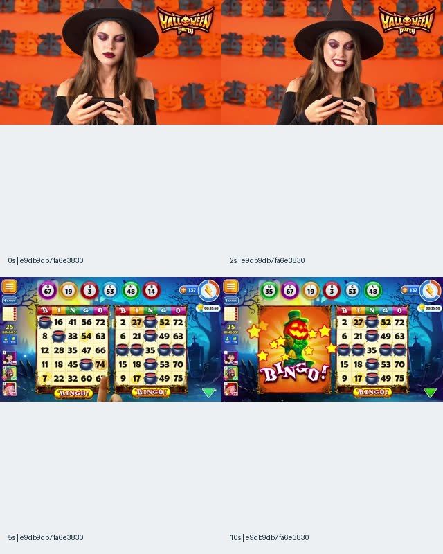
Image 7. Reported listing: Halloween Bingo, Android package com.dynamicgames.bingohalloween. The 0- and 2-second frames show a presenter; the 5- and 10-second frames show a bingo interface. The landscape source frames are arranged within the contact sheet.
The orange background, witch hat, makeup, and pumpkin decorations establish the seasonal occasion before the sampled gameplay appears. At 5 seconds, numbered balls and bingo cards make the category visible. At 10 seconds, a pumpkin-themed “BINGO!” graphic occupies part of the game screen.
The relationship between presenter and screen is the main production question. The presenter holds a phone, but that image alone does not establish that the subsequent screen is a recording of the same person’s session. The article therefore treats the sequence as an advertised presentation, not evidence of personal use, an unscripted reaction, or a verified win.
An original creator brief can make the desired continuity explicit. Ask for the approved product interaction to be recorded, identify the moment the presenter should respond to, and keep the visible outcome consistent with the accompanying screen. If the reaction is staged, the internal brief should say so plainly rather than asking the editor to create an unsupported testimonial impression.
The Halloween treatment also continues into the product display. The later result graphic uses a seasonal character, while the board remains recognizably bingo. That is a useful distinction from a costume-only opening: the seasonal layer can appear in both the introduction and the demonstrated experience, provided the product actually contains it.
Test hypothesis: a costumed presenter followed by a clear product action may communicate the seasonal occasion and game category differently from an opening that begins directly on the board. A matched comparison should preserve the same game sequence, result, claim, and destination while changing the introduction.
Do not interpret “rewards” in the associated advertising copy as proof of cash prizes, withdrawals, or any particular reward system. The supplied frames establish a bingo result graphic, not its economic meaning. Your own script should name only the reward conditions that the product can substantiate.
Finally, preserve the source aspect ratio in the research record. The landscape frames are not evidence that the asset ran on a particular platform, and the empty areas of the contact-sheet layout should not be mistaken for designed whitespace inside the original advertisement.
Example 8: Compare Autumn Comfort With Explicit Halloween Fantasy
The eighth example uses autumn scenery and home interiors within the same reported puzzle listing as Example 4. Its opening shows a house, fall foliage, and a wagon of flowers and pumpkins rather than a ghost. This offers a concrete reference for varying seasonal mood while keeping similar category and benefit wording, although it is not a controlled performance comparison.
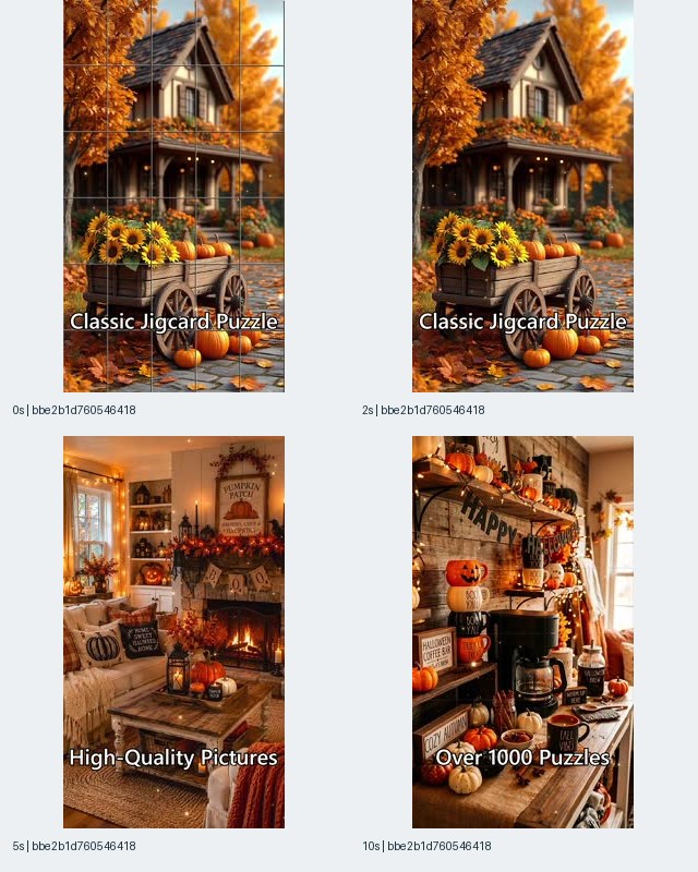
Image 8. Reported listing: Halloween Jigcard Puzzle, iOS store ID 6798938110. The opening frames show an autumn scene with “Classic Jigcard Puzzle”; later frames show seasonal interiors with “High-Quality Pictures” and “Over 1000 Puzzles.”
The 0-second frame shows a grid over the autumn image. At 2 seconds, the same general composition is visible without the grid apparent in the earlier frame. The 5-second frame shows a living room with seasonal decorations, and the 10-second frame shows a coffee station with pumpkins and Halloween signage. The contact sheet does not reveal the interaction or transition responsible for these changes.
The comparison with Example 4 is useful because both records point to store ID 6798938110 and use the same visible category and benefit phrases at the sampled stages. One opens with a reading ghost on a crescent moon; the other opens with a house and pumpkin wagon. That supports a comparison of creative presentation under a shared listing association.
It does not support a claim that the advertiser ran an A/B test. The records have different observation histories, and the supplied material lacks campaign settings, audience assignments, budgets, conversions, and experimental controls. The difference between their estimated impression figures cannot isolate the effect of the artwork.
For an original brief, treat “friendly fantasy” and “autumn home” as art directions. Keep the actual puzzle interaction constant, then decide which visual elements must change to express each direction. A house scene should not receive additional catalog claims simply because it leaves more room for text; otherwise the comparison changes both mood and proposition.
Test hypothesis: an autumn-home treatment may communicate comfort and seasonal familiarity differently from an explicit ghost treatment. This hypothesis can be investigated through open-ended comprehension responses and, later, your own campaign experiment. It does not identify a proven audience segment.
This example also raises a calendar question. Some visuals are tightly connected to Halloween, while autumn foliage can have a broader seasonal reading. That observation can inform version planning, but it does not prove that the pictured ad remains effective after the holiday. Any post-holiday continuation decision should depend on accurate product availability and your own results.
The useful adaptation is therefore modular: retain the puzzle demonstration, prepare separate artwork treatments, and keep a clear record of which captions depend on seasonal content or catalog conditions. That makes later revisions easier to evaluate without rewriting the product promise.
A Framework for Keeping the Product Visible
A seasonal creative brief becomes easier to evaluate when it separates occasion, activity, evidence, and destination. Each layer answers a different viewer question. The eight examples supply concrete references for those layers, but no single example proves that a particular arrangement is commercially superior. Use the framework to identify missing information before deciding which variation to produce.
| Layer | Viewer question | Reference from this sample | Production requirement |
|---|---|---|---|
| Occasion | Why does this feel seasonal? | Ghosts, pumpkins, costumes, moonlit scenery | Specify the seasonal element and its role |
| Activity | What would I actually do? | Puzzle gaps, palette, bingo board | Show an authentic action or unmistakable category cue |
| Evidence | What supports the promise? | Available artwork, visible interface, demonstrated result | Match each claim to product evidence |
| Continuity | How does the opening connect to the product? | Scene-to-puzzle or presenter-to-board handoff | Preserve a recognizable object, action, or visual relationship |
| Destination | What happens after I respond? | Invitation to play or explore content | Align the ad with the current listing and available experience |
The framework should produce an edit, not merely a score. If the activity is missing, add a real demonstration. If the evidence is missing, narrow the claim. If continuity is weak, replace an unrelated transition with a matching product detail. If the destination cannot fulfill the seasonal promise, revise the promise or the destination before launch.
For teams already using an ad creative analysis framework, these layers can become fields in the existing review rather than a separate reporting system. Keep the language descriptive: “palette visible” is easier to verify than “strong product clarity.” The interpretation can follow in a separate note.
It also helps to distinguish category recognition from brand recognition. A viewer might correctly identify a coloring app while being unable to name the product. Conversely, a logo can be legible while the activity remains unclear. Your review should ask which kind of recognition the creative needs to support and collect evidence for that particular objective.
An internal viewing exercise can be simple. Show the draft without explaining the brief, then ask what is advertised, what action the viewer expects to take, and which promise they remember. Record their words before offering choices. This is a proposed comprehension check, not a claim that these examples have undergone one.
A Practical Workflow From Search Result to Production Brief
A useful Halloween research workflow ends with an original, supportable creative decision. It should preserve enough source context for another teammate to understand the decision without reopening every reference. The output is a brief that identifies what to borrow structurally, what to replace, and what remains a hypothesis.
Start with the product action. Write down the interaction your app can demonstrate today. For a coloring product, that could be choosing an available illustration and filling a region. For a puzzle product, it could be selecting and placing a piece. Define the actual experience before searching for seasonal imagery, so the references do not quietly expand the promise.
Set the research scope. Record the market, keyword, measurement dates, retrieval date, sorting choice, and collection limit. This article’s example is the US query Halloween over 2026-09-12 to 2026-10-11, collected on 2026-10-12. A new research exercise should save its own scope instead of borrowing these dates while using a different result set.
Check the listing association. Preserve the linked store identifier beside the displayed name. Keep record titles, in-ad brand wording, and store names in separate fields when they differ. Do not merge products because their names resemble each other. If a result cannot be associated confidently, retain it as an unresolved visual reference rather than attributing it to a particular product.
Group repeated files. Use the individual values within fingerprint arrays to identify reused videos and playable assets. Keep the underlying file grouping separate from advertising instances. In this sample, that distinction prevents the repeated Spooky Halloween Color video from becoming several supposedly independent creative ideas.
Annotate only inspected evidence. For each chosen frame, note the timestamp, visible subject, readable copy, product cue, and uncertainty. “Numbered palette visible at 10 seconds” is an observation. “The user completed the image” is not established by a completed-looking picture alone. If audio or later playback has not been inspected, leave those fields unknown.
Extract a transferable structure. Convert the reference into a neutral description such as “seasonal artwork contains the task” or “presenter introduction hands off to a recognizable board.” Avoid instructions to copy a particular character or reproduce a competitor’s illustration. The structure should remain useful when the source artwork is removed.
Write the hypothesis and alternative. State what might change for the viewer and what comparison would help evaluate it. For example: “Showing the real coloring action in the opening may improve recognition of the activity compared with opening on finished artwork.” Name the intended evidence, such as comprehension responses, before discussing commercial outcomes.
Complete the promise check. Verify content availability, catalog wording, update frequency, access conditions, and any statements about advertising or connectivity. The creative owner should know which product source supports each line. If there is no support, replace the claim with an observable demonstration or a narrower invitation.
Hand off a bounded production task. Give the editor the approved product capture, artwork direction, copy, reference frames, aspect ratio, and acceptance criteria. Separate required elements from optional treatments. “Keep the palette readable” is a requirement; “try a candlelit border” can remain an art-direction option.
Save the decision alongside the evidence. Record why the concept entered the backlog, which uncertainty it addresses, and what would cause the team to revise it. This prevents a reference from becoming a permanent “winner” simply because it was saved early or carried a large estimated impression figure.
For a small team, one shared table can hold this workflow. The essential discipline is maintaining the distinction between source observation, product fact, creative hypothesis, and actual test result. Those categories should remain visible even when the same person performs every step.
Three Original Briefs You Can Adapt
The following briefs translate the sample’s structures into proposed production tasks. They are original examples, not scripts recovered from the source videos, completed campaigns, or recorded tests. Each requires real product footage and confirmation that the depicted content is available. Their purpose is to make the creative decision concrete enough for an editor and a buyer to discuss.
Brief A: Finish the lantern scene.
The product is a hypothetical jigsaw app with an available illustration of a lantern outside a Halloween house. The opening shows the real puzzle with an unfilled area around the lantern. A selected piece moves into place through an authentic product interaction. The completed detail then remains visible long enough for the viewer to understand the result.
Proposed on-screen copy: “Find the piece that lights up the scene.” The invitation is “Choose your next puzzle,” provided that the destination offers the depicted activity. The brief does not include a catalog count, a difficulty promise, or a claim that everyone can finish immediately.
The structural reference is Example 1’s integration of artwork and task. The original artwork, interaction, layout, and copy should come from the advertiser’s own product. Acceptance requires a visible gap, an understandable placement, and a consistent image before and after the action. A proposed comparison could remove the task from the opening while preserving the later demonstration.
Brief B: Pick a picture, then color one detail.
The product is a hypothetical coloring app with an available seasonal collection. The opening shows a small selection of actual illustrations. One picture is selected, and the same picture appears in the coloring interface. The demonstration shows a real color selection and a region filling, followed by a view that preserves the selected detail.
Proposed copy: “Choose your Halloween picture” followed by “Make the details yours.” These lines should be revised if the product does not permit the degree of choice they imply. The destination should open or clearly explain the same collection; it should not send users to unrelated content while relying on the seasonal ad to attract them.
The structural references are Example 2’s gallery and Example 5’s persistent palette. Acceptance requires continuity between thumbnail and canvas, readable controls, and a real action. The hypothesis concerns whether selection plus demonstration communicates the experience more clearly than a finished-art montage. It does not assume that a larger visible selection produces more installs.
Brief C: A seasonal host introduces the actual game.
The product is a hypothetical bingo app with a verified seasonal presentation. A presenter in modest Halloween costume introduces the occasion, then the edit shows an approved recording of the real game. The reaction corresponds to the visible result. The seasonal treatment remains secondary to readable board information during the demonstration.
Proposed copy: “Tonight’s game has a Halloween look” followed by an accurate invitation to play. Any wording about prizes, rewards, free access, or event availability must be supplied separately by the product owner. The presenter should not invent personal experience or guaranteed outcomes.
The structural reference is Example 7’s presenter-to-board sequence. Acceptance requires consistency between the presenter’s statement, the screen recording, and the destination. The proposed comparison begins directly on the same board sequence, allowing the team to examine the role of the presenter introduction without changing the game evidence.
Across these briefs, the production handoff should name what stays fixed and what may vary. This makes the eventual comparison interpretable and limits avoidable revisions. A seasonal concept becomes easier to test when the editor knows precisely which element is the experiment.
How to Evaluate a Seasonal Variant Fairly
A fair evaluation separates message clarity from campaign performance and uses evidence appropriate to each question. The supplied advertising sample can suggest what to examine, but it cannot provide the results of your experiment. Begin with product fidelity and comprehension, then use your own advertising and product data to evaluate commercial behavior.
Before spending, check whether the proposed action is real, the pictured content is available, and the claims match current conditions. Review the draft at its intended viewing size. Text that is readable on an editing monitor may become difficult to inspect in a smaller placement. This is a production check to perform, not a problem measured in the source campaigns.
For comprehension, ask viewers to identify the product category, expected action, seasonal promise, and next step. Avoid explaining the intended answer first. A person who remembers a witch but cannot describe the app has given a different response from someone who recognizes a puzzle but forgets the brand. The edit should address the specific gap rather than treating every uncertain response as a need for more text.
For a campaign experiment, define the comparison before launch. If the question is seasonal artwork, preserve the product demonstration, offer, destination, and other relevant conditions. If the question is demonstration order, preserve the artwork and claim while changing the sequence. When several elements must change together, describe the test as a concept comparison rather than attributing the result to one isolated feature.
Use an outcome that fits the product’s business objective, and retain supporting measures that explain the path. Attention, clicks, installs, and meaningful in-app actions answer different questions. A seasonal opening might attract attention while creating an expectation that the app does not satisfy. That possibility is a hypothesis to monitor, not a conclusion about any example here.
Document the measurement window and denominator for every result. Keep production cost and revision effort available for the decision even when they are not part of the primary campaign metric. A concept that is difficult to maintain may require a different operating choice from one that can be updated accurately with available assets.
Set review and stopping rules from your own account economics, measurement setup, and available evidence. This article supplies no universal acquisition-cost threshold, conversion benchmark, or minimum sample size. The creative testing framework is a relevant next step for structuring the comparison and recording uncertainty.
Most importantly, keep external research and internal results in separate fields. “Observed in a dated search sample” and “improved our measured activation outcome” are different statements. The first can justify creating a test; only an appropriately designed and measured test can support the second.
Common Mistakes When Adapting Halloween Ads
The most consequential adaptation mistakes change the product promise while appearing to change only the seasonal style. They can happen in the brief, during editing, or when research findings are summarized for a client. A useful review looks for specific mismatches rather than applying a generic instruction to make the creative more authentic.
Copying the subject instead of the structure. A masked character is a subject; placing the product task inside the opening artwork is a structure. Borrow the latter and create your own expression. This keeps the research useful even when the source imagery does not fit your brand or available content.
Treating an ad claim as a product fact. “Over 1000 Puzzles,” “Daily Updated,” and “No Wi-Fi Needed” are visible statements in the references. They are not verified catalog, scheduling, or technical facts. Your own version needs independent support from the product it advertises.
Calling the sample the Halloween market. The collection is limited by keyword, country, window, sorting, and page count. Its mix of puzzle, coloring, and bingo examples does not establish the market’s full category distribution or its most popular creative treatment.
Counting repeated videos as new ideas. Separate advertising instances from underlying files. Different attached assets can matter operationally, but they do not automatically represent different video concepts. A swollen reference board can hide how little structural variety the team actually collected.
Converting observation age into performance. Some records were first observed before the measurement window. That does not prove uninterrupted delivery or commercial success. Dividing the window’s estimated impressions by the record’s apparent age would mix incompatible scopes.
Inferring a network from the layout. A portrait video is not automatically a TikTok ad, and a landscape screen is not automatically a YouTube ad. The supplied material does not identify a named network for these examples, so platform-specific conclusions would exceed the evidence.
Mistaking an overlay for an actual interaction. Puzzle outlines, a color reveal, or an inset panel may communicate the product, but the contact sheets do not establish how those elements behave. Your own demonstration should be checked against the real app.
Letting the holiday outlive the promise. If seasonal content, an event, or an offer changes, the ad and destination need another accuracy check. Continuing an autumn visual may be reasonable, but continuing expired wording is a separate decision that artwork alone cannot justify.
When AdMapix Fits This Workflow
AdMapix fits the discovery and evidence-organizing stage of seasonal creative research. It is an advertising intelligence product: the relevant task here is finding indexed references, inspecting their reported associations, and turning visible creative patterns into a structured brief. The dated sample demonstrates that research input, while the production and testing decisions remain the responsibility of the advertising team.
Use it when the question is concrete: “How do seasonal puzzle ads show the activity?” or “Which references preserve the coloring interface while changing the artwork?” A search becomes more useful when the team knows which field or visual relationship it needs to capture. Collecting more examples without a decision question can simply increase review work.
The handoff should include the source record, listing identifier, observation date, inspected frames, visible claim, proposed adaptation, and evidence still required. This makes the reference usable by someone who did not perform the search. It also makes it easier to remove unsupported wording before it reaches a script or client presentation.
AdMapix should not substitute for your own conversion measurement, product verification, or a controlled experiment. This sample does not establish a particular network’s coverage, a refresh guarantee, or the complete advertising activity of a listed app.
Ready to build the next brief? Inspect Halloween references for my product idea, then carry one clearly stated hypothesis into production. Check the live AdMapix pricing page for current access and commercial terms. Prices and credit allowances are deliberately not repeated here because they can change while an evergreen article remains online.
FAQ
The answers below distinguish what these examples show from what a team still needs to verify. They are practical research and production questions arising from the sample, not a claim about measured search demand or customer survey results.
What makes a Halloween ad useful as a creative reference?
A useful reference shows a relationship you can adapt: seasonal artwork containing a puzzle task, a gallery leading into a coloring screen, or a presenter handing off to gameplay. Save the relationship with its source and limitations. A memorable character alone provides less production guidance unless you can explain how it connects to your own product action.
Are these the best-performing Halloween ads of 2026?
No. They are eight visual references selected from a bounded US search sample for 2026-09-12 to 2026-10-11. The supplied impression values are third-party model estimates, and the evidence contains no conversion, spend, retention, or profit results. The article compares visible presentation and proposes tests; it does not rank commercial performance.
How can I add a seasonal hook without obscuring gameplay?
Keep an authentic product action visible or connect the opening to it through a clear handoff. Specify what the viewer should recognize, then inspect whether the artwork, copy, and controls support that recognition. A puzzle gap, palette, or board can provide a direct category cue. Whether a particular arrangement improves results remains a hypothesis for your own evaluation.
Can I reuse claims such as daily updates or no ads?
Only if your own product supports the exact wording and relevant conditions. The screenshots establish that another advertiser displayed those claims; they do not verify them or make them transferable. Check content schedules, access requirements, exceptions, and destination wording before production. If the evidence is incomplete, narrow the statement or show an observable product feature instead.
Does a long-observed Halloween ad prove that it works?
No. A first-observed date describes an observation in the source, not verified profitability or uninterrupted delivery. The record may also reuse an older file. Its window impression estimate should not be divided by apparent age to create a performance metric. Use the observation history as research context and use your own measured outcomes to evaluate effectiveness.
Should a Halloween creative be scary or cozy?
The sample supports both as available creative directions, not as proven audience preferences. Threatening figures, friendly ghosts, and autumn interiors create visibly different moods. Choose a direction that fits your product, then formulate a specific hypothesis about comprehension or response. For a cleaner mood comparison, preserve the demonstration, claim, and destination while changing the artwork treatment.
How should a small team use these examples?
Start with one real product action and one unresolved creative question. Select the reference that helps describe the question, capture its source details, and write a brief with approved assets and claims. Review product fidelity and comprehension before evaluating campaign outcomes. A small, well-documented comparison can be more interpretable than a large batch that changes every element simultaneously.
Key Takeaways
The practical value of these Halloween ads is the set of inspectable creative relationships they provide, not a claim that their commercial results are known.
- Put the seasonal cue beside a recognizable product action, or define a clear handoff between them.
- Preserve listing IDs and distinguish advertising records from unique media files.
- Treat catalog, update, connectivity, and advertising claims as separate verification tasks.
- Turn each reference into an original hypothesis with a specific comparison and acceptance criteria.
- Use your own product and campaign evidence to decide what to continue, revise, or stop.
Sources
The sources below document the article’s advertising evidence and the relevant AdMapix research workflow. The observation date is 2026-10-12; the advertising measurement scope is United States, query Halloween, 2026-09-12 to 2026-10-11.
- Public frozen source package: collection batches, request parameters, checksums, record associations, and sample facts. The eight illustrated video contact sheets support observations only at 0, 2, 5, and 10 seconds.
- AdMapix Halloween search workflow: the relevant live discovery route for this research task. Linked on 2026-10-12; current results may differ from the frozen collection.
- AdMapix methodology: public methodology and interpretation reference. The product boundaries supplied for this article were reviewed on 2026-08-13; this article adds no claim of a newly completed tool test or live service verification.
AdMapix’s original contribution here is the dated sample organization, source-linked contact sheets, and creative analysis. Impression figures remain third-party model estimates. No complete videos, installed apps, associated playables, external tools, or campaign outcomes were tested for this article.
Turn these observations into your next creative study
Open the creative library and select samples for your market, network and research question.
Related Articles
Candy Crush Ad Strategy: Puzzle Demos, Event Hooks, and End Cards
A dated US iOS sample connects 30 Candy Crush Saga advertising records to 27 video files and four playable files, with eight visual analyses and practical briefs that separate observed creative structure from untested performance hypotheses.
TikTok Shop Ads: Beauty References for Demonstrations, Proof, and Offers
Compare eight beauty creative references from a dated US skincare sample, distinguish demonstrations from claims and historical offers, and build original briefs without assuming verified TikTok Shop attribution or campaign performance.
Clash Royale Ad Strategy: Hooks, Gameplay, and Video Reuse
A bounded US sample links 72 Clash Royale advertising records to 57 video files and 12 playable files, with eight timestamped visual analyses and practical briefs that separate creative observations from unmeasured performance.